A typeface is a collection of unique letters that share certain shapes. Typefaces represent these shared shapes and patterns; when the patterns change, it creates a new typeface.
Typefaces affect style and readability making their design important.
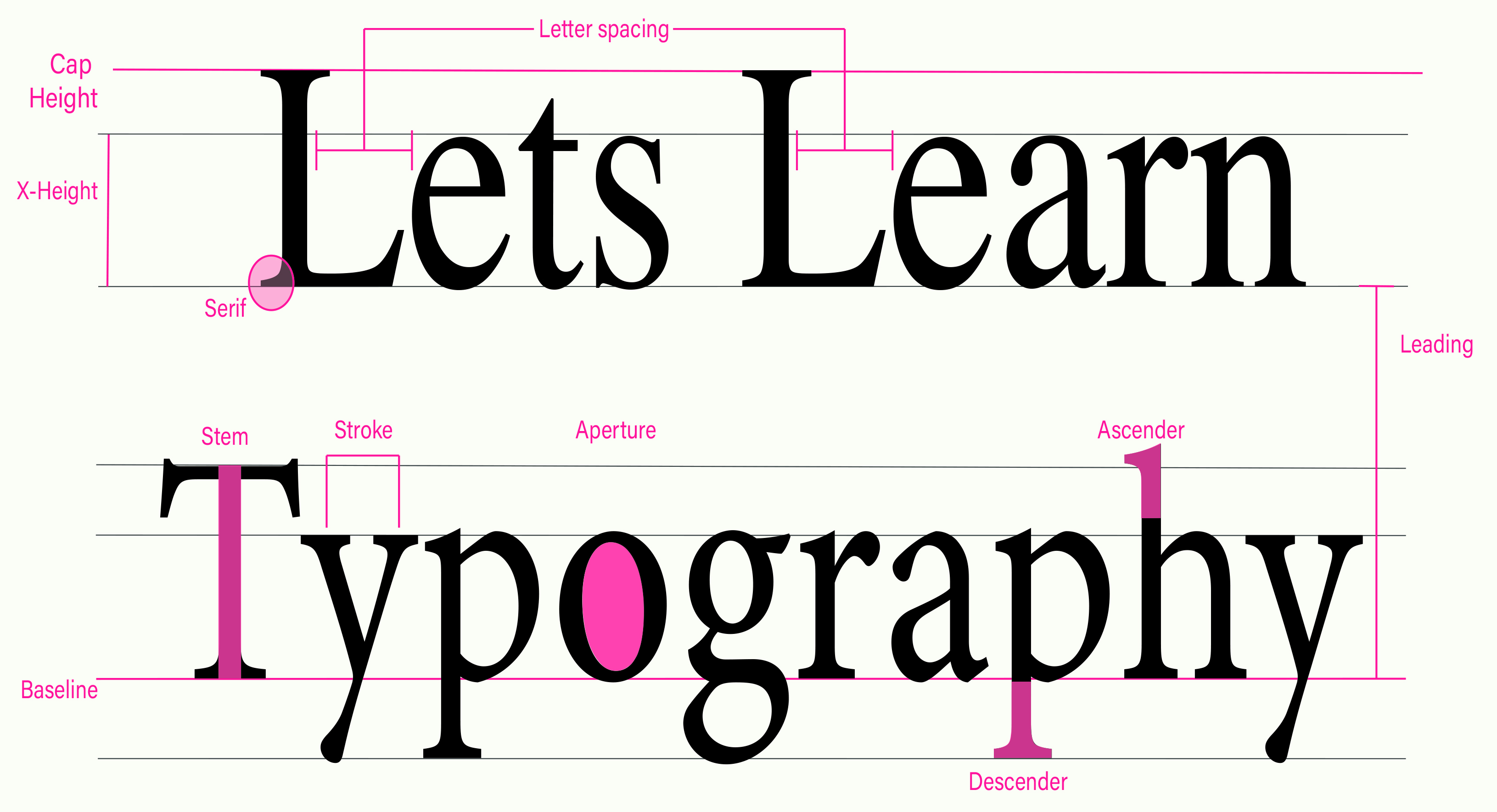
Letter Form Parts
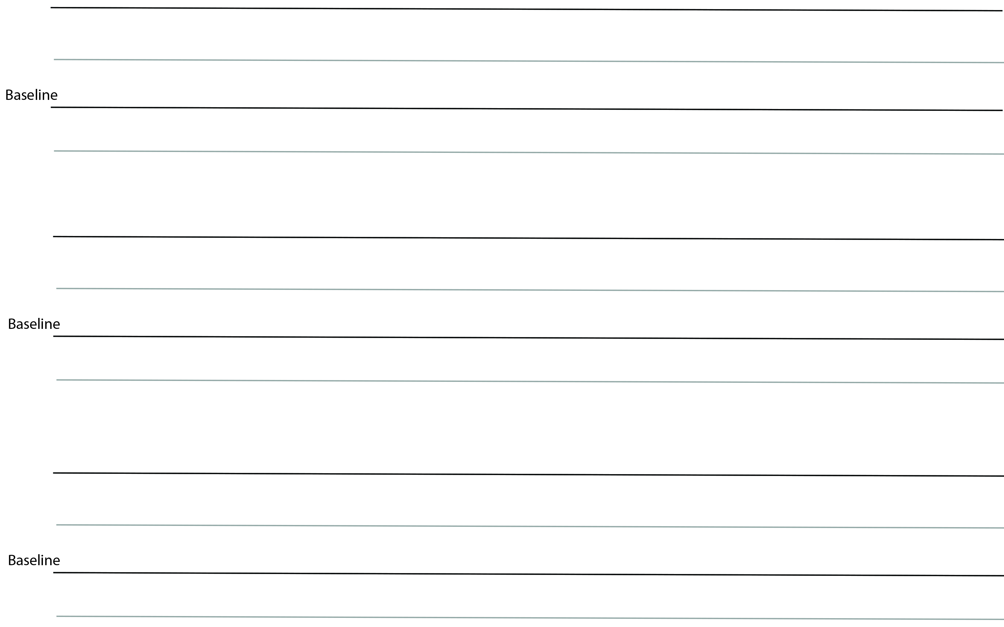
Baseline
The baseline is the invisible line that the text rests upon. This is important for keeping text straight and measuring the distance between text and another component. In CSS, the measurement form the baseline is called padding.
4dp Grid
No matter the size of text, the baseline sits on the 4dp grid. Line height must be divisible by 4 to maintain the grid.
Cap height
Cap height is the high of the capital letters, starting at the base line.
X-Height
The X-height is the height of the lowercase x for a typeface. It indicates how tall each glyph in a typeface will be. Fonts with a larger x-height are clearer to read at small font sizes.
Ascenders and Descenders
Ascenders are the upward stroke that is found in certain lowercase letters like h, d, and l, that extends beyond the cap height.
Descenders are the downward stroke in the letter like y, p, and g, and they extend below the baseline.
Line Height
Line height is the spacing distance between the baselines in text. If the line height is too small, the ascender and descenders and collide with one another.
Weight
A type's weight is the thickness of the line's stroke. Four to six weighs are the typical available for a font. The four most common are light, regular, medium, and bold.
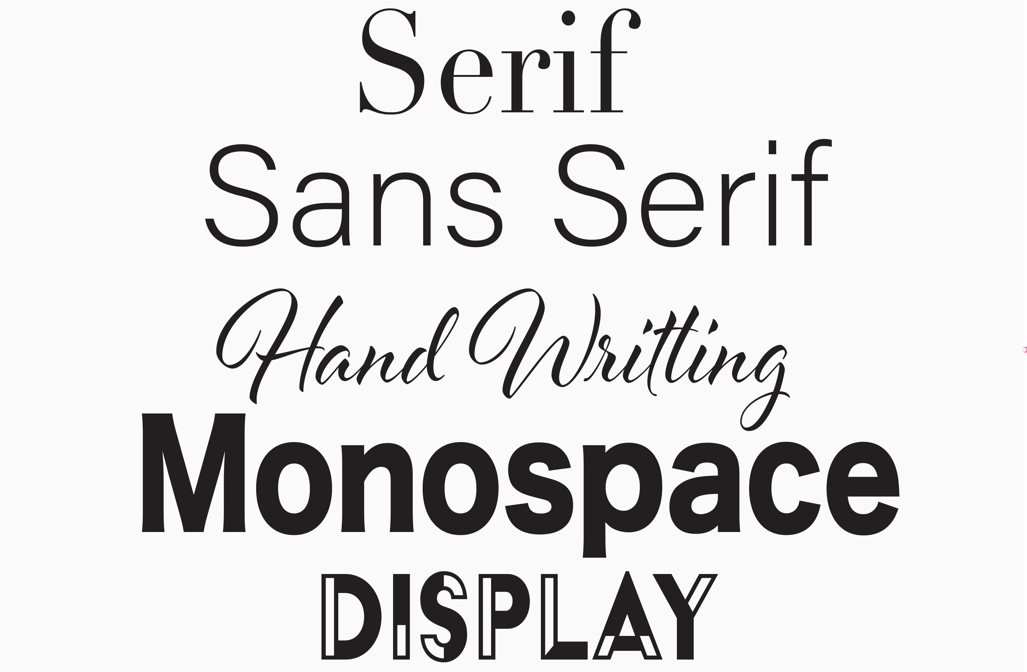
Classification
Serif
Small projection at the begining or end of a stroke on a letter.
Sans Serif
A typeface without serifs. “Sans serif” is French for without.
Handwriting
Typefaces that look like handwriting. This includes scripts.
Monospace
A typeface that displays all characteristics with the same width.
Display
A miscellaneous category for all classification types.
The History of Type
Usability
How Does Typography and Color Affect Usability?
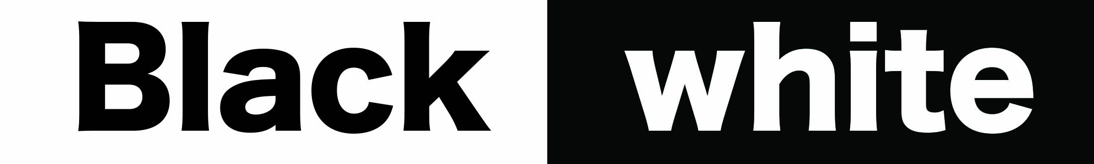
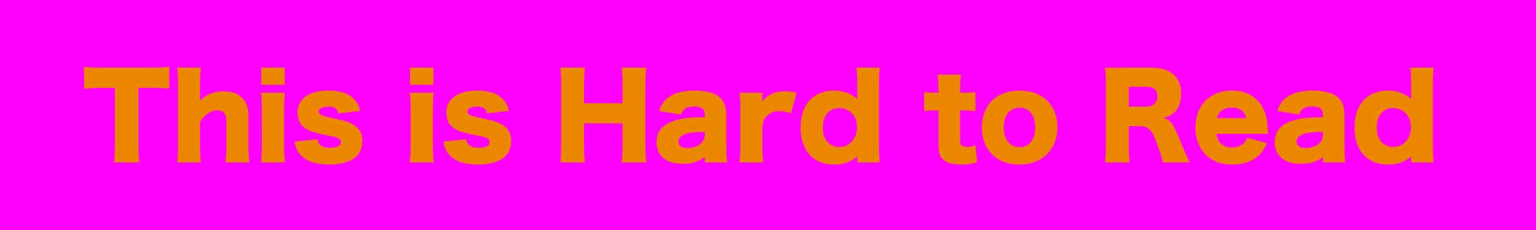
Typography and color make the first impression on a user when they visit your website, making them the most important design features. The type of typography you choose and color can make a positive or negative response on the user. The way color and type work together affect readability, whether it’s a website or a book. The most common and easiest color combination is to have a neutral color for the back ground and a dark color for text, or vice versa. There should be a drastic contrast difference in colors (like black and white) to make the text stand out.
You can highlight text and to draw people to important information, like I have done on this website with the pink titles.
Readability
The style of the typeface can affect how easy or hard words are to read.
Letter-spacing
Also, called tracking. It’s the space between letters. Large type sizes use tighter letter-spacing and smaller type sizes use larger letter-spacing.
Line Length
Line length is the distance of the body of text.
Line Height
Line height is the spacing distance between the baselines in text. If the line height is too small, the ascender and descenders and collide with one another.
Paragraph Spacing
The distance between paragraphs. Should be .75x and 1.25x of the type size for ideal readability.
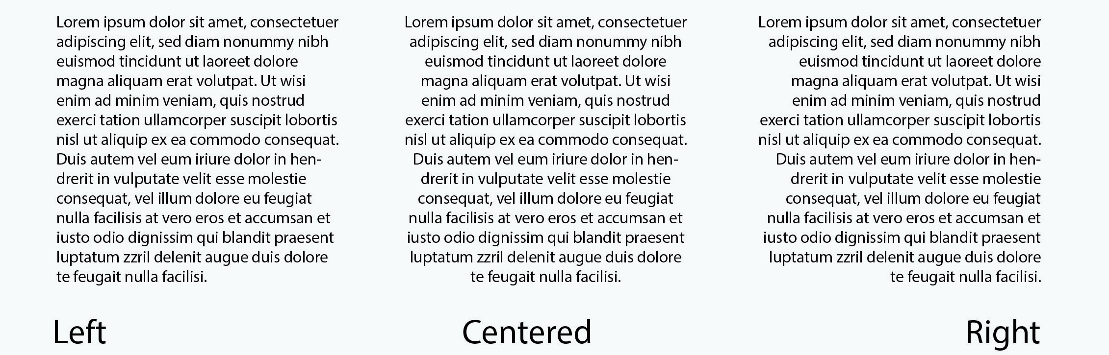
Alignment
Want to Make a Font?
How to Make Your Own Font That You Can use Online
What you’ll need:
-Fontself Maker (Get it Here)
- Adobe Illustrator CC 2019
- Template
- Pencil or marker (optionl)
NOTE: Fontself does cost money and requires Adobe Illustrator. You can still create a font with out it, but you wont be able to publish it online.
You can either print the template below or save it to your computer
Downloaded Version
Step 1: Bring the downloaded template into Illustrator.
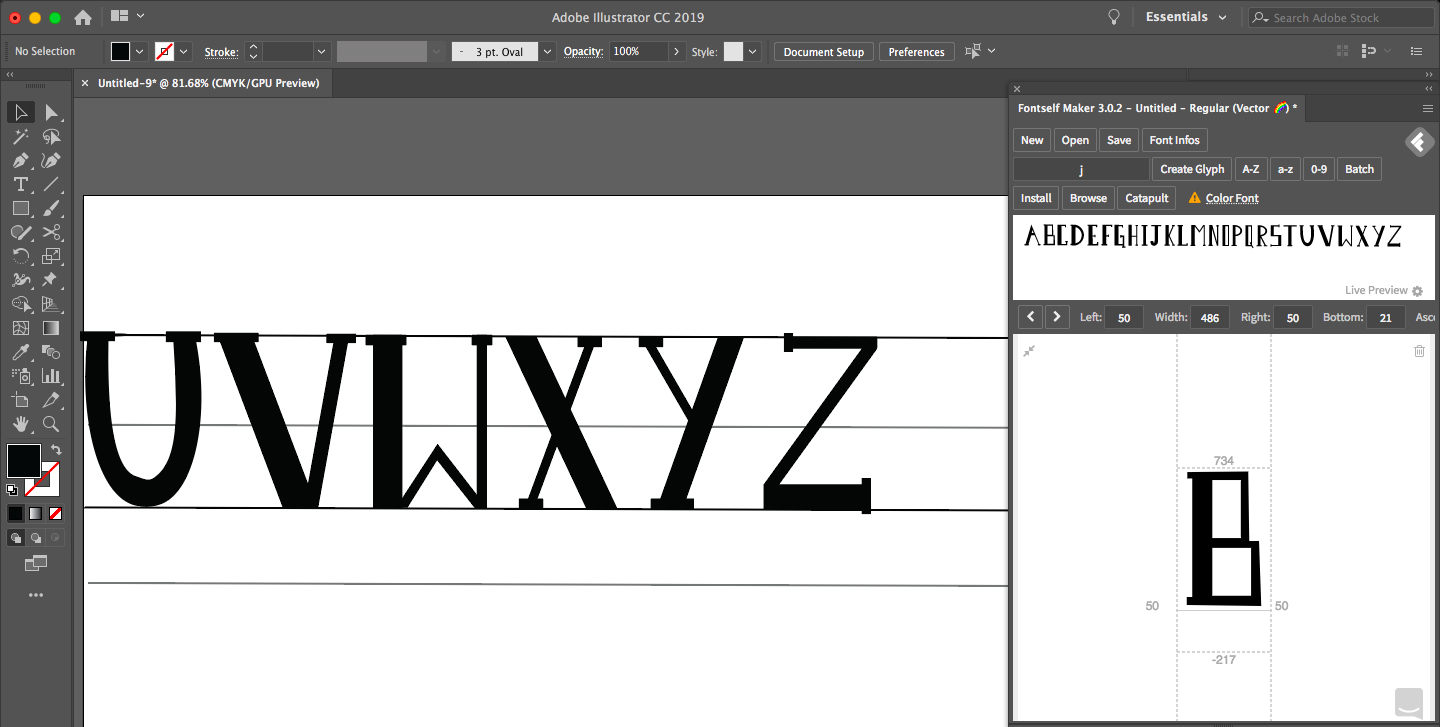
Step 2: Using the template as a guide to create a custom font. Its best to make capital letters first, lowercase second, numbers third, and symbols last. If you use multiple shapes for one letter, make sure to group them together when you’re done; Fontself won’t recognize them as a letter if they aren’t grouped.
Below is an image of the first font I made. I decided to go with something simple for the first example.
Step 3: Once you have created your letters, numbers and symbols, arrange them in a line. Note: it’s important that the letters are in order from A-Z.
Step 4: Starting with the capital letters first, click their section in Fontself, then select all letters, and drag and drop into font self.
Step 5: Repeat step 4 for lowercase letters, numbers, and symbols.
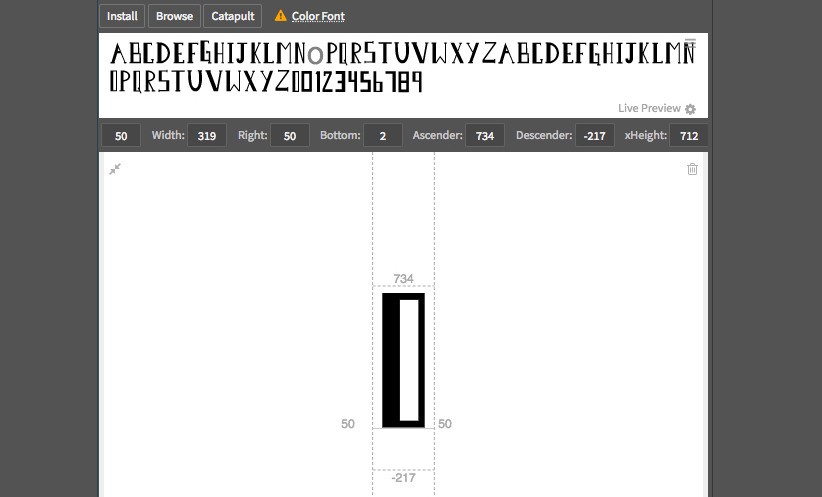
Step 6: Once everything is in Fontself, go through each letter to make any adjustments.
Step 7: save your font and upload it to the Catapult in Fontself. There you will be able to upload it to your website!
Printed Version
Step 1: Using a marker or pencil, draw your custom font. You’ll need to make uppercase letters, lowercase letters, and symbols.
Step 2: Once you have your font drawn, take a picture of it or scan it onto your computer and bring it into Illustrator.
Step 3: In Illustrator, lock the layer with the image of your font and create a new layer above. On the new layer, using the pen tool, trace over all your letters you drew.
Step 4: See step 3 in the downloaded version. Follow the rest of the steps.
If you get stuck and need further help, check out this online tutorial!