The houseless crisis in Portland and it’s surrounding areas is a growing concern that is far past “getting out of hand.” The content of this website just barely scratches the surface of what is going on in the Portland metro area, discussing the scale of homelessness, some of the prevalent causes, and linked resources that aim to help in a plethora of ways. The direction of our website entails this process in a sort of chronological path, discussing scale and information first (home), then diving into cause and effect (documentary), and closing with aid and connection (resources).
As a group, our aim is as the title implies - humanizing the homeless. The knee jerk perception of the homeless population is all too often centered around degrading. Someone on the streets is easily tied to the small portion of the percentage of homeless Portlanders than run through the park naked high out of their mind. The dismissal of these people is something we are looking to prevent by giving a story to their struggle. Interviewing a handful of individuals both currently and formerly living in homeless communities, we look to tell their stories and allow them to vouch for their humanity in an effort to give them a platform for empathy. Creating a documentary style interview based video that is contained in a multimedia website, this page will serve as that platform for reaching the general person in Portland and sprout empathy over animosity towards these groups.
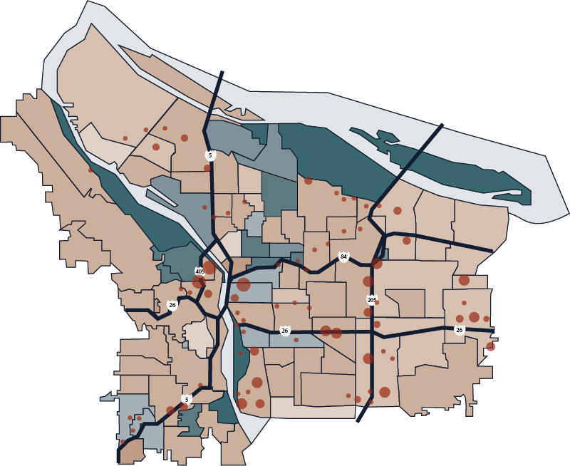
The diagram above created by Megan Tuthill demonstrates trends in the median home price. The lighter browns showing larger increases in the median and darker blues showing larger decreases. The darkest blue shade shows a nonresidential block of Portland, thus visualizing truly how many regions of the city are plagued with skyrocketing household costs. The map also visualizes the known homeless communities, with larger red dots signifying larger communities. It is worth noting this is only the known camps - individuals who move every day are near impossible to account for without placing a massive circle over the entire city.
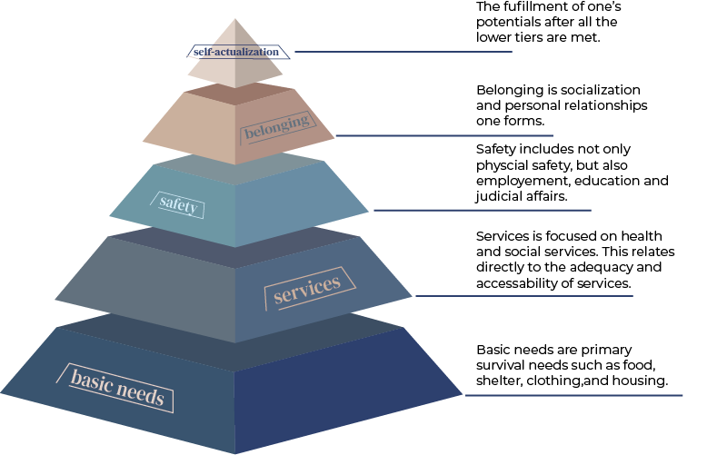
The second diagram visualizes how difficult it is to navigate fulfillment in a homeless setting, rewording the famous Maslow’s Hierarchy of Needs in a specific context of this homeless community. If the bottom sections can-not be achieved, how can we stop these red bubbles from growing so dramatically?