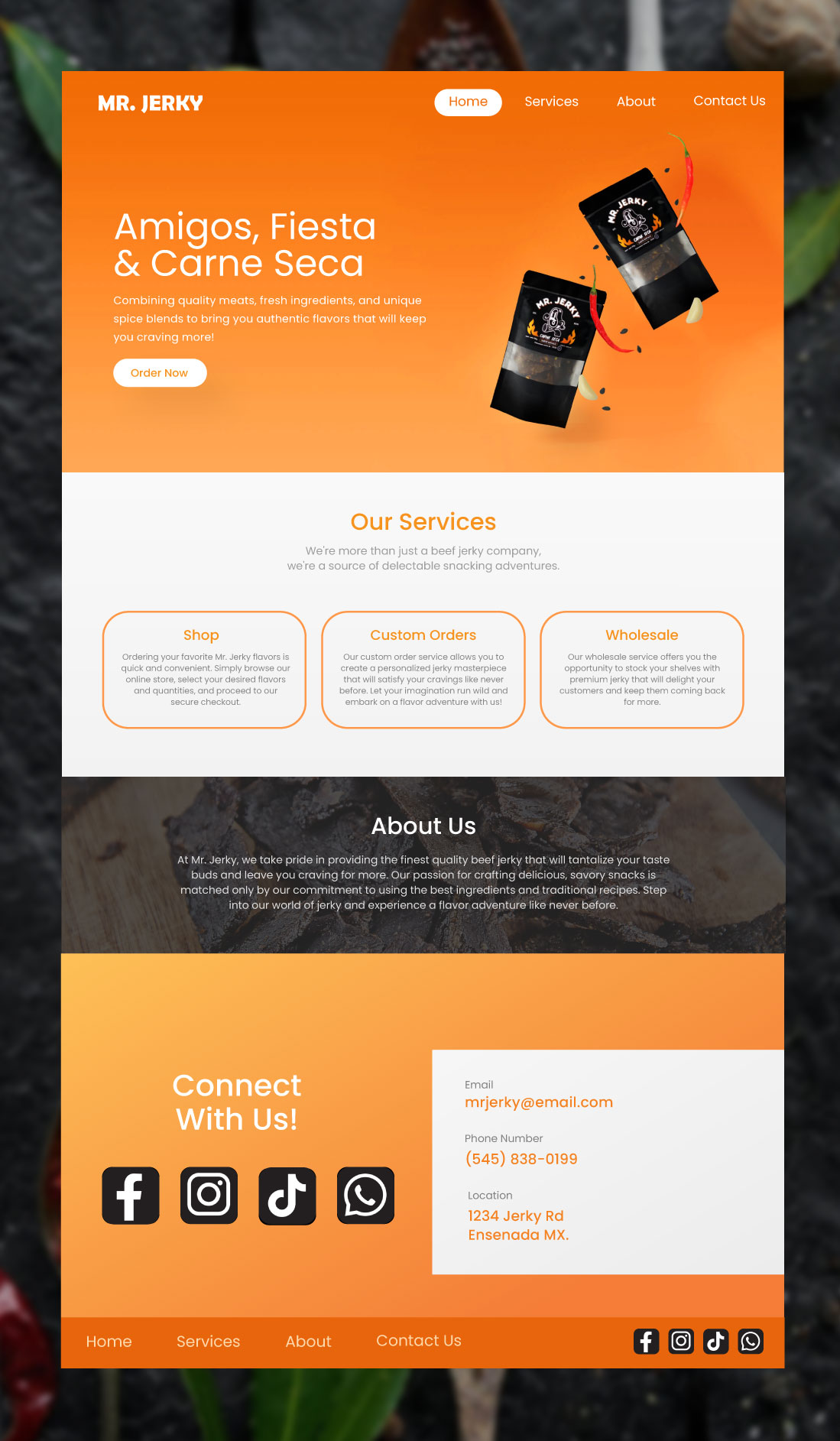
Mr. Jerky - Carne Seca
Visual Identity Design
Adobe Illustrator, Adobe Photoshop, Adobe XD
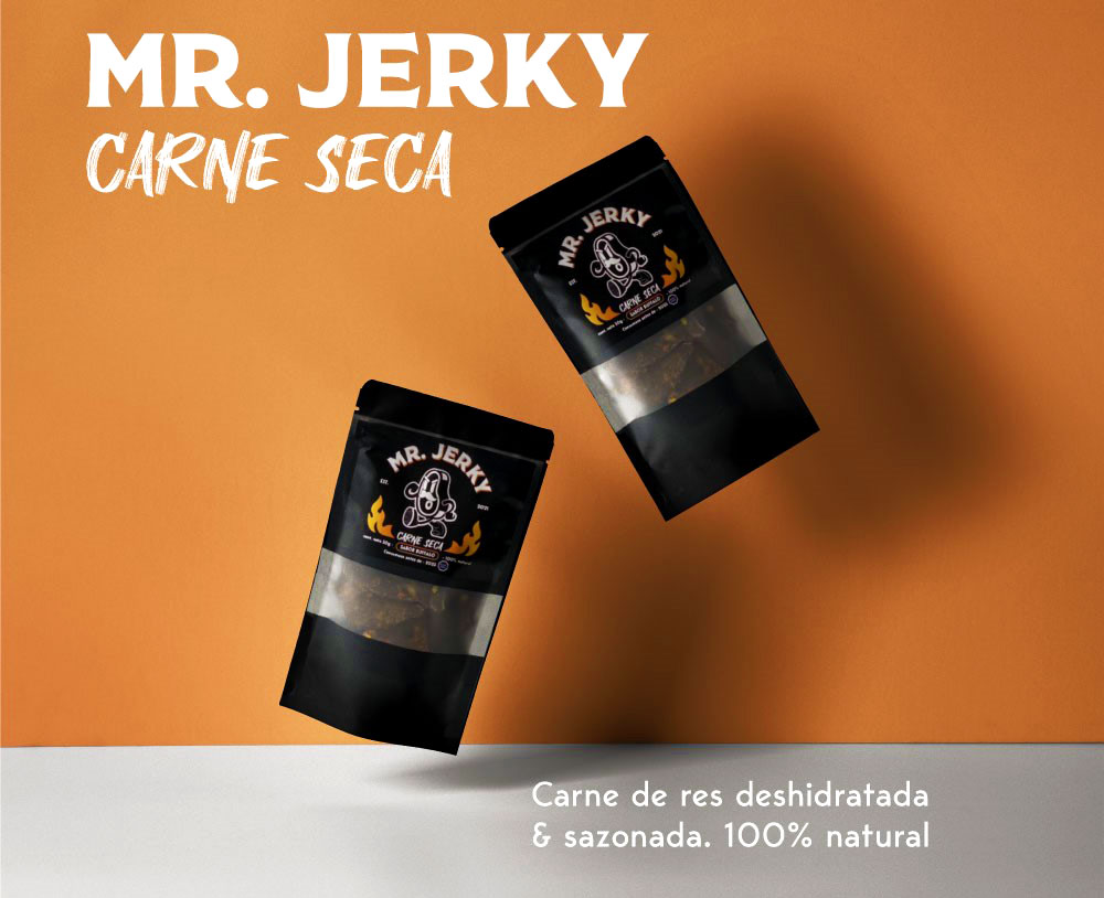
The branding of Mr. Jerky, a Mexican beef jerky company, is a visual design project focused on creating a cohesive identity that blends tradition with modernity.
Challenge
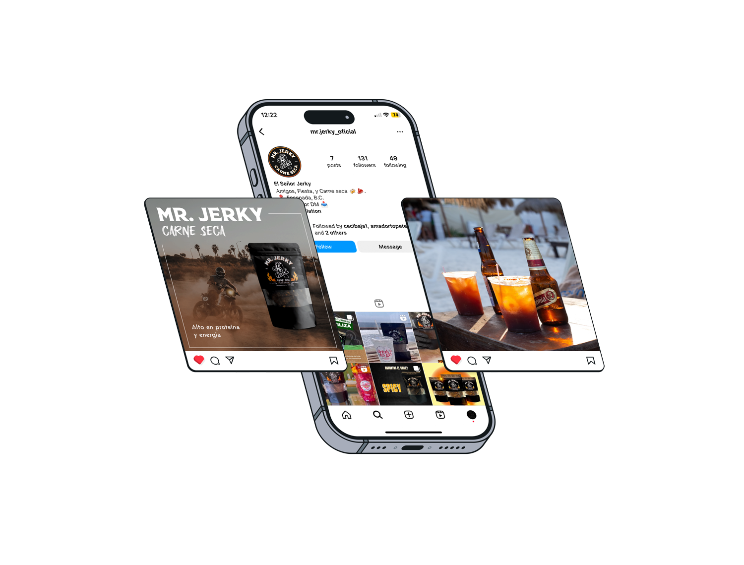
In a crowded beef jerky market, Mr. Jerky must carve out a distinct identity that reflects its unique personality. The brand needs to effectively communicate its adventurous spirit, which is intertwined with themes of motocross sports, party snacks and social gatherings.
Solution
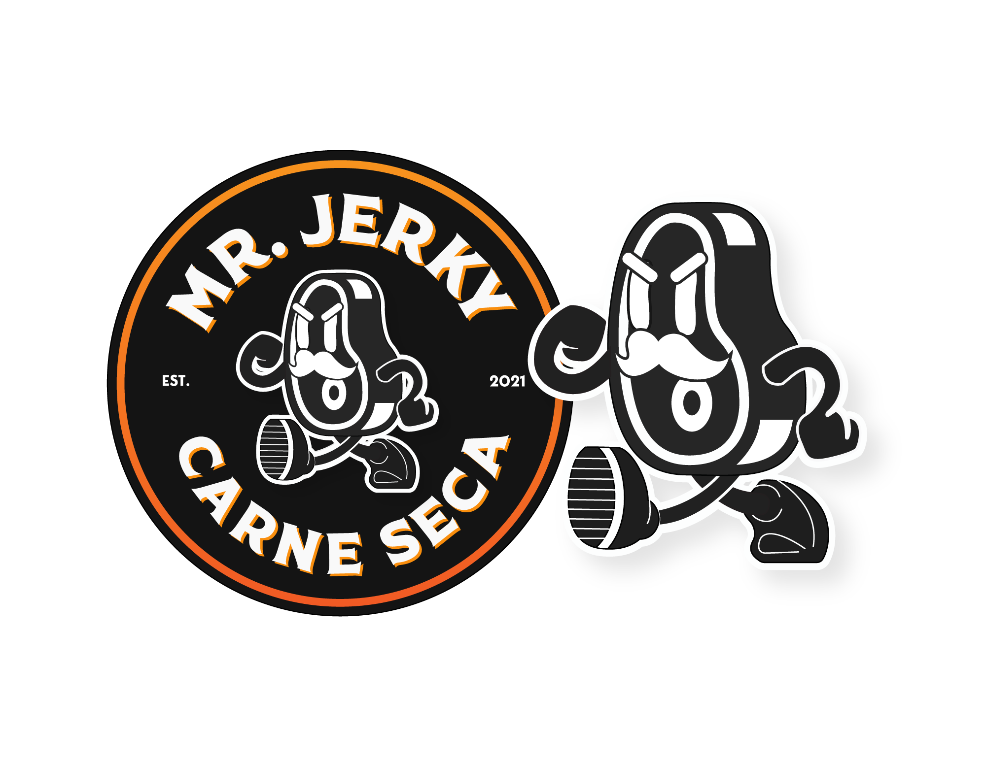
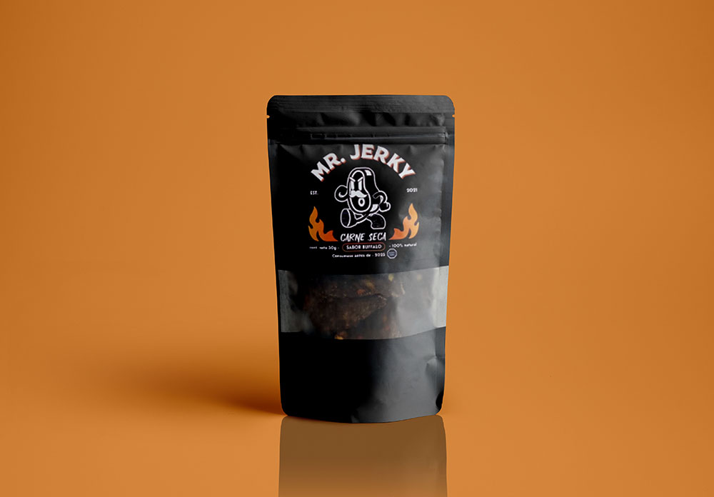
The design approach emphasized establishing the brand’s vibrant personality. The logo was crafted to be bold and energetic, yet simple. Complementing the logo, a suite of brand materials such as packaging and a potential website design was created to reinforce the brand's adventurous, spicy, and modern identity, ensuring a cohesive brand presence.
