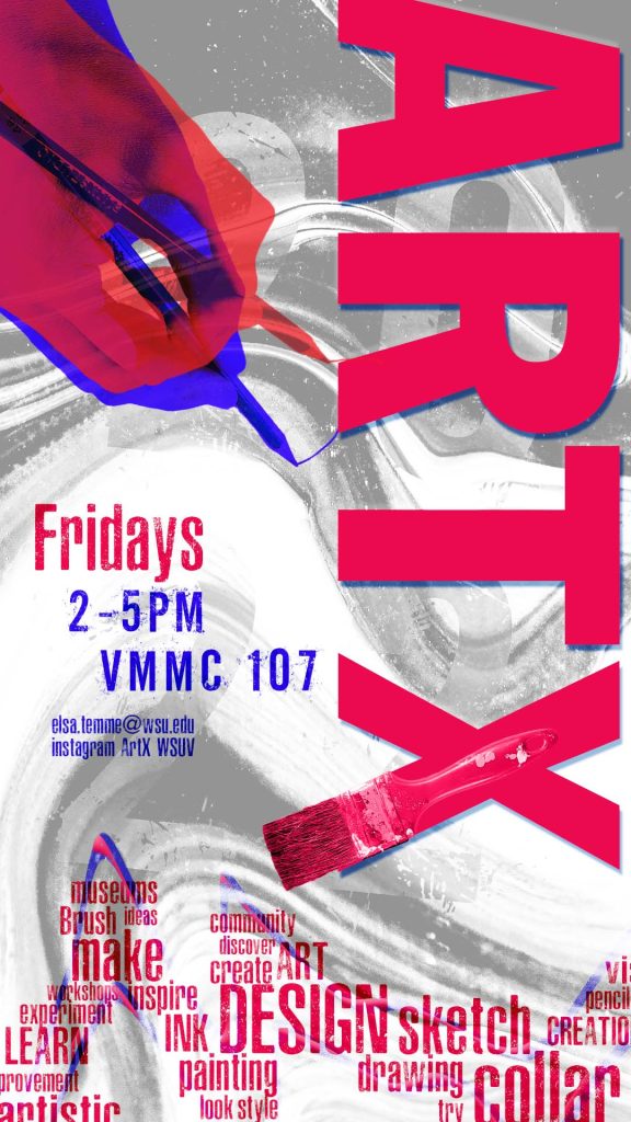
This is a poster that reflects on the ideas and overall direction the ArtX club is all about.
A major effect I used throughout this poster is the overlay settings to create high and low contrast effects to draw attention to specific elements on the page. I took inspiration from the 00’s grunge band posters, and similar themes that incorporate messiness and creativity into a fun and unpredictable aesthetic to push the idea of “thinking outside of the box”. Elements in this design included the action of creating (the hand with pencil), materials used (paintbrush in the “X”) and the final product (abstract art spill background).
All of the photos were taken by me in the art studio on campus, except for the paint warp background I sourced from Pexels. I staged the materials on a white sheet of paper with even lighting to make masking their backgrounds out easier.
When it came time to assemble the draft, I started out with the background and the main title text “ArtX”. I tried out different positioning for the title until I found one that fit the theme. I then began choosing a color scheme to follow and brought in more of my elements like the brush and hands to see how they fit with the piece. I didn’t want them to appear “plain” so I found ways to make them apart of the dialogue, for example the brush IN the “X” and the hands drawing the “R”. I tried out different warp techniques on the elements but decided it was best to warp a plain rectangle because it didn’t need to be as recognizable as the rest of the elements.
The only problems I ran into were minor technical things like transforming my paintbrush element because the bounding box was larger than the element itself and would get in the way. My best solution was just locking the layer when I didn’t need it since cropping the original image distorted the placement of the clipping mask.
Fonts used
Asphalt Scratch Rounded Free for personal use
CGF Off-Road 100% Free
Franklin Gothic Free for personal use