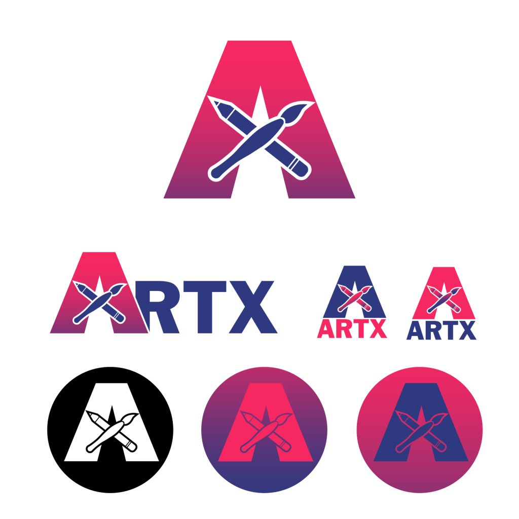
And here we have it, the ArtX Club Logo Version 2!
Many of the feedback suggestions from other students, was that I should try adding a gradient or changing the color selection. The pink and violet is a consistent design color choice that I’ve stuck with in the previous designs so I decided against changing the colors. However, I was interested in trying out some different gradient arrangements and moving my two colors around more.
Overall, I think the biggest logo demonstrates this gradient the best because it makes the “a” shape feel more towering and powerful, which draws on the energy of inspiration and creating.
For background information on my progress, inspiration and technical work-arounds, visit my Previous Post for a full disclosure.
TLDR Previous Post:
Ideas and Inspiration
A simple and straightforward logo that encompasses the ArtX art club at WSU Vancouver and it’s purpose.
Design Process
I pulled ideas from major brands identities and focusing on negative space (kinda), to drive the direction. I didn’t like what googled “art club” logos looked like because they looked cheap. The letter A and X were most important when sketching, while incorporating elements used in the club like the pencil and paintbrush.
Technical Detail
The shape builder and pen tool were my best friends when it came to designing this in illustrator. Clipping masks are unnecessary in this case and would have caused too many problems to make it worth it. For small scrappy lines that get missed once and again, I go into their isolation mode and deleted them there to prevent any damage to other assets and designs that may be grouped together.
Sources and Materials
I’ve been using Franklin Gothic as the main font, but the “A”, pencil and paintbrush were hand drawn in illustrator.
Here it is again as a .jpeg with a white BG.