Friends of Tree’s PSA (WIP)

[su_vimeo url=”https://vimeo.com/156752567″]


Artist Statement:

For my PSA I decided I wanted to try modeling a realistic character. I learned to sculpt and texture in mudbox for this project which was something I’d never tried. I didn’t really have a clear idea of what I was going to do with this PSA, I just knew I wanted to work on a realistic character. In the end, the character became a Monk. This was partially because I didn’t want to create a hair system and he just sort of had that look to him as he was developed. Because I was short on time I decided to work on simple animation. I learned more about Maya paint effects to create the tree and I worked with ncloth but it was too slow so I then learned about wraps. The hardest part of the PSA was getting the clothes to deform with the body but because I modeled them separately from different primitives, It was very hard to accomplish, so there are parts in the video were the body shows through the clothes. I also had to learn about working with normal maps, and rigging a high poly mesh vs a low poly mesh. Because my scene was so dense in polygon count and had a short time limit, I had to render using Maya hardware renderer 2.0. During my trails with trying different renderers, I learned a lot about each one and also tried some new ones like vray and renderman. I feel the modeling and texturing of the monk is my best work yet but the rest of the project isn’t quite up to par and I wasn’t able to accomplish everything in the rest of the scene that I wanted too. Overall I feel I learned a lot of information during this project that I can take into other projects in the future.8″]


Rupp Project 1

On this project which is 30 seconds I created an animation which helps explain a few ergonomic work tips. The purpose of this video is too raise awareness of really simple things that you can do in order to avoid health issues when working at a computer workstation. The video was designed in mind that there would be more videos regarding ergonomic work tips as if in a series of public service announcement videos. Being a short PSA this video focuses on taking a break every 10 minutes and what to do during that break. This information was taken from the Occupational Health and Safety Administration (OSHA), whom has gotten this from several studies. This wouldn’t just inform workers but also students and people using computer workstations at home.
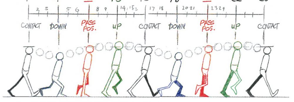
The animation itself is set inside a office but tries to also offer a cartoon look. It uses text, voice and artwork to tell the PSA’s narrative. The text helps reinforce what the voice is saying and the artwork does so also but it a more creative manner. The animation I tried to always keep moving so that something is happening and so the attention of the viewer is always captured. But the animation itself also helps reinforce what the voice is saying with such uses as the clock moving or a person walking. The animation ends with text pointing us to the OSHA website where someone can get more ergonomic information.

Johnson_Jonathan_Project_1_Final

Coming to design this project was both interesting and a challenge because it could be taken in all kinds of directions depending on the theme. While my theme dealt with the humane society when it was storyboarded, I needed to further refine and deal with a single idea. Otherwise it would have gone in some other direction that would not have made sense and feel vague at the same time. So in those regards I choose to go with no-kill shelters.

After going with that theme, the next step was to look for audio and create the assets that would be used for the animation. Audio went well for all that can be said the assets however took a little longer than I would have thought because of ideas of what would work for the animation. Cat and dog were already planned out to be within the animation along with a person. This part of the animation took a little longer because I was using a tool I rarely used before, the puppet pin tool. This was great and annoying to deal with because if I moved one pin then the rest would deform. I worked out what needed to be ironed out later on in regards to moving them with the timeline and not making too many pins for me to deal with. Another thing that needed to be worked out was timing for the voice and animation in which some parts needed to be shown longer. With some rearranging of some assets timings and a re-done audio I think I got it solved.

Travis Lane Project#1

For my animation I decided to try and persuade people to use or support their local public transportation system, in this case C-TRAN. Many people rely on public transport in order to gain access to opportunities and services including jobs, education and health care. I wanted to show that buses were an acceptable and in many cases preferable alternative to people driving themselves. For every person who chooses to ride a bus to get around that takes another car off the road which can reduce both traffic congestion and pollution. There are many reasons why someone should ride the bus whether they cannot afford a car or would just like to reduce their carbon foot print.

In the animation I show a city street with multiple people standing around waiting for the bus, as they wait cars drive by producing exhaust and creating a cloud of exhaust that blocks the screen. On the cloud is where I give my first statistics, after the cloud clears the animation zooms in on a public bus that has picked up the stick people and is now listing reasons to ride public transit. The animation ends with a screen which tells people how the can find out more about C-Tran.

I used Adobe Illustrator to create every asset in this animation with the exception of the C-TRAN logo and completed the animation in after effects. My animation changed a great deal from what I had imagined in my story board, in my storyboard I wanted to move across a bus station with buses moving across the screen each giving a new piece of information. I decided to change my idea after I realized exactly how short thirty seconds can seem when you are reading out statistics, people need time to be able to read what is being shown and by focusing on less statistics the audience is able to view the information I give for a longer time.

Haley Zach PSA Final

https://vimeo.com/156693384

My intent for this animation was to create a 30 second public service announcement, addressing the people Vancouver, Washington. My hope was to raise awareness about the dangers of texting and driving. For the presentation of my animation, I chose to have most of the animation be in the perspective of an individual who is texting while driving. I did this so that the viewer could potentially relate to the driver since they are seeing what they would normally see while driving. I felt that by doing this I could reach a more personal level of emotion which would then help to bring about more of an awareness to focus on driving and to not be distracted by a device while driving. I really wanted to get the message across that texting and driving does not only affect the driver. It also affects everyone around them.

To animate this I used Adobe After Effects. This was my first big project using After Effects so it was an interesting ride getting to know the interface. Though after getting to know the interface it became rather simple and intuitive. All of the assets for this animation were created in Adobe Illustrator. Illustrator was also a program that I was not familiar with so it was fun exploring the program and discovering the magic of the pen tool. The hardest part of this animation was getting the timing right for all of the small animation pieces, like the text messages moving. I solved a lot of my problems by pre-composing most aspects of my animation. This both saved me time and my sanity.

Christopher Pien Project 1

This project had two main goals from the outset: to create a visually interesting and high-fidelity animation, and to draw attention to a cause which was both local to the Portland/Vancouver area and still personally important.

With this in mind, I chose a cause near and dear to my heart – the Columbia River Crossing. Having commuted into Portland for the entirety of my high school career, the growing congestion in the Portland metro area, specifically on the Glen L. Jackson and Interstate bridges was always somewhat confounding, especially given the fact that a good chunk of it could be alleviated simply by extending light-rail lines into Washington. With this in mind, reviving the CRC was an obvious choice for my PSA animation.

The animation itself was quite straightforward and stuck extremely closely to the initial storyboard, although there was some fine-tuning and re-recording required for the audio to strengthen the ‘call to action’ at the end of the animation.

From the outset, the plan for asset creation was to use illustrator to create all assets. This was for two distinct reasons. First, working in illustrator guaranteed that all assets would be vector-art, allowing for them to be scaled with no loss in fidelity. Secondly, using illustrator for all assets forces a consistent, stylized look, which pulls all of the assets together in any given scene.

Overall, I feel that I was quite successful in achieving both of my goals from the outset of the project, as well as overall creating a high-quality and persuasive PSA.

Billison Project 1

This animation I created was a Public Service Announcement to inform the audience of the dangers involved with texting and driving, but through the guise of a less serious cartoon medium. I decided to focus my message on texting and driving due to the issues it creates locally and globally. With the topic in hand, I started working on the animation going through many stages of critique and adjustment in order to reach its present form.

Starting with the basis of the animation, I created most of the assets, with the exception of the creative commons music and sounds I would use later to finish the animation. Utilizing Photoshop I drew out the basic shapes of the vehicles, environment, and people in the animation. I chose to use more rudimentary shapes in order to better incorporate its cartoon feel.

After creating all of the visual assets in Photoshop, I imported them into after effects utilizing the editable layer function in order to animate the scenes. Trying to experiment with my animation and storytelling abilities, I divided the animation into first person and third person segments to add variety to the animation. I also used many tools in after effects such as the puppet pin tool and animated transitions in order to create some of the visual effects.

Finally I compiled all of the scenes into a complete sequence using premiere, where I added the various layers of audio including the voice over I recorded myself. In the end, the animation turned out wonderfully, with a childish tone at times, but overall covering a very poignant subject.

Meiners_Paul_Project1

My idea for this project came while I was hiking with a friend. We were up in the hills, and we came upon a viewpoint, but when we looked out most of the trees had been removed leaving hills of dirt in their place. I feel like often people don’t realize the potential danger to our forests if we don’t take more responsibility for them.

Rather than take a factual approach I chose to make my PSA more of an emotional journey. I thought this would be an issue where showing would be more powerful than telling. So I came up with a short story about a father taking his son to one of his favorite camping spots, and finding that the location has been deforested. Throughout the project I struggled with cutting each scene down, in order to get the whole video down to thirty seconds. I especially struggled with the text, which has to be on the screen long enough to read clearly.

To animate this project I used After Effects, which was a new experience for me. I would say most of the software was fairly intuitive making animation a simpler matter. The hardest part of the video to animate was the lip sync for the father’s dialog. To do it I made nine different mouths, and swapped them out every few frames to simulate speaking. This was a tedious process, but I am happy with the results. Overall I found this project to be a good learning experience, and I am happy with the final results.

Jaymes: Low Income Housing PSA

This short PSA asks viewers to support the construction of low income housing in the Vancouver area, and, indirectly, to reject movements intended to drive the homeless elsewhere. It came about after I noticed that I’d seen several news stories on the issue of Vancouver and Portland’s homelessness problem, many of which featured interviews with city authorities who all seemed to promise solutions in the form of stricter enforcement of loitering laws, the relocating of homeless camps, and generally sweeping the problem under the carpet instead of dealing with the underlying issues: the competitive job market (a national issue) and the lack of affordable housing (an issue near and dear to Vancouver, which boasts one of the worst markets for affordable housing in the country).

I was appalled at the idea that our political leaders were thinking of the problem in the context of “how do we get these homeless people out of our city,” rather than “how do we get these homeless people homes.” This short PSA satirizes this attitude by turning this metaphorical “sweep it under the rug” stance into a literal visualization using simple, recognizable icons. It points out just how ridiculous this “solution” looks in practice and drives home the point that thinking this way is no different from treating the homeless like litter to be swept away. My hope is that some of the people thinking of the issue this way will see this PSA and reconsider the way they have been approaching the problem.