Caleb Stenberg

Final Project: The Final Cut

Hi everyone,

Here is my final version of my video project for this class.

This entire class turned out to be one of my favorite courses I’ve taken at WSU Vancouver. I realized that videography and cinema are two passions of mine that got to stretch their creative legs this semester.

This work is heavily inspired by Daniel Liss’s pandemic pantheon: a-z. Initially, I wanted to do a 23 listed video essay about my process of moving out. In reality, I had little time to film before the move happened, resulting in my decision to create the video essay around the idea of already being moved out. I prefer this idea over my previous one, as I had a plethora of new ideas to explore and tie into the numbered theme of this project.

After receiving some critiques in class during our rough cut presentations, includes about 10 more seconds of content to allow space between each numbered item. On top of this, I removed the entire “flashback” section where all the videos and pictures shown in the beginning of the essay were cut together at the end. Instead, as suggested by Will, I found a scrapbook my mom made for me when I moved out that contained pictures of me from K-12. This seemed to fit much better with the narrated dialogue referencing how younger me wouldn’t believe where I am today.

This process was straightforward compared to the other projects in this class. I felt prepared with ideas and filming techniques from the previous assignments and am proud of the work that I made.

I’m stoked to see what else everyone will create in the future.

View Post

Week 13 Blog Post

Hey everyone,

I plan on creating a video similar to the style of Daniel Liss’s pandemic pantheon: a-z. My goal is to create montage, looped, video essay-like short film revolving around 23 facts about my perspective on life, a 23 year old college student whose moving out at the end of this week.

I’m not making this an egotistical project that’s all about me, because that’d be lame. I want to include thoughts or ideas that I have which many others share and hopefully connect to them on some level. I’ve begun writing a script for how this should play out and will be including some old footage I have alongside newly recorded pieces. I’m thinking of this project as a sort of check in point for myself on where I’m at in life.

I haven’t decided if I’m going to stay in a numerical order or choose random numbers to convey and connect ideas. I do want to connect ideas in clever ways as the numbers either increase or decrease to help keep the audience engaged with the content.


View Post

Hypercinema Project

Hello everyone, hope you’re all doing good.

Here is a hyperlink to my project: Hypercinema491

I struggled quite a bit with this project as I kept changing my ideas about what to do. My narrative isn’t as strong as I’d like for it to be, so I may change this project in the future.

View Post

Video Essay V2

Updated video and I forgot about the thumbnail so please don’t tell my girlfriend.

View Post

Week 10 Blog Post

Hello everyone,

I’d like to begin this post with a quote from Bill Viola’s writing that I feel perfectly illustrates Viola’s vision of the potential of technology.

“Leaping directly into the farther future for a moment, we can see the seeds of what some have described as the ultimate recording technology: total spatial storage, with the viewer wandering through some three-dimensional, possibly life-sized field of prerecorded or simulated scenes and events evolving in time.”

In truth, we have achieved this very situation he describes. It could be argued that modern day video games represent this vision, a three dimensional space where a “participant” explores a pre-rendered world as events unfold around them. If we choose to consider this vision solely in the form of cinema, then Bandersnatch is a prime example. The viewer is provided choices as the story progresses, changing the story dependent on the choices made, until the viewer kills the character or resets the story to previous decisions.
Yet, Bandersnatch can at times feel similar to the classic choose your own adventure stories many of us have experienced. The story becomes increasingly “meta”, totally shattering the fourth wall at points. It’s innovation comes in the repeated scenes with alternate choices resulting from the viewers other previous choices. This changes theme drastically compared to previous choose your own adventure works where the structure follows and rinse and repeat pattern. Which, as it turns out, is something Viola also discussed in terms of nonlinear story telling.

“As a start, we can propose new diagrams, such as the ‘matrix’ structure (fig. 31.4). This would be a non-linear array of information. The viewer could enter at any point, move in any direction, at any speed, pop in and out at place. All directions are equal. Viewing becomes exploring a territory, traveling through a data space.”

This vision is revolutionary thinking. It places the responsibility of creating a cohesive story to the viewer or participant. If all the information becomes accessible at any point, all the time, the line begins with the viewer and follows them through their journey.

View Post

Favorite Place: Video Essay

Hey everyone,

Here is my video essay for this week.

I took a gamble using the voicemail audio for my narration, and depending on how it sounds in class I may change it.

Thanks for watching.

-Caleb

View Post

Week 8 Blog Post

Hey everyone,

I myself am relatively new to the video essay genre of content. That being said, I’ve seen a fair share of these works over the years. One that I find particularly interesting is a video essay by Jeffiot about finding the creator of the skull trumpet gif.

I believe this video works incredibly well as a video essay. From the editing to voice-over works, graphics, and sound effects, each piece has purpose and creates an overarching flow for the narrative. Narrative is a key word here, the video is structured almost like a feature film or documentary. A prologue is provided followed by an actual introduction with proper credits and calling card of the episode. There are clear sections designated by the narrator, acts if you will or parts, as the video continues.

The structure appears very well thought out, especially for a channel that isn’t insanely well known, but one with over 100k subscribers. Learning from this particular video, I have several key takeaways that I can and will most likely use in my own video essay.

  1. Script: A carefully written script that progresses the narrative effectively and in a logical direction.
  2. Video clips: The creator utilizes a mixture of their own captured footage and clips from various other sources when discussing ideas relevant to the visual imagery.
  3. Clear topic: The idea of this videos essay is clear, from the title to the content of the video, every piece of information correlates or traces back to the skull trumpet origin in some way or form.
  4. Editing: Each transition and cut has a purpose, following the speed of the narration smoothly and making sense with each word spoken.

These are only a few ideas that I feel would work very well in my own work, yet they convey the success of this type of video essay regardless.

Thanks for reading.

-Caleb

View Post

AI Cinema Project

Hi class,

Here is my AI cinema project.

I apologize for the non 16:9 format, I realized much too late that you can change the format of the videos in RunwayML.

Please don’t be mad.

Caleb

View Post

Week 7 Blog Post: AI Cinema Summary

Title : Rejuv

In a desolate future, Ohm, a lone robot awakens amidst ruins, its metallic and plastic form a stark contrast against the decaying remnants of humanity. Programmed with a singular purpose—to initiate the Rejuvenation Protocol—Ohm ventures forth into a world consumed by emptiness.

Guided by ancient algorithms and forgotten coordinates programmed by its long deceased creators, Ohm traverses the barren landscape, its sensors scanning for signs of life. Along the journey, it encounters the relics of humanity’s past glory: countless crumbling cities collapsed and sunken into the dead Earth.

Yet amidst the ruins, Ohm faces obstacles both physical and existential. Collapsed buildings obstruct its path, toxic wastelands threaten its circuits, and rogue machines challenge its resolve. Beaten and battered, Ohm presses on, driven by its program’s purpose.

Finally, after a perilous journey, Ohm arrives at the heart of the desolation—a lifeless wasteland much comparable to the salt flats of our world today, where nothing grows, and no life stirs. Here, amidst the ruins of civilization, Ohm prepares to enact its ultimate mission.

Ohm activates the organic bomb, unleashing a wave of energy that transforms the landscape before its sensors. Grass sprouts from the barren earth, trees stretch towards the sky, and the air is filled with the sound of nature’s symphony.

Yet amidst the newfound life, there is a poignant absence—no organic beings emerge to inhabit the rejuvenated world. As Ohm watches the transformation, it realizes the bittersweet truth: it has succeeded in its mission, but humanity’s legacy remains absent from the reborn world.

As Ohm’s systems begin to shut down, its circuits fading into darkness, it finds solace in the knowledge that it has become a part of the rebirth it facilitated. A silent guardian of a changed world, Ohm’s legacy echoes across the ages, a testament to the enduring spirit of hope in a desolate landscape.


Visualization:

Influenced by the cinematic styles of Ridley Scott, Christopher Nolan, James Cameron, and JJ Abrams, shots will focus on vast spaces and the objects within them rather than the main character themselves. Shot on the same film stock favored by Christopher Nolan (65mm IMAX), the film will capture the bleakness and desolation of the post-apocalyptic world with stunning realism. Long panning shots of the collapsed ruins followed by transition shots of different angles as we follow Ohm on their journey. Never closer than 50 feet to Ohm, the camera mainly focuses on the environment.

Vast expanses of destroyed and collapsing cityscapes with overwhelming amounts of man-made structures amidst the absence of nature. The camera will pan across abandoned skyscrapers, rusted vehicles, crumbling infrastructure, downed powerlines, destroyed roads, rubble, shattered windows, oil, and other chemical spills, and so forth. CGI will most likely be used when showing these vast landscapes, but areas of close quarters may use small set design to achieve the desired look. The wastelands will be portrayed as vast and empty, devoid of any signs of life. Picturing the Bonneville Salt Flats, but with less sunlight. The lack of trees, plants, animals, and humans will be clear. The sky is gray or black, the sun barely piercing through the clouds of acid rain and smokey atmosphere.

The lighting will play a crucial role in setting the tone of the film. Shadows will loom large, casting an eerie pall over the landscape and heightening the sense of isolation and foreboding. Shadows will reflect the metaphor of the past.

The colors for this story follow the theme and lighting. A near total lack of vibrancy with only very dark or very light grays, blacks, whites, and browns will be present. Anything resembling concrete, inorganic materials will be used. The color of the robot’s light, either red or green, will be the only real form of color until the end of the story when the mission completes, and life begins to spawn again.

Key words to remember for prompts: Realistic, 65 mm IMAX, dystopian, dilapidated, bleak, post-apocalyptic, technological, barren, sci-fi, robotic, metallic, rusted, void, devoid, rejuvenation, ruins, abandoned, lack of life, decay, natural disaster, exploration, vast, expansive, transformation, mission, man-made, etc.


I used ChatGPT to help convey certain aspects of this story into the right words for this post.

-Caleb

View Post
Week 6: Loops

Hey everyone,

Here is my loop video, I included all three loops into one.

This was a tough project personally but a creatively expressive one nonetheless.

-Caleb

View Post
In Class Loops

By Gunner Kipp and Caleb Stenberg.

View Post

Week 5 Post

Hello everyone,

Here are three looping videos that I found on YouTube for this week’s post.

This Minecraft loop incorporates sound alongside repeated visuals. The player/camera moves forward in an already visually perplexing environment as the screen is framed by different types of blocks each second or so. The sound of the loop is one that uses “Shepard’s Tone” to simulate an ever-decreasing sound. The editing of the sound and movement of the player/camera adds a rhythmic pattern to the loop. The video itself ends the loop by the player breaking a block which returns the loop back to the beginning. There is a slight moment where the editing from end to beginning seems just a hair off of perfection, but I believe this comes very close to nailing it.

This looping video contained some useful information regarding creating loops while being a loop itself. The difference here, however, is that this loop is cyclic. Rather than having repeated elements within a single loop, this video cycles its content once per loop and contains a lot of visual elements that could partially place it into a frantic category. The creator uses an audio cue at the end of the loop to cycle straight into the beginning and even includes a countdown to the loop restarting. They also edit the footage by cutting a single recording in half and then placing one half at the start and one at the end to simulate the video continuing after the loop begins.

In this video, we see the creator interact with themselves to create a loop. I find videos that duplicate the creator to be very interesting and clever video editing. They had to record both of these instances and then combine the footage by either layering or resizing the footage to match up. The audio is important as well, the space between responses seems reasonable and the loop transition is barely noticeable. Another cyclic example as the previous but with less elements and a more simplistic concept. The creator also made sure to follow with their eyes the location of their duplicate to add to the illusion.

Thanks for reading!

-Caleb

View Post
Montage/Discontinuity

Hi class,

Here is my video for this week’s project.

Not quite sure how I feel about this work but I took some inspiration from Requiem for a Dream. 

Thanks for taking a look!

-Caleb

View Post
Week 4 Post

 Hey everyone,

I first came across McCloud’s work in DTC 354, Digital Storytelling. I couldn’t believe the level of depth contained within comics that McCloud discusses back then, and I’m still contemplating that information to this day.

Time and space are interchangeable within comics. Film, unlike comics, doesn’t typically display all their “frames” at any single moment. We as the viewer can practically experience the entire comic at our own pace, choosing when and where to place our eyes onto any given frame. However, the viewer doesn’t typically spend the same amount of time on each panel depending on its content, and in McCloud’s words, its shape as well. And as McCloud states,

“…the panel shape can make a difference in our perception of time. Even though this (referring to the page 101 with the extended panel in the middle) long panel has the same basic ‘meaning’ as its shorter versions, still it has the feeling of greater length!” (pg. 101).

Does film express its passage of time in the same ways comics do? I would place a yes/no/maybe-so to this question due to a few factors. Firstly, film is really a comic with each panel stacked on top of the other and then displayed one frame at a time on repeat until the last frame appears. In this case, time is passing automatically and the “gutters”, or frame gaps representing time, are absent. The viewer isn’t meant to pause a film just to experience the shot for a longer duration, but to rather experience the shot visually and for its intended duration.

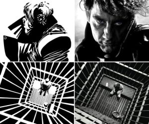
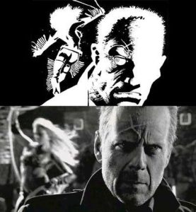
A great example that is a near straight conversion of comic to film envisioning this idea is Sin City from 2005. This film is based on Frank Miller’s comic book series of the same name. The film takes some of the comics wider/longer panels and translates their durations into the film.

No_December4277. Comic vs. Movie (Sin city). 2022. Reddit, https://www.reddit.com/r/comicbookmovies/comments/pmnyi4/comic_vs_movie_sin_city/. Accessed 27 Jan. 2024.

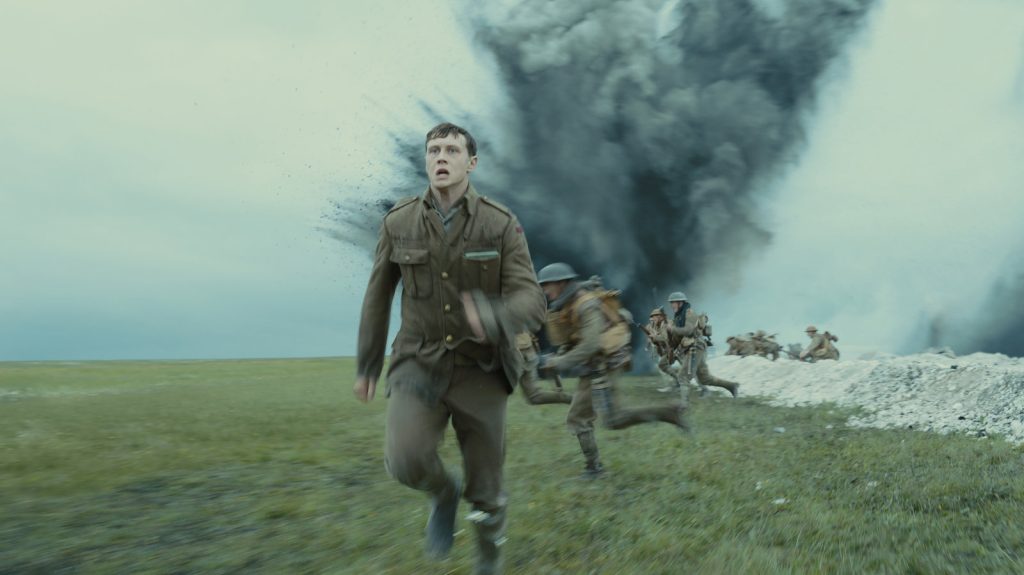
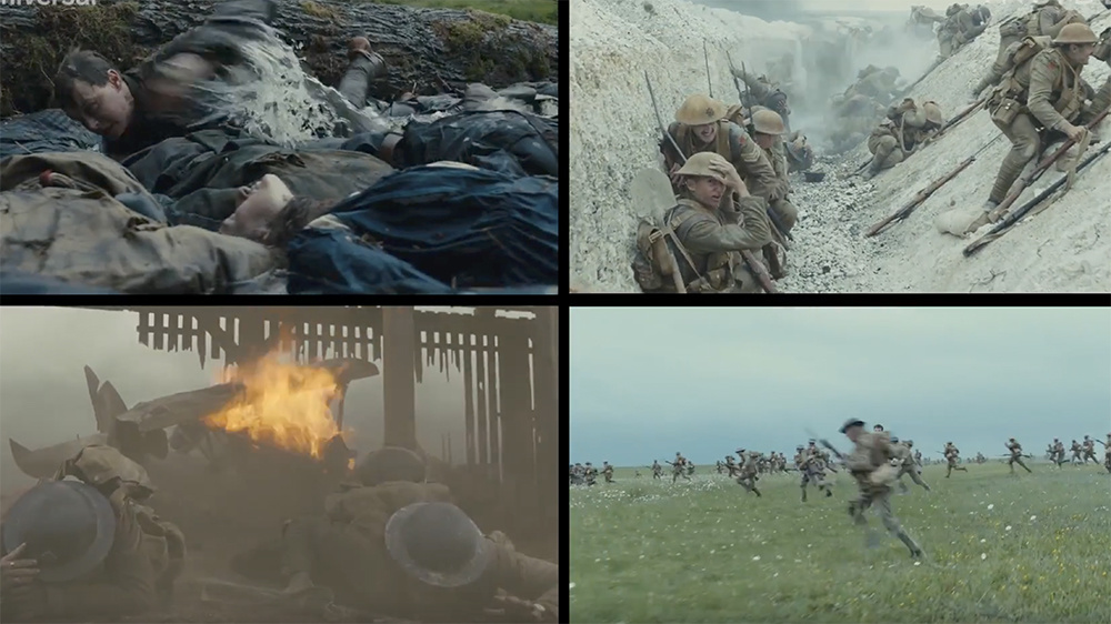
Another example of a film that passes time through unique cinematography is 1917. This film was shot with a particular method to appear as a “single take”. While there is a ton of methodology as to how this film was made, one factor remains that pertains to this discussion. 1917 used multiple shots of greater length to make the film appear as one whole piece. The transitions from shot to shot were edited carefully at moments of break, mere seconds in length, that would immediately return to the previous shot such as the camera passing a background element or when characters cross the frame of the camera (DeGuzman).

Gibbons-Neff, Thomas. The Main Theme of ‘1917’? The Innocence That War Destroys. 31 Jan. 2020. The New York Times Magazine, https://www.nytimes.com/2020/01/31/magazine/1917-innocence-war.html. Accessed 27 Jan. 2024.
Malcolm, Christopher. How Cinematographer Roger Deakins Lensed WWI Epic 1917 As One Shot. 25 Jan. 2020. Fstoppers, https://fstoppers.com/bts/how-cinematographer-roger-deakins-lensed-wwi-epic-1917-one-shot-448138. Accessed 27 Jan. 2024.

Film, much like comics, experiment with the perception of time in ways that fit their respective mediums. I will certainly be keeping an eye out in the future for moments like these.

Thanks for reading,

-Caleb


Works Cited:

DeGuzman, Kyle. “How Roger Deakins Shot ‘1917’ to Look like One Take.” StudioBinder, StudioBinder, 1 Feb. 2021, www.studiobinder.com/blog/1917-one-shot-cinematography/.

View Post

Creating Space

Hey everyone,

Here is my 55 second video about creating space.

I hope you enjoy and I’m stoked to see what you’ve all made for this assignment!

-Caleb

View Post
Week 2 Blog Post

Autumn Mists

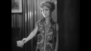
I find interpreting silent films fascinating, especially since I grew up watching sound cinema. Watching silent films comes with a challenge, however, of relying solely on imagery to understand a silent films meaning. This challenge arises while interpreting Brumes d’automne by Dimitri Kirsanoff, but I believe I’ve gathered a good comprehension of the twelve minute silent film.

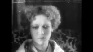
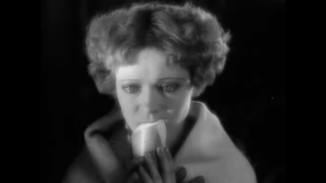
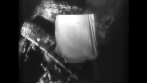
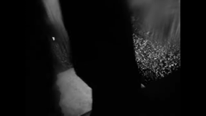
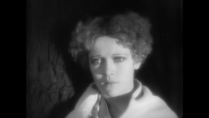
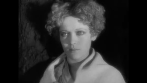
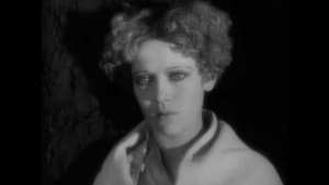
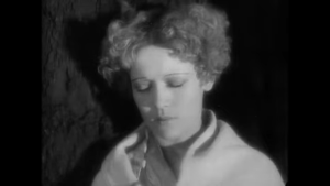
While there is no established plot outside of the audience’s perspective, the film does include a very poetic story. I believe this film is about a person’s emotional experience with the loss of love. This experience is expressed through intricate montaging techniques and visual storytelling as the world around the main character distorts and blurs. Close ups, stills, panning, transitional shots, film distortion and blur, just to name a few forms of editing this film employs. This love seems to be potentially romantic given the time period this film was made. Various scenes also suggest this theme, including the burning of letters, the shaking of hands with a figure, the scenes of a person leaving a house, and the close up shots of the main character tearing up.

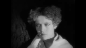
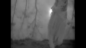
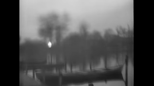
I managed to get a few screenshots to note the scenes I mentioned above to illustrate my reasoning behind my interpretation of the films plot. To start, we have the scenes where the woman is clutching letters that they ultimately burn in the fireplace.

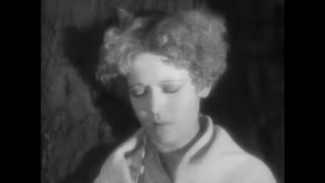
The woman seems reluctant at first to dispose of the letters as she holds onto them for multiple beats. The film shoots from the shoulders up in these scenes, allowing the audience to see the characters whole face and movements with the letters. For these particular scenes, the spatial shots work well to convey this type of emotion.

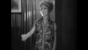
A montage then follows the rest of the film as we see the woman shake hands with someone, the camera holding position until the hands slowly slip away from one another leaving the woman still in frame. Cut then to a person leaving a building while a piece of paper falls out of their pocket. Then cutting back to the woman, then back again, and so on until the whole scene changes.

Once again, the film’s editing succeeds at conveying the emotion of the woman as we experience her point of view while the figure, assumedly lover, leaves her. Sudden, confusing, and without explanation.

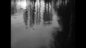
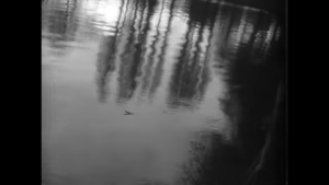
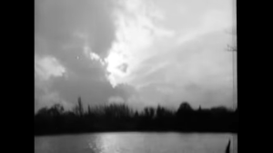
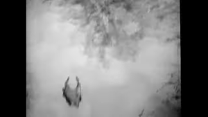
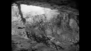
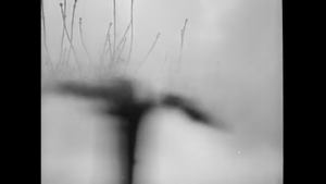
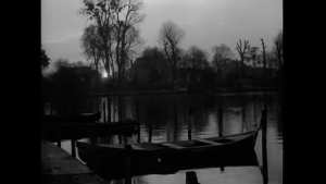
Next up are the usages of montage express the woman’s feelings after her loss of love. So much so that film depicts scenes of nature with a lens distortion/blur while cutting to the woman staring into the distance. Much like the technique we discussed in class where directors will transition scenes based on where the character in the previous scene is looking. The film then cuts and follows the woman walking through the woods while cutting to a scene of a leaf flowing in water. These scenes could be depicting the woman flowing through her emotions and finding some form of acceptance through nature. Once again, here are some screenshots of said scenes.

Camera rotates the shot of the water, cuts back to woman.


Shot of the lake blurs and distorts, almost a radial blur.


Shot drastically changes into something jagged and sharp.

.

A shot of a tree slowly blurs and appears somewhat human-like as it cuts to the woman closing her eyes.


A simple shot of a dock as the camera blurs cutting back to the woman opening her eyes.


The last few scenes of the woman walking down a river and a leaf flowing down a river. A comparison shot of the two.


Overall, Autumn Mists tells a melancholy story through the thoughts of the main character and very intricate film editing.

Thanks for reading,

-Caleb


View Post
One Day in 30 Seconds

Hey everyone,

Here is my video on YouTube.

I made my first 30 second video in DTC 354 and feel this one was better in some areas, but could be improved in others.

Thanks,

-Caleb

View Post
Week 1 Blog Post


Looping With Lola

Run Lola Run is one of the most fascinating films I’ve seen to date. From the cinematic imagery to camera positions, describing this film to someone who’s not seen it before may throw them for a loop. Describing the narrative momentum of Run Lola Run is the focus of this post however, so let’s dive into it.

How does this film manage to keep the attention of the audience? There’s certainly a lot going on even before the time loop aspect is introduced. There are a handful of factors that retain the film’s momentum, the first being attention to detail.

The first loop introduces most of the films characters that in sequential loops have their lives changed by Lola’s actions. We see this through the pictorial montage after Lola interacts with people. As the audience, it’s interesting to us to see how the lives of the characters change with each time loop. It may entice the audience to think how the next loop will affect these characters, maintaining their interest and giving the film more room to explore this narrative.

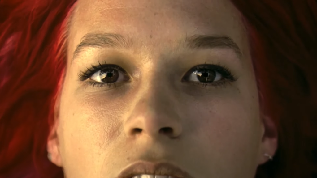
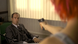
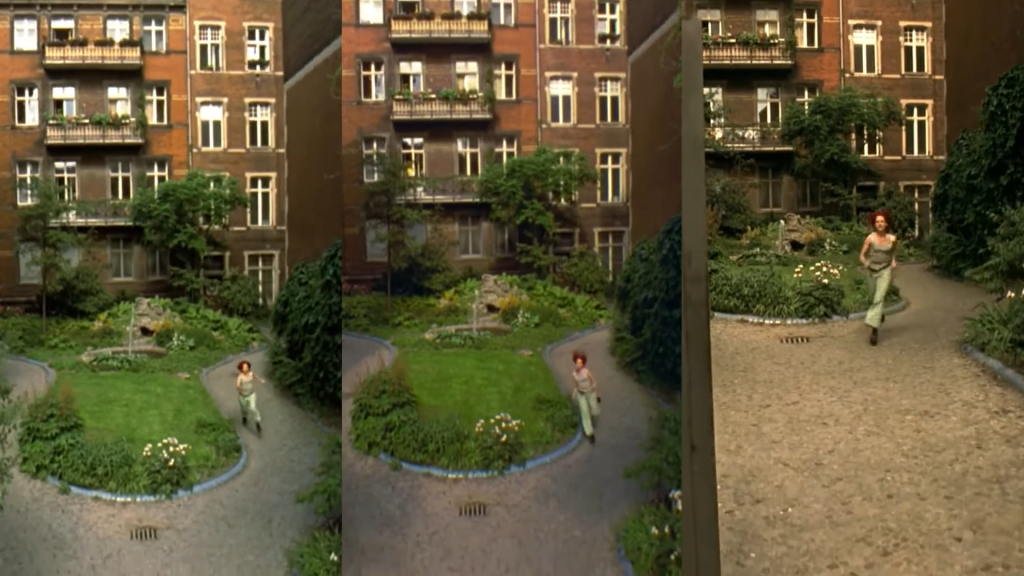
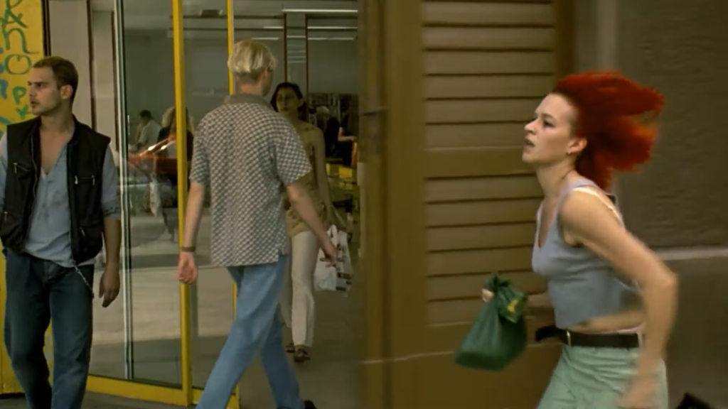
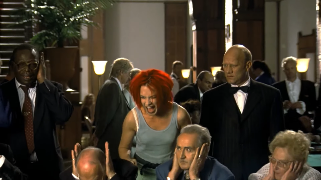
A screenshot from the film Run Lola Run.


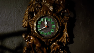
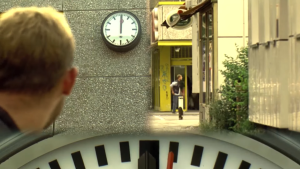
Not only do we see repeated characters through each time loop, but objects as well. Clocks are the “golden object” if you will, or the object controlling the flow of the film for the audience. The clock displays where Lola is in the narrative, especially in the following time loops. A clever plot device that helps push along the story while keeping the audience engaged with Lola’s journey.

Similar to the clock, locations in the film are repeated to clearly inform the audience that a time shift is taking place. These locations also help to pinpoint Lola’s location in the narrative, such as the train crossing over the bridge that Lola runs under.

Lastly, Run Lola Run maintains the narrative flow using incredible cinematography and a tight-nit story. There are a few questions left unanswered in the film such as why Lola has super-human screams, how the time loops are happening, and other similar vein of questions. These questions don’t need answering however as I believe the story would become too convoluted for the audience if they were.

To coincide with this point, the films’ identity in the form of cinematography has no real definition since the story has no real answers. The film diverts the audience’s attention with animation, various camera shots, and overall flow to allow the audience to focus on other aspects of the film and ignore the rising questions.

I will be recommending this film to everyone I know.

Take care,

-Caleb

View Post
Introduction: Week 1

Hey everyone,

I’m Caleb and this is my last year at WSU. I’m a DTC major pursuing a degree in game studies. I’ve taken 354 prior and have some experience with video editing, film making, and hyperlinked games. I’m stoked to learn more in this course. I also live in a coffee shop!
Hope everyone has a smooth semester!

-Caleb

View Post