This is the second part of my ChatGPT conversations and composition of my AI Video project. For more early conception ideas refer to “Rylan Eisenhauer Blog Post #4 (Chat GPT Video Chat)”. This post is about the specifics in narrowing down the shots I want to create for the project using ChatGPT to edit and narrow down my ideas. Below is a screenshot of my finalized list of shots and expressed emotions that I am aiming for, and below that is the entire conversation I had with ChatGPT to edit and narrow down my ideas:
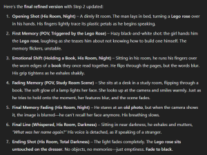
Since the video work I am creating consists of sad and slow shots, I should only have about 7-8 shots as I think the drawing out of scenes and panning shots can help extenuate the feeling of things being slow and gloomy. Too many fast and whippy shots can ruin the effect I am going for as well as give the audience “too much” information when things should feel a bit ambiguous so that many can relate their experience to my video.
I was recommended to try and practice using RunwayML a little bit in order to experiment with AI creating video. I knew exactly what I wanted to test as I have had a still graphic of a lens flare that I wanted to give some motion. I gave RunwayML the image with the prompt:
“the yellow/orange flare in the middle does not move from the middle, but the rays that it shines slowly shine outwards without covering the red background. The video should end looking how it started as if it loops.”
Here is the still image as well as the video it gave to me as a result of the prompt, it was almost exactly what I was looking for besides the loop part:
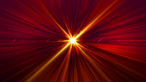
This is exactly as I was looking for and I am glad it seems I understand that being specific with prompting is important. I will ensure to keep this strongly in mind when making my AI video and ensure that there is a strong sense of consistency in the videos as well as characters (such as the female AI character) looks consistent and natural.
-Rylan Eisenhauer