Final Project Final Cut
I mostly focused on perfecting the sound mix and a few tweaks to the visuals and music to make the whole thing look and sound more professional. Thanks for a great semester!
View PostDTC 491 Advanced Digital Cinema
Washington State University Vancouver
I mostly focused on perfecting the sound mix and a few tweaks to the visuals and music to make the whole thing look and sound more professional. Thanks for a great semester!
View PostFor my final project, I am planning on writing and recording a video essay about the absurd tone of Metal Gear Solid 1 and why it functions from a character and thematic standpoint. I think the game is often unfairly distilled to in-jokes and references, and I wanted to talk about some of my impressions with it. It’s a combination of a more straightforward academic essay and my personal feelings towards the project.
I will mainly be exploring the “video essay” module but there will be elements of continuity and montage with the way I arrange clips of the game. I hope to take what I learned from the last video essay and build on some of the potential missteps pointed out by Dr. Luers and the class. I believe I have a strong foundation and I am excited to finish working on it!
View Post
In his essay, Viola states that “We are proceeding from models of the eye and ear to models of thought processes and conceptual structures of the brain.” In short he invokes the shape of something planar instead of linear, an expansive matrix with infinite points of inflection and engagement, something that is not confined by the continuity of video. He specifically references 3d geometry in his visualization of such a narrative evolution. He explains that a “participant” may be able to traverse such a 3d plane of hypermedia and thus a new type of artistic experience would be created.
If we are to compare Viola’s prophecy to Bandersnatch, I would argue that Netflix has not reached Viola’s described “data space” with their ambitious yet bottlenecked choose-your-own-adventure project. Because the user is not, in fact, free to traverse a planar space, or interact freely with media. They are passive observers, occasionally providing an input between some options, which is quite novel and impressive but not the innovation Viola details. The series could as well have been 30 discs, and at the end of each one there might be text displayed that indicates, “Insert disc two for option one, and disc eight for option two,” or something to that effect. The degree of interactivity and exploration of a data space is comparatively shallow when put next to Bill Viola’s outline. It does not contain its own “structure and architecture” beyond what derived flowchart you could illustrate from the decisions.
That being said, I wouldn’t say Bandersnatch is “tedious” or even “boring.” For what it is, I enjoyed the experience and had fun selecting the options available to me. I admired the commitment to making a massive amount of film that the user might never experience. And I think the very fact that it doesn’t reach Viola’s expectations indicates a bright future for other such artistic innovations that will take its cues from the fearlessness of Bandersnatch as a project.
View PostThe thing about Jason’s essay (which I think is fantastic) is that it is not especially insightful or cinematically literate. There are very few discussions of the jargon of the craft, or the outlying context of Playtime, or really any of the deeper disciplines of creating movies.
But what it does do is use the form of the video essay in such a succinct and absorbing way. Jason’s editing is sharp and gives you the sense that his excitable voice is commanding the images swiftly shifting before you. Take the introduction of the first shot, where Jason uses editing in multiple ways to communicate the atmosphere of the movie.
We first are shown some rote footage of a few classic films. Then, when we cut to our main subject, it is cropped to the smallest fragment of the screen. Then the cropping retracts, bringing into focus this expansive and bustling frame, accompanied with the sound of a mechanic lens zooming out, and Jason’s commentary on the effect of the shot. The combination of these aspects of the medium, edited in such fast succession, create this immediate effect of understanding.
A similar effect is achieved at 4:54- Jason’s language becomes breathless as he describes this scene, and these descriptions punctuate cuts of different scenarios, all while the sounds and music grow more frantic. Then, at 4:54, all of that cuts out to emphasize the sudden passage of time. While Jason is not delving into some impenetrable subtext or element of craft, he is invoking the message of the film that is not outright stated to the viewer. The layered editing of the essay keeps the audience invested and, most importantly, following the threads of logic Jason wants them to.
Jason uses the essay to sweep us up in his passion and share with us the boundless ideas Playtime is brimming with that the audience might never have came upon themselves.
View PostStory synopsis: A detective navigates through a futuristic alien city, interrogating a variety of outlandish puppet creatures in an attempt to solve a murder case. Emphasis is placed on the expansive shots of a foreign setting, which I hope to emphasize through prompting. Things like dubious gravity as city blocks are constructed sideways up walls, the architectural verticality of the city, and flying vehicles that weave through aerial traffic.
This is contrasted with shots of building interiors, where the detective describes his luck (or lack of it) interviewing these alien creatures. The interiors are grungy, with eccentric technologies populating every corner of the frame. The creatures are meant to imitate practical effects of the 80s/ 90s, almost like Henson creations.
I would like to try to find an ai voice that replicates the golden age transatlantic noir accent. It describes the peculiarities of the city, the struggle of the job, sort of rambles like a real person might while recounting a narrative. The story concludes with the detective unable to locate a suspect, resulting in the dismissal from his job. This city will chew you up and swallow you whole…
Look and style: Something moody, with harsh lighting and a grimy tactility; A science fiction noir a la Dark City, Minority Report. The neon of skyscrapers and billboards contrast the oppressive shadows of perpetual night. Lots of static wide shots with narration, since I think the look of ai when it tries to recreate moving figures is pretty ghoulish (and in general, but…)
View PostThis has always been my favorite gif- Mac and Charlie make awkward eye contact across the restaurant. Through the use of cutting, this moment is extended indefinitely. It reads entirely differently from within the context of the show. The loop now portrays this eternal moment of shock.
This is an interesting example unique to animation- there are no cuts, so the manipulation of time is accomplished through the protraction of a single shot. Homer is continually thwarted in his Sisyphean attempts to eat a chip, but there are only really two animations that are repeating, even though it appears infinite.
https://youtube.com/shorts/wL948xguzfo?si=VQYk6X9ISJO8jV3C
This example utilizes cutting and dialogue in tandem to create the illusion of a loop. Peter’s dialogue doesn’t register as reactive until the first time it loops, but then you realize that Brian and Peter’s statements ping-pong off each other to create an infinite conversation.
View PostMcCloud presents a lot that is both intensely, exclusively staked in the medium of comics, but almost equally ideas that translate to cinema. As McCloud says, comics readers are conditioned through Western media conventions to expect linear progression- the same is true of film. If you’re breaking the natural chronology of things than you must strictly communicate that through visual technique (as we discussed via Run Lola Run).
I think McCloud’s ideas surrounding ambiguous duration can also be applied here. A single panel of two men staring at each other in a courtyard- with no dialogue it’s entirely contingent on surrounding panels to imply how long this panel lasts. The same is true of replicating this panel in a cinematic shot- If we cut to different locations on either side of it, than the true duration of the image we’re seeing is entirely ambiguous. If we are cutting to close shots of dialogue from either men, than we might interpret that intermediary shot as a more literal rendering of the lapsed time; The idea of dilating time with the camera and with comic panels are entwined in ways like this.
McCloud writes that “Time and space are one and the same,” and in the manner that he elaborates on this, it is equally applicable to film. Every cut is illusory and veils the passage of time, the mutation of space. The first step in utilizing this is being conscious of that inherent power of cutting that we often take at face value.
View PostAutumn Mists is a succinct capsule of what good cutting can evoke. The film is impressionist, poetic and plotless, but it manages specific narrative through its editing. Kirsanoff says his intention with the short was to imply “nature losing its density and unity,” but we also see this refracted in the emotional state of the central woman.
The most obvious use of editing is that of the reaction shot- images are given drastically new context when intercut with this bleary-eyed, yet stoic, woman. A letter goes up in flames and smoke, filtering out the chimney above: What does this set of shots say? What does it mean, beyond object information? But now every cut is interrupted by this woman, and our unconscious rushes to fill the gaps. Has she written this letter? Has she received it? What does the burning of this letter represent to her? Who is it from? We may not know, but it evokes a feeling in us- We empathize with her grief, with the longing and forlorn expression she wears as she watches the flames consume it. Layer onto this the shots of nature, of the storm battering the puddle and the gauzy lens transitions. By adding a variety of shots Kirsanoff redefines the emotional context of what he is showing us.
Another notable feat of editing is near the very end, where the woman walks along and we match cut with the leaf being swept up in the current of the river. She follows along with it, investigates its origin, and finally her shadow blends with that of the countless tree trunks. Intercutting the human and the natural in matched compositions is that specific artistic editing choice that elevates the film into something this meaningful.
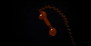
View PostRun Lola Run retains narrative momentum by both establishing its metaphysical defiance early and by using an array of compositions, camera movements, and types of cuts to weave its images into continuity. Most obvious is the use of the “red phone” image, which slams itself down upon reset of each timeline.

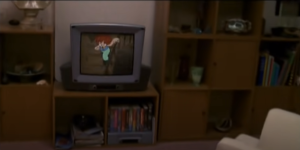
It also repeats an animation and the event of Lola scrambling down the apartment hallway at the beginning. It is not enough to merely repeat the events, however- the composition and camera movements are meticulously imitated, invoking that sense of Deja-vu as the timelines reset and converge. The camera diverges from Lola at the end of the hall, sweeping into a new room where an elderly woman speaking on the phone becomes our new subject. In one timeline, we glide right past her and into the television; As the narrative becomes more frantic, the camera spins erratically before entering the television. As we become more entrenched in the repeated rules and cinematic gestures of the timeline, the film becomes more comfortable breaking them.

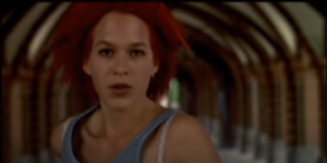
One of the more fascinating edits in the movie sees Lola sprinting, the frame interrupted by pillars splitting the image, and occasionally we intercut for a fractional second and see Lola’s face as she runs. A cut is a way to conceal many things, but in this case it is a dilation of time- Run Lola Run frequently manipulate geography with cutting, but these cuts also switch the shots from wide to close, allowing a greater emotional insight and distressing tone.

Run Lola Run is a dense example of the way cutting, composition, images, and editing can allow an audience to understand the spatial and temporal manipulation of a story.
View PostHi class 🙂 my name is Gunner. I love movies and filmmaking, some recent favorites have been Beau Travail and Ritual (2000). I don’t make much outside of class but am excited for the semester!
View Post