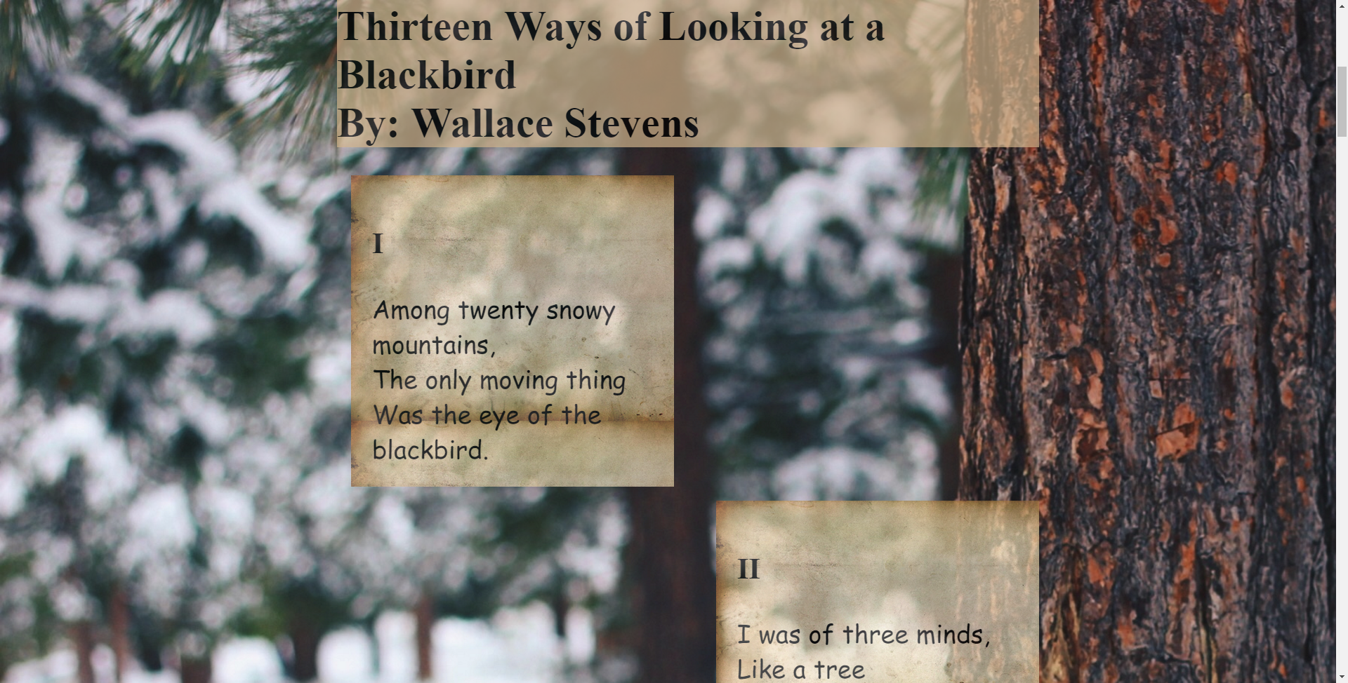
Blackbird
This was the first website I ever created in my DTC 355 class. I interpreted the poem "Thirteen Ways of Looking at a Blackbird" by Wallace Stevens as loving notes falling to the forest floor. This first design was rough, but I was able to push myself to create a staggering effect between the stanzas that is truly pleasing to the eye.
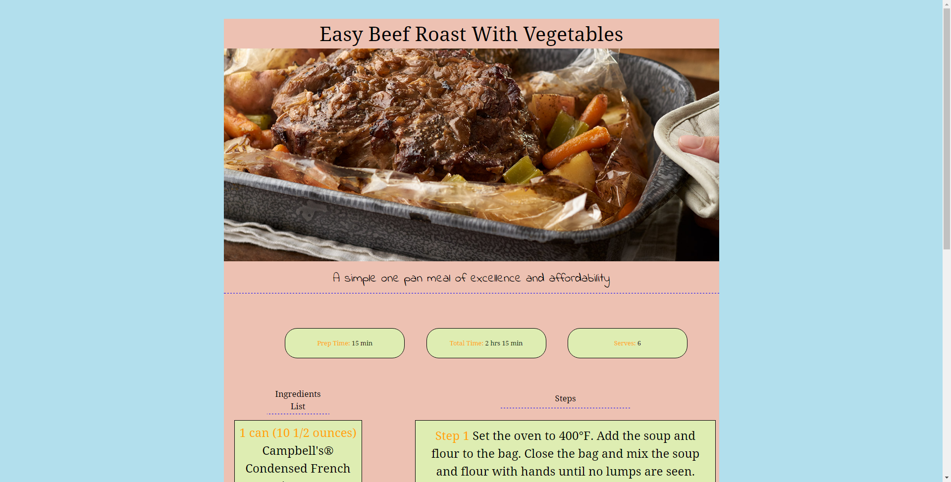
Recipe
The second website I ever built was a recipe site that was designed to be responsive. This means that the website can be adjusted to properly fit different screen sizes. The layout is fairly simplistic, but what I really enjoyed about my site was the eye popping contrast in colors. I also like the way the site looks on a mobile screen.
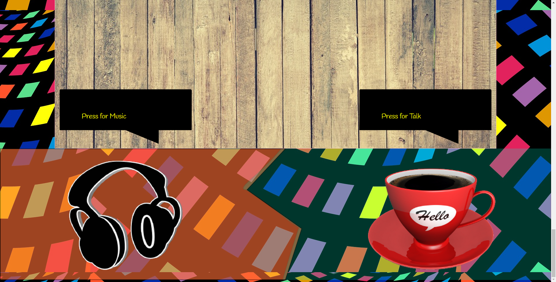
How to Write a Show
This project was intended to be a sequential narrative site. I wanted the user to make a choices that would help guide their experience through my site. I chose the focus of the site to be on how to make a radio show. I tried a lot of different skills out on this site. One of those skills was a new HTML 5 property called flex box, and even though I didn't fully understand everything about it, I had fun trying it out. This was the first site I was on my own for in terms of content, so I feel like I learned a lot even though I struggled at times with it.
Time Project
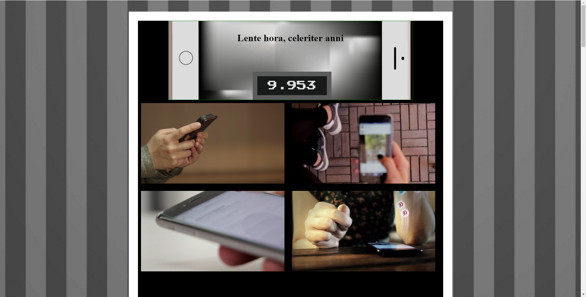
For this project I decided to focus in on mobile embodiment and how we are attached to our mobile devices. I wanted my project to make the viewer uncomfortable. It represents in the purest sense our "always on" culture. The timer at the top of the page counts continuously to remind the audience they are viewing a screen and taking up their own time. It pokes fun at this again by showing a series of videos on loop of people using their phones. This is to again remind the viewer of their own phone usage. I also chose to create a poem that would prompt the audience to consider how valuable their time is. The page itself has a white border and a black background that in my mind represents a phone screen being turned off in order to engage with the real world. I wanted to make elements of the page more interactive, such as the title changing to English on a click, but I still lack some skills in that area and I ultimately ran out of time. The title (Lente hora, celeriter anni) stands for: An hour passes slowly, but the years go by quickly. This was a nod to a podcast I just finished called S-Town, which heavily inspired some of the ideas in my project. If I had more time I would have focused on making clearer design choices with my site, but overall I learned a lot and I am happy with what I have.