High-fidelity Website Redesign
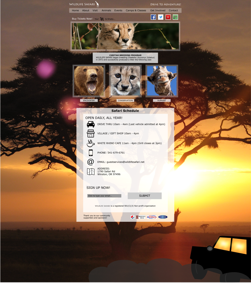
An interactive prototype created with assets made in Adobe Illustrator and imported to InVision, which includes full menu, slider, and link/button functionality. High-fidelity graphics provide most realistic pre-production experience, code-ready, collaborative, and makes rapid iteration and testing a breeze.
This is one of the projects I did that really made me appreciate hand-coding websites. Making a functional yet strictly visual version of a website out of Illustrator files is almost more time-consuming than just creating the site out of HTML5 and CSS3. However, there are times when using this method is necessary and even advantageous. For instance, if the client requires absolute control over the creative process, they can use InVision to collaborate in the work and give feedback at every step without any need for emailing lengthy PDF files and keeping track of myriads of versions.
Real World Experience
Another benefit of doing this project was to find out some problems with trying to create a mobile menu with collapsible sub-menus. I learned to work within the client's (hypothetical) constraints, which in this case that we couldn't change the content, but only its appearance. There are times when a client puts their foot down and demands to keep category pages that could be reworked with a better Information Architecture in favor of continuing to support existing repeat visitors with familiar patterns.
While the drop-down within a drop-down isn't ideal in terms of User Experience best practices, UX is a subjective art rather than a hard science and sometimes conventional wisdom has to be over-ridden based on client/project constraints or a deeper knowledge of the target audience. With InVision, I managed to create a working prototype of every screen element that would need to be coded later, including the nav menu with links to each page, the slider with links to their respective pages and buttons to change slides, and links lower down for the purpose of emulating user interaction typical contact info and icons. The social and community partner icons also link to pages for demonstration purposes.
Digital and Print Assets
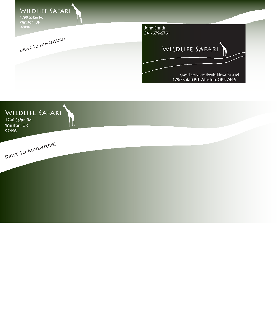
The final client requirement for this project was to create digital and print assets like a banner ad image, business cards, business letterhead, and branded envelopes. These deliverables were easily created in Illustrator to match the imagery already used in the website design, such as the title, giraffe logo, and the cheetah from the slider.
This project definitely set the stage for some of my learning and growth in the web development and design skills I have obtained since then. Although it really was a lengthy process, sometimes this kind of work is necessary, especially for big companies or in a large project when an MVP (minimum viable product) needs to be proofed out ahead of time in detail.


