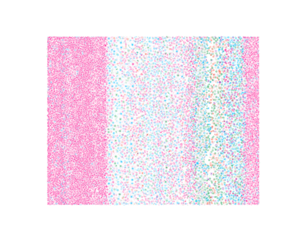
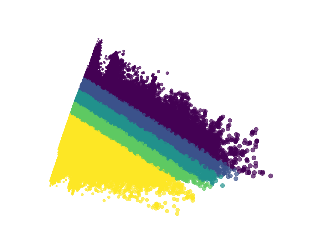
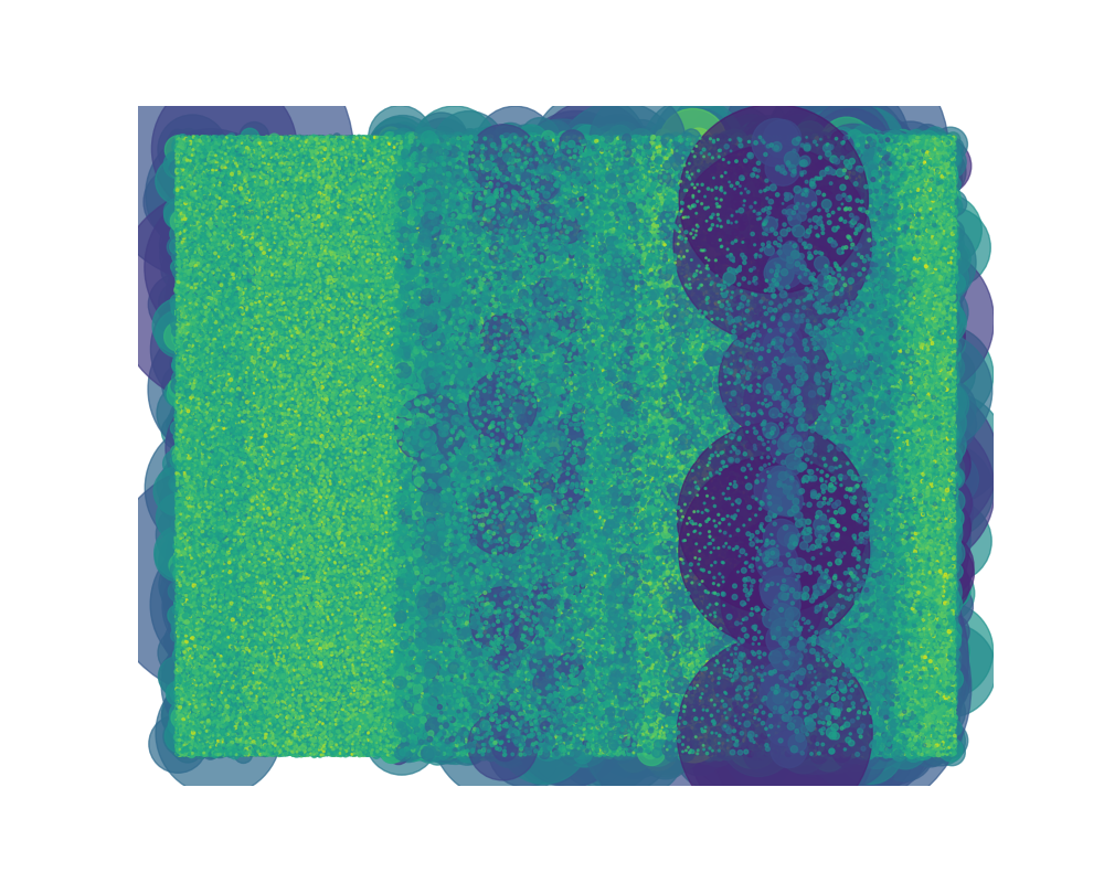
The Final Results
Hebrail, Georges and Berard, Alice. (2012). Individual Household Electric Power Consumption. UCI Machine Learning Repository. https://doi.org/10.24432/C58K54.


Hebrail, Georges and Berard, Alice. (2012). Individual Household Electric Power Consumption. UCI Machine Learning Repository. https://doi.org/10.24432/C58K54.