Business Profiles
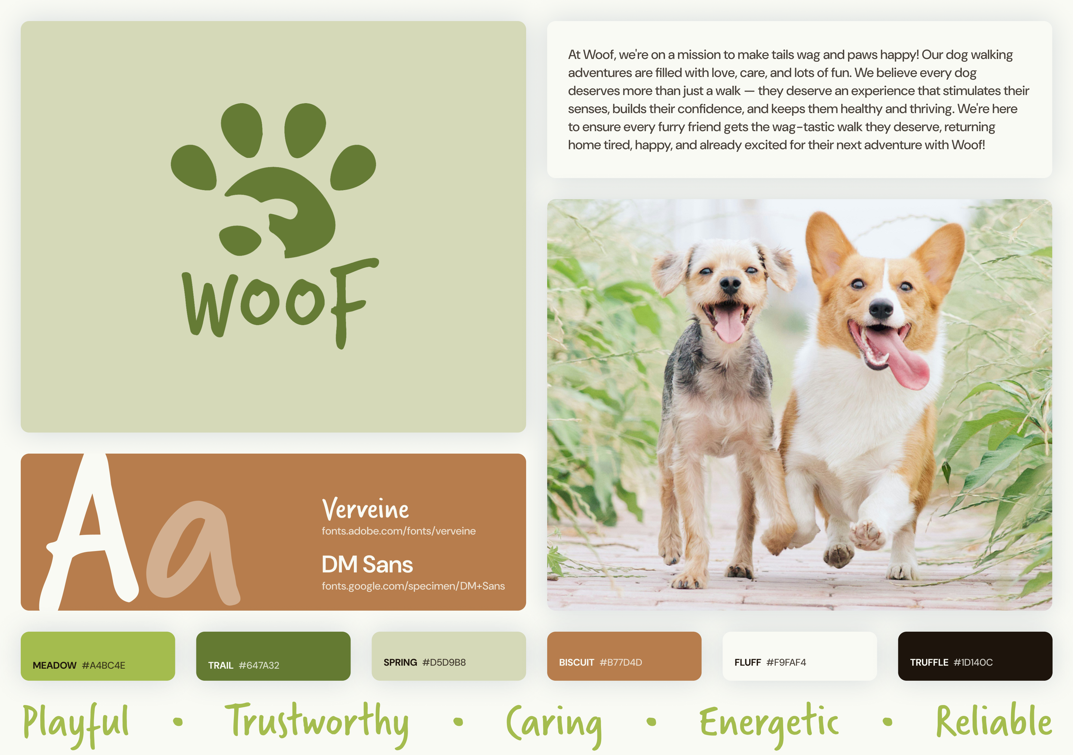
Woof.
Business type: Dog walking services
Mission statement: At Woof, we're on a mission to make tails wag and paws
happy! Our dog walking adventures are filled with love, care, and lots of fun. We believe
every dog deserves more than just a walk — they deserve an experience that
stimulates
their senses, builds their confidence, and keeps them healthy and thriving. We're here to
ensure every furry friend gets the wag-tastic walk they deserve, returning home tired,
happy, and already excited for their next adventure with Woof!
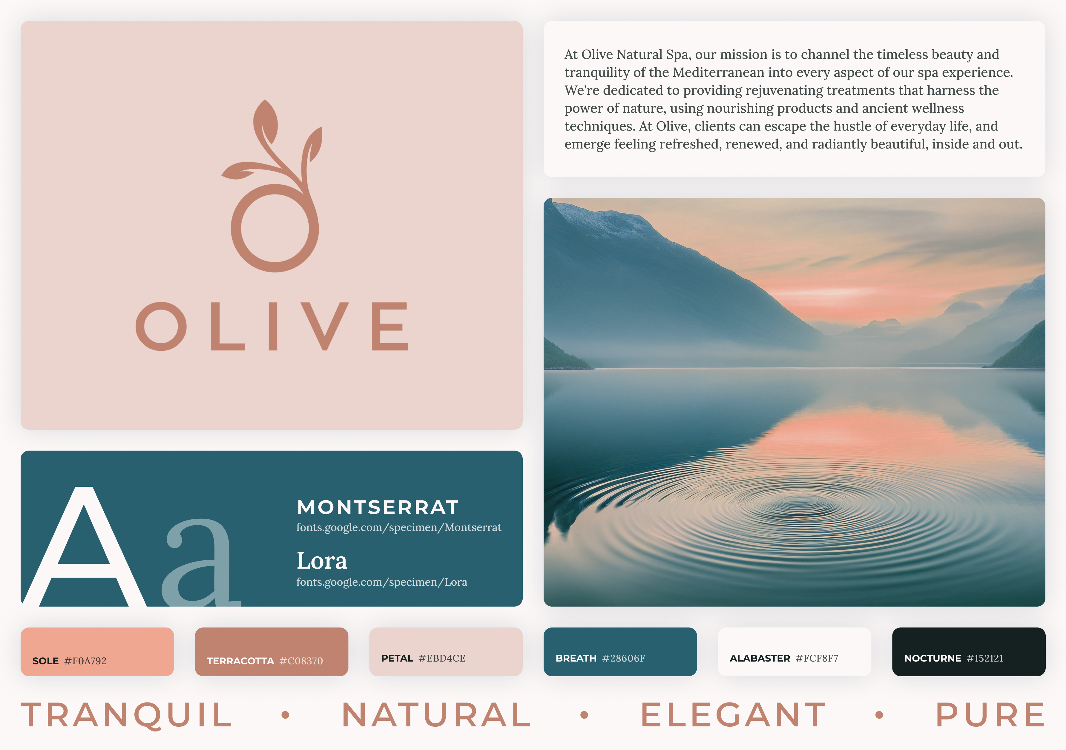
Olive Natural Spa
Business type: Spa
Mission statement: At Olive Natural Spa, our mission is to channel the
timeless beauty and tranquility of the Mediterranean into every aspect of our spa
experience. We're dedicated to providing rejuvenating treatments that harness the power of
nature, using nourishing products and ancient wellness techniques. At Olive, clients can
escape the hustle of everyday life, and emerge feeling refreshed, renewed, and radiantly
beautiful, inside and out.
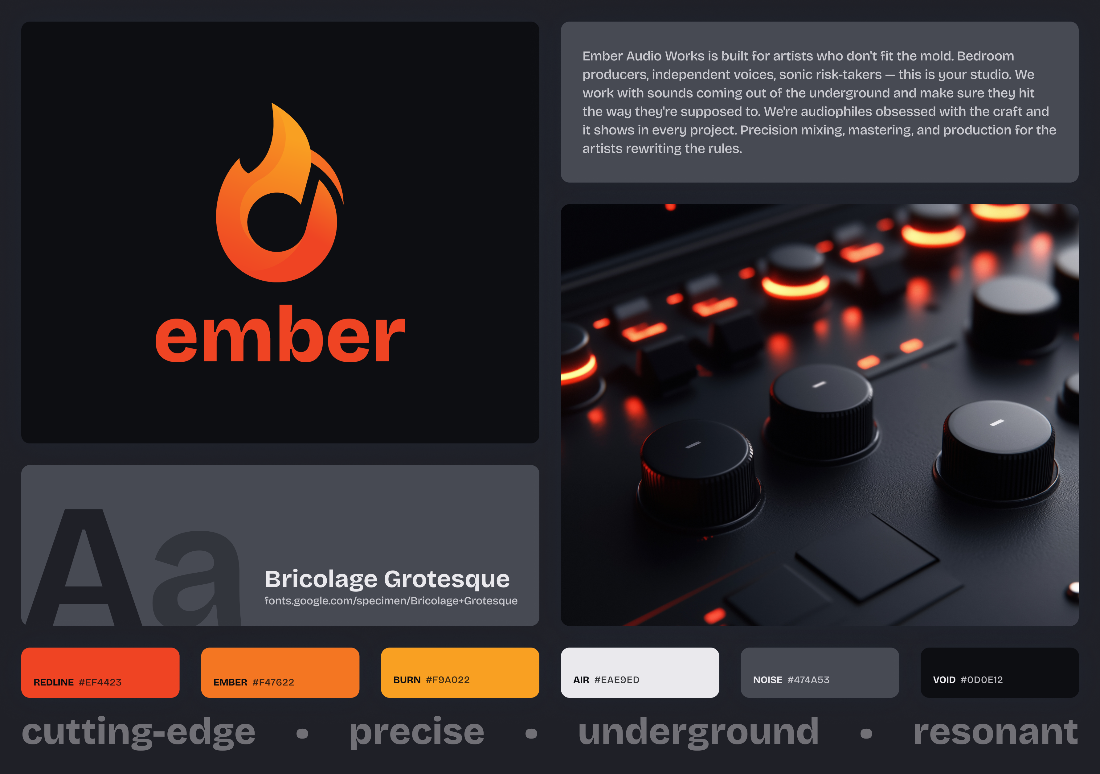
Ember Audio Works
Business type: Audio production studio
Mission statement: Ember Audio Works is built for artists who don't fit the
mold. Bedroom producers, independent voices, sonic risk-takers — this is your
studio.
We work with sounds coming out of the underground and make sure they hit the way they're
supposed to. We're audiophiles obsessed with the craft and it shows in every project.
Precision mixing, mastering, and production for the artists rewriting the rules.
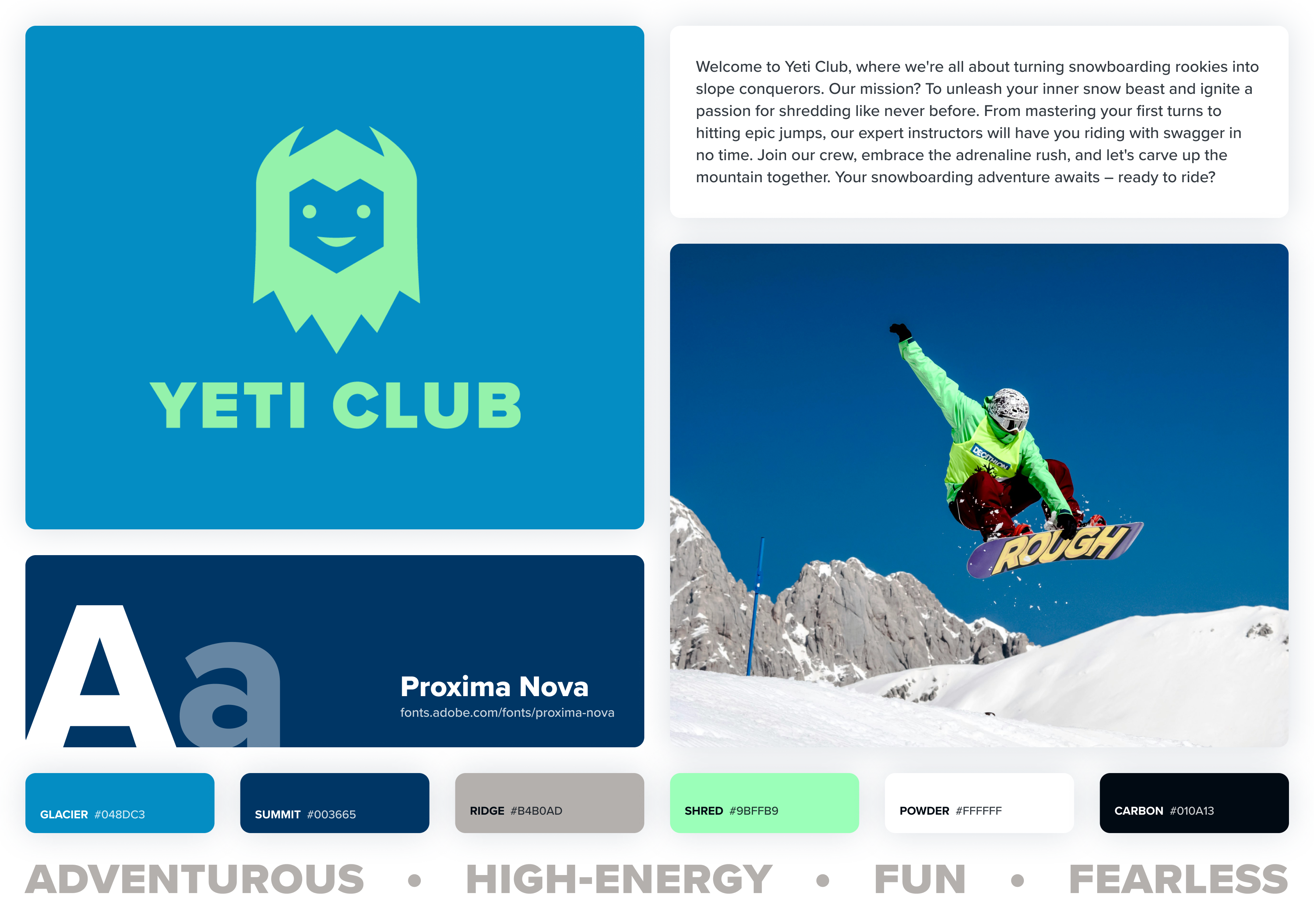
Yeti Club
Business type: Snowboard lessons and training
Mission statement: Welcome to Yeti Club, where we're all about turning
snowboarding rookies into slope conquerors. Our mission? To unleash your inner snow beast
and ignite a passion for shredding like never before. From mastering your first turns to
hitting epic jumps, our expert instructors will have you riding with swagger in no time.
Join our crew, embrace the adrenaline rush, and let's carve up the mountain together. Your
snowboarding adventure awaits – ready to ride?
Understanding Your Audience
Before you open Figma, you need to figure out who this website is actually for.
Not the business owner. Not you. The person who's going to land on this site
and decide in a few seconds whether to stay or leave.
Identifying the audience
Every business has a target audience — the people most likely to use their
service. That means thinking about age, lifestyle, income level, and what problem
they're trying to solve. Someone looking for a dog walker has different priorities
than someone booking a spa treatment or signing up for snowboard lessons.
Demographics are a starting point, but mindset matters more for design. A person
booking a spa day is probably in a different headspace than someone searching for
an auto mechanic. One is browsing leisurely, the other wants answers fast. That
difference should show up in your layout, your copy, and how aggressively you
push your CTA.
Different brands, different audiences
Look at the four business profiles for this project. They're all service-based,
but the people visiting each site want very different things:
- Woof — Pet owners who need to trust a stranger with
their dog. They're looking for reliability and personality. The site needs
to feel friendly and trustworthy.
- Olive Natural Spa — People who want to relax and
treat themselves. They expect a calm, polished experience. If the site
feels cluttered or loud, they're gone.
- Ember Audio Works — Independent musicians and
producers who want a studio that gets their sound. The site needs to
feel credible and current — not corporate.
- Yeti Club — People looking for snowboard lessons,
probably a mix of beginners and experienced riders. They want to see
energy and get signed up without a lot of friction.
A design that works for Olive would feel completely wrong for Yeti Club. That's
not about personal taste — it's about what makes sense for the person
on the other end of the screen.
How audience shapes design decisions
Your audience should inform your choices across the board:
- Color: Muted earth tones say something different than
bold, saturated colors. Match the palette to the mood your audience
expects.
- Typography: A clean sans-serif reads as modern and
approachable. A heavy display font reads as loud and bold. Your typeface
sets the tone before anyone reads a word.
- Imagery: The photos on the site should look like the
experience the audience is hoping for. Action shots for Yeti Club,
serene environments for Olive — the images do a lot of heavy
lifting.
- Language: A dog walking service can be playful and casual.
An audio studio should probably be more direct and confident. How the
site talks to visitors matters as much as how it looks.
- Layout: Someone in a hurry needs a fast, scannable page
with a clear next step. Someone exploring a premium service might be
willing to spend more time scrolling through content.
Designing for a Business
Up until now, most of the sites you've designed have been personal projects. You picked the
colors you liked, used fonts that felt right to you, and made layout choices based on your
own taste. That's a great way to learn, but designing for a business is a different
challenge. You're no longer designing for yourself. You're designing for a brand, its
audience, and its goals.
Brand consistency
Each of the business profiles above includes a color palette, fonts, a logo, and a set of
brand keywords. These aren't suggestions. They're your design system. Every page you
create for that business should feel like it belongs to the same family.
That means using the brand's color palette intentionally (remember the 60-30-10 rule from
Module 2), sticking to the provided typefaces, and keeping the overall tone consistent.
If the brand keywords say "playful" and "energetic," your layout, imagery, and type
choices should reflect that. If the brand is "tranquil" and "elegant," heavy
drop shadows and neon accents are probably not the move.
Visual hierarchy still matters (maybe more)
We spent time in Module 7 talking about how size, weight, color, contrast, and whitespace
guide a visitor's eye through a page. That matters even more on a business site because
you're trying to lead someone toward a specific action. Maybe that's booking an
appointment, signing up for lessons, or learning about services. Your hierarchy should
make the most important information the easiest to find.
Think about what a first-time visitor needs to see right away versus what's secondary.
The business name, what they do, and how to take the next step should be clear without
scrolling. Supporting details like testimonials, team bios, or a full service list can
come further down the page.
Calls to action
A call to action (CTA) is the thing you want a visitor to do. "Book Now," "Get Started,"
"View Our Services." Business websites live and die by these. A CTA should stand out
visually from the rest of the page. Use color contrast, size, and placement to draw
attention to it. Don't bury it at the bottom of the page and hope someone scrolls that
far.
Most business sites repeat their primary CTA in multiple places: the hero section, after
key content blocks, and in the footer. That's not redundant. It's giving the visitor an
easy path to act whenever they're ready.
Common business page patterns
You'll notice that most business websites follow similar structures. That's not because
designers are lazy. It's because users expect certain things in certain places. People
scan websites quickly, and familiar patterns help them find what they need.
A few patterns worth paying attention to:
- Hero sections: A large, prominent area at the top of the homepage
with a headline, a short description, and a CTA. This is the first thing visitors
see, so it needs to communicate the core of the business fast.
- Service or feature blocks: A grid or set of cards that break down
what the business offers. Icons or images paired with short descriptions work well
here.
- Trust signals: Testimonials, client logos, ratings, or certifications
that build credibility. People are more likely to engage with a business that other
people vouch for.
- Consistent navigation: Your nav should appear on every page in the
same location. Visitors should never have to guess how to get around.
- Footer with contact info: Phone, email, address, social links, and
sometimes a secondary nav. The footer is where people go when they can't find
something elsewhere.
Responsive design is not optional
We covered responsive design in Module 7, and it absolutely applies here. A business
website that doesn't work on mobile is a business website that loses customers. More
than half of web traffic comes from phones. Your designs need to account for that from
the start, not as an afterthought.
When you're designing in Figma, create both mobile and desktop versions. Think about how
your grid, type scale, and image sizes shift between the two. A three-column service
grid on desktop might stack to a single column on mobile. A large hero image might get
cropped differently. Plan for it.
Keep it simple
It's tempting to throw everything at a business site: animations, parallax scrolling,
complex layouts, ten different sections on one page. Resist that urge if you're not ready
for it. The best business
websites are clean, focused, and easy to navigate. Every element on the page should earn
its place. If it doesn't help the visitor understand the business or take the next step,
it's probably in the way.
Thinking about SEO
SEO stands for search engine optimization. It's the practice of making your website
easier for search engines like Google to find, understand, and rank. This is not an
SEO class, and we're not going deep into keyword strategy or analytics. But some
of the basics overlap directly with good web design, and they're worth thinking
about even at the design stage.
Search engines try to figure out what a page is about by looking at how the content
is organized. That means a lot of the design decisions you're already making
— how you structure your headings, what content you put on each page, how
your pages connect to each other — have an impact on how well a site
performs in search results.
A few things to keep in mind as you design:
- Use headings with purpose. Your main heading on each page
should describe what that page is about. Don't treat headings as a way to
make text bigger — treat them as a content outline. If someone only
read the headings on your page, they should still understand what's
there.
- Use real content. Placeholder text like lorem ipsum doesn't
help you or a search engine understand the page. For this project, write
actual content that describes the business and its services. It doesn't
need to be perfect, but it should be real.
- Think about site structure. Which pages does your site
have, and how do they connect? A site with clear navigation and logical
page organization is easier for both visitors and search engines to follow.
If your pages feel random or disconnected, that's a problem for both.
- Plan your content flow. On each page, the most important
information should come first. Search engines weigh content near the top
of the page more heavily, and so do visitors. This lines up with the
visual hierarchy principles we've already covered.
You don't need to become an SEO expert for this class. But designing with clear
structure, real content, and logical page organization is already doing a lot of
the work.
Real-world examples worth studying
Looking at real service-based business websites can help you see these principles in
action. Here are a few that do it well. Spend some time clicking around each one and
notice how they handle branding, hierarchy, CTAs, and responsive design.
Orangetheory is a fitness class service, and their site reflects their brand energy
perfectly. The bold orange palette is consistent across every page, the hero section
communicates exactly what they offer, and the primary CTA to find a studio and book
a class is front and center. The layout is clean and well-organized without feeling
sparse, and trust signals like class descriptions and member results are placed
strategically to move visitors toward signing up.
Tend is a dental care service, and their site is a masterclass in modern, polished
design. The minimal color palette, generous whitespace, and refined typography give
it a premium feel that sets them apart from the typical dentist website. The booking
CTA is clear and repeated throughout without being pushy. Every page feels intentional
— nothing is there just to fill space. It's a great example of how strong
design can completely reframe how people perceive an industry.
Glamsquad offers on-demand beauty services, and their website matches the convenience
of their brand. The homepage quickly communicates what they do, the booking flow is
simple and prominent, and the imagery feels aspirational without being generic. The
design is clean, the navigation is straightforward, and the brand voice comes through
consistently in both the visuals and the copy.
Calm is a meditation and wellness service, and their website is one of the best
examples of design matching brand identity. The muted color palette, soft imagery,
and spacious layout immediately evoke the feeling of calm before you even read a
word. The CTAs are clear but gentle, the content hierarchy guides you naturally
through the page, and the overall experience feels cohesive from top to bottom.
It's a reminder that great design isn't just about looking good — it's about
making the visitor feel something.