Content
Sign up for Figma
Figma is the industry standard design tool for UX/UI design and web design. It is free and
full features can be unlocked with their free education account.
Sign up for Figma
Verify your account as an education account
You will be able to use the free version for this project, but you will need to verfiy your
Figma account to complete all the assignments for the semester.
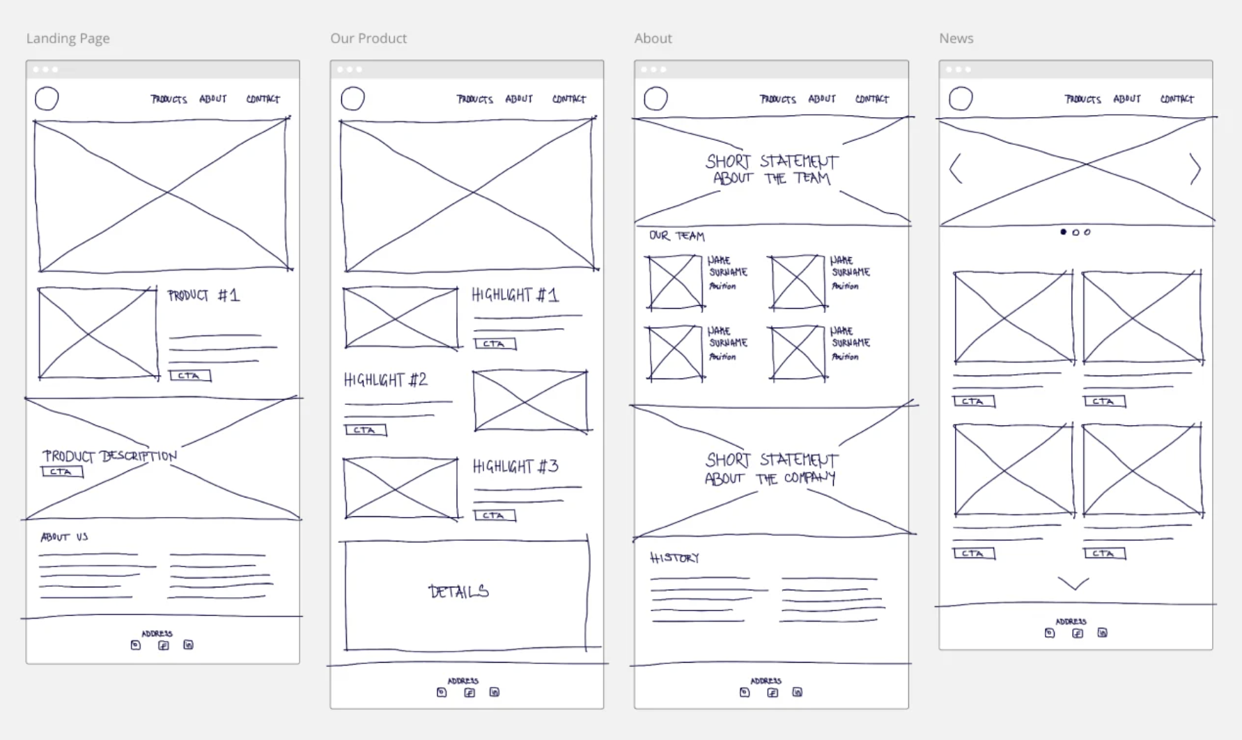
Wireframing
A wireframe is a way to design and visualize your website or application at the structural
level. It ignores the styles and aesthetics that can often trip up making sure we have an
effective foundation. Wireframes are used to layout content, functionality, and user
needs. It is much easier to make changes to things like navigation and layout when we
haven't added additional layers like visual design and content—it's easier to adapt.
Wireframes can also help us see the basic HTML elements a page needs when we start to code
because the structure is laid bare.
Wireframes are not fancy. You can even sketch a wireframe on a napkin and have it be an
effective tool.
Prototyping
A prototype takes the wireframe to the next stage but adding design choices such as color
palettes, fonts, icons, images, and specific content. This steps helps test out what
things will look like before writing your CSS. Maybe what you had envisioned in your head
actually doesn't look as good once it's down on "paper". It's much faster and easier to
make quick design changes to a prototype than it is to change code.
Prototyping tools will also allow you to add basic functionality to simulate the user's
experience. You can click through links, swipe through carousels, and see hover functions.
It is interactive.
A prototype also helps your show your vision to project stakeholders, such as your
teammates, boss, or even client. This allows you to get feedback and make changes before
you are too far into the development process, which saves you time and effort.
Although we don't go into user testing in this class (check out DTC 478 if you're
interested in that!), a prototype also allows you to take your website or application and
have users test it. This again allows you to gather feedback and make changes before you
are too far into the development process.
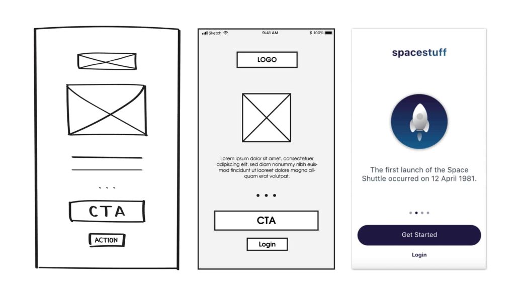
Low Fidelity vs. High Fidelity
Low fidelity and high fidelity refer to how detailed the wireframe or prototype is. A
wireframe scribbled on a napkin would most likely be considered lower fidelity than a
precisely aligned and sized wireframe made in Figma. A prototype with general visual
design only would most likely be considered lower fidelity than a prototype with visual
design, content, and interaction added. Sometimes, a lower fidelity prototype may be all a
situation calls for, and spending the extra time on making it the highest fidelity
possible isn't useful. Other times, a high fidelity prototype might be neccessary. It all
depends on the situation!
Collaboration
As we create websites and web applications beyond this class, it's important to realize
we'll rarely be doing it alone. There is almost always at least one other person involved.
Whether you're on a team, designing for a developer, developing for a designer, producing
something for your boss or a client, websites and web applications don't get made in a
vaccuum. Wireframing and prototyping make the collaboration process easier, providing
communication tools, a clearer production pipeline, and resulting in better feedback.
Designing with Grids
Grids are the foundation of the web. Even from the early days of websites, tables served
as the visual structure for many pages. Today, there are several types of grids that can
be leveraged for your layout.
Read more about grids in interface design from Nielsen Norman
Group.
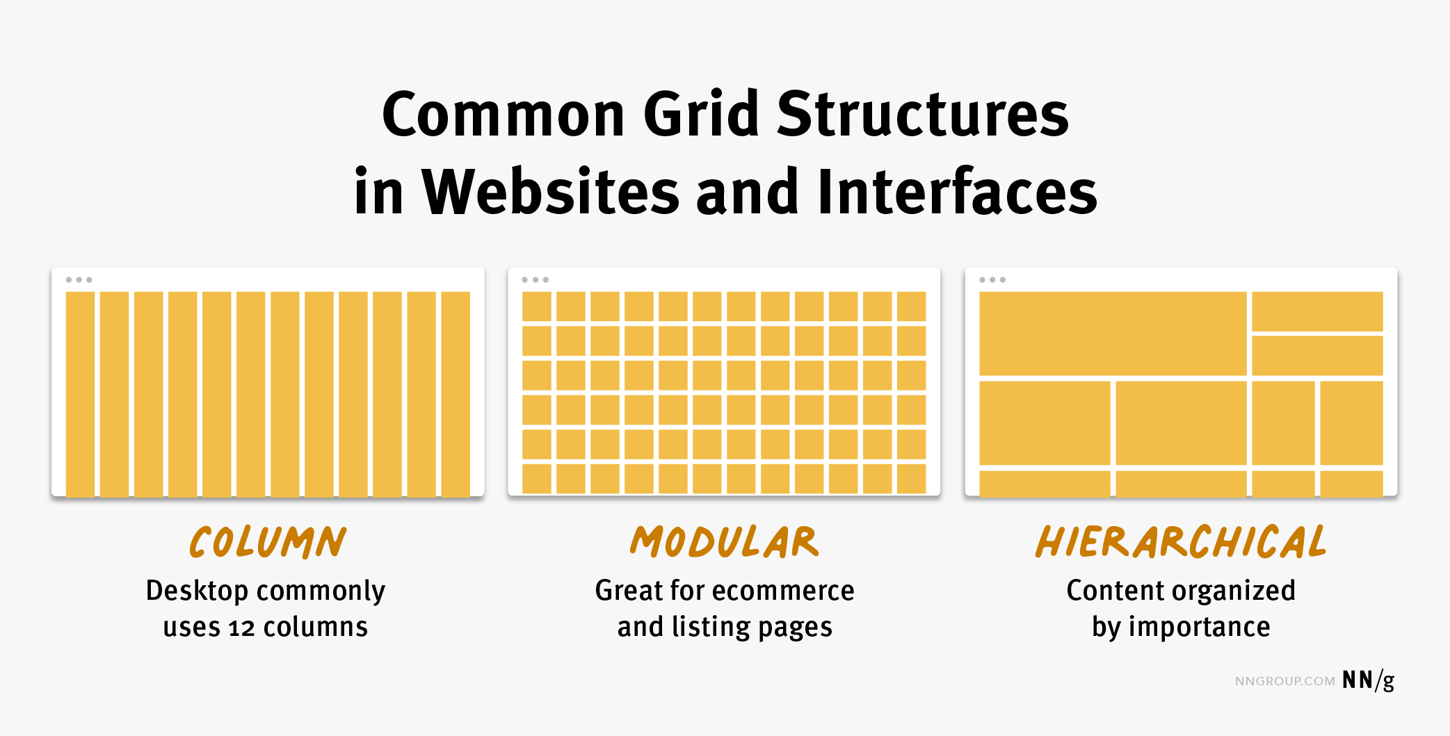
- Column grid involves dividing a page into vertical columns. UI
elements and content are then aligned to these columns.
- Modular grid extends the column grid further by adding rows to it.
This intersection of columns and rows make up modules to which elements and content
are aligned. Modular grids are great for ecommerce and listing pages, as rows are
repeatable to accommodate browsing.
- Hierarchical grid: Content is organized by importance using columns,
rows, and modules. The most important elements and pieces of content take up the
biggest pieces of the grid.
Using a grid helps keep your layout aligned, makes it easier to follow design principles
like balance and repetition, improves consistency, and make your page more functional. It
also helps your design adapt better across device sizes.
Color
You could take an entire class on color theory alone. While we will continue to talk about
color and other design aspects throughout the semester, for this module, we will look at
some basic do's and don'ts.
Color Palettes
A color palette should, in general, contain 3-5 colors. Any more and any less, and we can
find our design either too flat or too busy. Some great color palette resources are:
Adobe Color
Coolors
In additional to finding colors using these tools, you can also test your chosen colors for
accessibility.
Color Psychology
Color psychology refers to the influence of color on our feelings, emotions, and behaviors.
Although it's a bit subjective, color psychology can help us subconsciously influence
people who visit our website in meaningful ways. This makes it a powerful tool for design
and marketing. Colors can spark emotion and evoke certain cultural ideas based on common
color associations.
- Red: passion, power, love, danger, exictement, warning
- Blue: calm, trust, competence, peace, logic, reliability
- Green: health, nature, abundance, prosperity
- Yellow: happiness, optimism, creativity, friendliness
- Orange: fun, freedom, warmth, comfort, playfulness
- Purple: luxury, mystery, sophistication, loyalty, creativity
- Pink: nurturing, gentleness, sincerity, warmth, youth
- Brown: nature, security, protection, comfort
- Black: elegance, power, control, death
- White: purity, peace, clarity, cleanliness
It's important to realize that color psychology is both subjective, but also cultural. What
meaning certain colors might have in one country can be different in another.
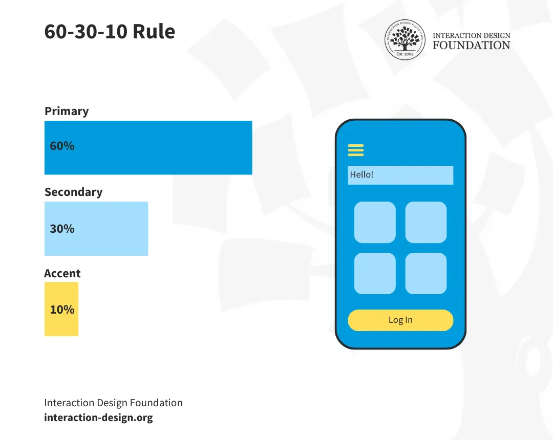
The 60-30-10 Rule
A common mistake in color is balance. The 60-30-10 rule is commonly used in all
areas of design, including interior design. It says that a primary color should be used in
60% of the design, a secondary color in 30% of the design, and an accent color in only 10%
of the design. The accent color is often a bright, eye catching color that can be used to
draw the user's eye to important elements like a call-to-action.
Assignments
Codeacademy: Learn HTML: Semantic HTML
- Complete the Learn HTML: Semantic HTML
- After completing the course, navigate to your user profile.
- Take a screenshot of your profile screen that includes both your username
and course completion.
- If the course provides a certificate to completing that includes your name,
you may use that instead.
- In Slack, in the Week 2 folder, submit your screenshot or certificate in the
turn-in thread.
- Partial work is not accepted for Codeacademy learning.
Figma exercise (mini project 2)
- Log in to your Figma account. Figma is free, but you can get more features
by verifying your account as an education account. Sign up here:
https://www.figma.com/education/.
- Create a new project titled 'lastname-firstname-mini-project-2'.
- Wireframe a one page mobile layout that makes use of a grid-based layout.
This does not have to be for any specific site, but you can keep your
explainer website in mind if you'd like.
- Once your mobile wireframe is done, create a wireframe of the same site for
tablet and desktop.
- Your structure should consist of the following elements at the minimum:
- A header
- A minimum of 4 paragraphs
- A minimum of 2 different types of headings (h1, h2, h3, etc.)
- A minimum of 2 images
- A minimum of 1 ordered or unordered list
- A footer
- Your wireframe must consider the following:
- No visual design added--only structural blocks
- Lorem ipsum placeholder text
- Only placeholder images
- Image formatting
- Margins and padding
- Focus on navigation, flow, and element relationships
- Grid-based layout
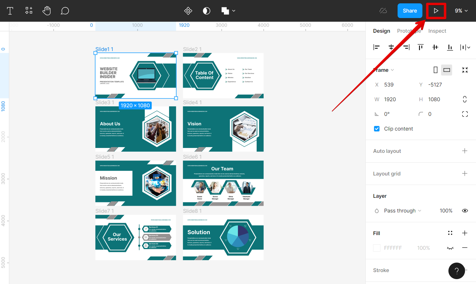
- When your wireframe is complete, select 'Share' and select 'Copy prototype
link'.
- Ensure your link permissions allows anyone with the link to view.
- Paste the link in the Slack turn-in.