Content
Hypertext Markup Language or HTML
HTML is the standard markup language for creating websites. It defines the content and the
content structure of your website. HTML does not make your website
pretty—styles are done with CSS (coming in week 4).
The first
website, Tim Berners-Lee
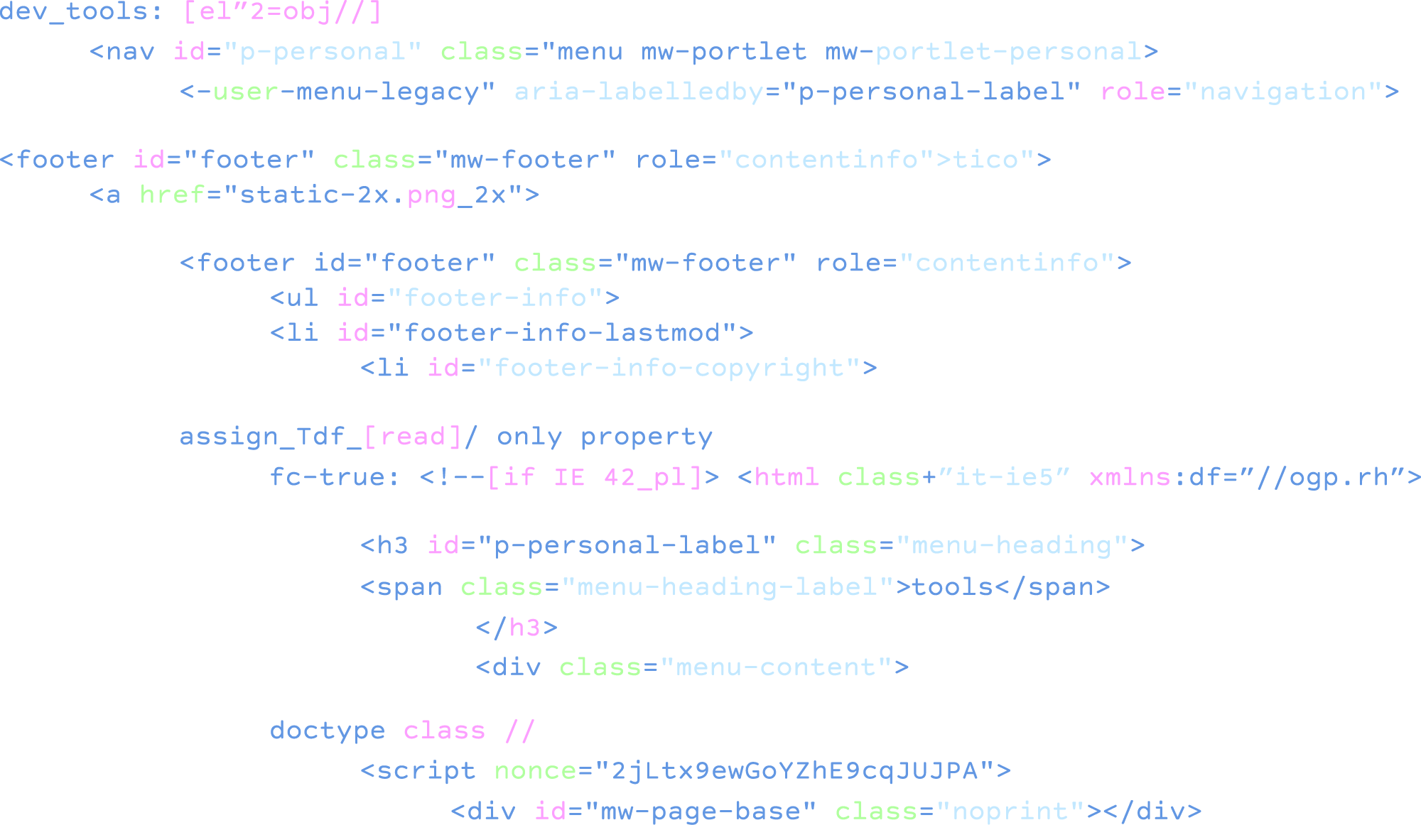
HTML tag
reference
Take a look at this sample page. Look at the
source code and the output.
HTML is incredibly stable. Although there have been several versions of HTML since it was
created in 1993, it is largely backwards compatible—new features build on old
features and allow you to provide fallbacks for older browsers. This is why we still can
view Tim Berners-Lee's first website today. While new tools come and go (ahem, here's
looking at you Flash), HTML has so far, stood the test of time.
Block-level vs. inline elements
Every HTML element has a default display value, depending on what type of element it is. The
two most common display values are block and inline.
A block-level element always starts on a new line and stands on it's own. Examples of
block-level elements are:
An inline element does not start on a new line. Examples of block-level elements are:
Two block level elements next to each other will display stacked, because they each take up
their own line.
Two inline level elements next to each other will display side by side.
Attributes
- All HTML elements can have attributes
- Attributes provide additional information about elements
- Attributes are always specified in the start tag
- Attributes usually come in name/value pairs like: name="value"
Common attributes you will use are class, ID, href, and src.
You can apply styles, or CSS, through attributes. This is not considered best practice, but
it's good to know it's possible.
<h1 style="color:red">I'm a
heading!</element>
HTML syntax
<element attribute="value">Content</element>
Some elements are self-closing. In that case, the syntax is: <element
attribute="value">
The document tree and parent/child elements
The nesting that happens within an HTML file can be understood through thinking about it as
like a tree diagram.
The HTML Document Tree
Images
- Images are inline elements.
- Images will display at their full width unless specified through CSS.
- If you have a very large image and size it down through CSS, the browser is still
loading a large image file. This can cause your website to load slowly. It is good
practice to make sure image files are only as large as they need to be.
- Your browser cannot display an image at 300 PPI. Using 300 PPI images only make your
image file larger and slower to load, with no added benefit. The standard resolution
for web images is 72 PPI.
- Images must be an image file type, like JPG, PNG, GIF, SVG, etc. Browsers cannot read
PSD, AI, etc.
- Use PNGs if you need transparency in your image.
Accessibility and HTML
It is our ethical imperative to create accessible spaces for all web users. As designers, we
can consider accessibility through the layout, color palette, button sizes, typography,
and many other aspects of design. As developers, we can consider accessibility through the
code that we write.
Semantic HTML
Most HTML elements are what are call semantic elements. Section, article, header—these
are all named in relation to the elements meaning. When elements are semantic, screen
readers are able to better interpret the website to users who rely on assistive
technologies. Bonus: it's easier for us to read our own code, too! There are some elements
that are not semantic, like <div>. Div has its use, but should not be used for
everything.
Even though our ID and class attributes might be descriptive in the same way semantic HTML
elements are, browsers are not able to interpret strings of text that way. For
example:
<div id="header"></div> can be seen by assistive technologies, but it does not
understand it's a header element.
<header></header> can be seen by assistive technologies AND understood as a
header element.
Both behave the same way as block-level elements, but the semantic element is more
accessible.
Headings
A website should always have an H1. It's important we don't skip headings. If you don't have
an H1 on your page, don't begin with H2. If you have an H1 and an H2, don't jump to H4
without using H3. Sometimes we can get attached to the default sizes of heading elements,
but those can always be changed with CSS. Our HTML elements should be focused on structure
first and foremost.
Readable text
Because assistive technologies read your HTML, not your your HTML output, text that is
embedded in images cannot be read by assistive technologies. For example, all those
hilarious meme we shared in mini-project-1 wouldn't be readable. Assistive technologies
would see that there was an image, but cannot tell what the images look like or contains.
Sometimes we might have a cool image that has the website or business name on it that we
think can take the place of an H1. This may look cool, but it isn't accessible. Make sure
text that informs the use of your website is always parseable in your HTML.
Alt text
There is an attribute that can be applied to images that helps provide additional context
for assistive technologies—alt tags. Alt tags allow us to describe the image. It's
not a perfect solution, but in a world where image often plays a critical role in
communication, it's a lot better than nothing. An example could look like:
<img src="red-panda.jpg" alt="A red panda playing in the snow">
Accessibility resources
There are a large number of things we can do to make our code as accessible as possible.
Explore these resources:
WCAG
Overview
A11y Accessibility
Checklist
ARIA
When we need additional tools to improve accessibility, there is a supplemental markup we
can add called ARIA. When we need to go beyond what clean code and semantic HTML can do,
ARIA comes in to provide additional context for assistive technologies. It becomes
especially useful for dynamic content, JavaScript, and advanced user interface controls.
You will likely not need to use ARIA for most of your projects in this class, but it's
important to understand what it is.
WAI-ARIA
Overview
GitHub, Working Collaboratively, and Sharing Files
Ahead of Wednesday's class, sign up for GitHub and add your email and username to the GitHub
accounts list in the Week 3 folder in Slack. This is required in order to turn in all
code based work in the class.
Sign up for a GitHub account
GitHub Desktop download
What is GitHub?
GitHub is a web-based platform that uses Git, a version control system, to help developers
manage and track changes to their code. It stores your files in the cloud and keeps a
complete history of every change you've made. This makes it easy to back up your work,
collaborate with others, and recover previous versions if something goes wrong.
Why we use version control
Version control allows you to save snapshots of your project at different points in time.
This means you can experiment with new ideas or try different approaches without losing
your working code. It also creates a complete history of your project, showing what
changed and when. For web developers working with HTML, CSS, and JavaScript, having this
record becomes increasingly important as projects grow more complex.
GitHub Desktop
GitHub Desktop is a visual application that makes working with Git and GitHub more
approachable. You'll use it throughout this course to save your work to GitHub, where it's
backed up and accessible from anywhere. We'll cover how to use GitHub Desktop in detail
during our workshop.
Collaboration and portfolios
GitHub enables teams to work on the same project without overwriting each other's changes.
It's also widely used as a portfolio platform. Potential employers often review
candidates' GitHub repositories to see their code and projects.
Assignments
Edit HTML template exercise (mini project #3)
- Download the 'mini-project-3' folder.
- Unzip the folder and move it into your class repository folder.
- Open mini-project-3 in VS Code.
- Using what you've learned about accessible HTML this week, edit the HTML to
reflect best practices for accessibility. Evaluate the HTML tags,
structure, and media content. Make at least 10 changes.
- Once you've made the changes, push your completed 'mini-project-3' folder to
GitHub.
- In Slack, add your name to the turn-in thread when your push is complete.
Explainer prototype
- Create a new Figma file titled 'lastname-firstname-explainer'.
- Design a single page website that explains your topic to a general audience.
- Your website design must consist of the following elements:
- A header
- A minimum of 4 paragraphs
- A minimum of 2 different types of headings (h1, h2, h3, etc.)
- A minimum of 2 images
- A minimum of 1 ordered or unordered list
- A footer
- A mobile and a desktop design
- Your design should consist of the following style considerations at
the
minimum:
- At least 1 custom font (use only Google fonts or Adobe fonts)
- Different font sizes for different heading hierarchies
- A clear color palette, tested for accessibility
- Image formatting
- Margins and padding
- A clear sense of alignment and balance
- A clear visual hierarchy
- Use of a grid template or guides to ensure alignment
- When your design is complete, select 'Share' and select 'Copy prototype
link'. Be sure it is publicly viewable.
- Paste the prototype link in the Slack turn-in.