Content
Positioning
CSS gives us several positioning properties that allow us to have greater control of where
things sit on our website.
Relative
An element with position: relative; is positioned relative to its normal position. Setting
the top, right, bottom, and left properties of a relatively-positioned element will cause
it to be adjusted away from its normal position. It is not removed from the flow of the
page and other content will not be adjusted to fit into any gap left by the element.
Absolute
An element with position: absolute; is positioned relative to the nearest positioned
ancestor (instead of positioned relative to the viewport, like fixed). However; if an
absolute positioned element has no positioned ancestors, it uses the document body, and
moves along with page scrolling. Absolute positioned elements are removed from the page
flow and can overlap elements. This is particularly useful when stacking elements "on top"
of one another.
Fixed
An element with position: fixed; is positioned relative to the viewport, which means it
always stays in the same place even if the page is scrolled. The top, right, bottom, and
left properties are used to position the element. A fixed element is removed from the flow
of the page and does not leave a gap in the page where it would normally have been
located.
Sticky
An element with position: sticky; is positioned based on the user's scroll position. A
sticky element toggles between relative and fixed, depending on the scroll position. It is
positioned relative until a given offset position is met in the viewport - then it
"sticks" in place (like position:fixed).
https://www.w3schools.com/css/css_positioning.asp
The Z-Index
Although we may think of webpages as flat, 2 dimensional spaces, they do have depth. The
z-index property specifies the stack order of an element.
An element with greater stack order is always in front of an element with a lower stack
order.
Note: z-index only works on positioned elements (position: absolute, position: relative,
position: fixed, or position: sticky) and flex items (elements that are direct children of
display:flex elements).
Note: If two positioned elements overlap without a z-index specified, the element
positioned last in the HTML code will be shown on top.
Layout and Setting Content Side-by-Side
Achieving the perfect layout with CSS can be achieved through several different methods.
This week we will look at float, flex, and grid.
Float
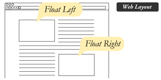
The float property in CSS is used for positioning and layout on web pages. A common usage
might be floating an image to one side and letting text wrap around it. To understand the
purpose and origin of float, we can look to print design. In a print layout, images may be
set into the page such that text wraps around them as needed. This is commonly and
appropriately called “text wrap”. In web design, page elements with the CSS float property
applied to them are just like the images in the print layout where the text flows around
them. Floated elements remain a part of the flow of the web page.
Source: CSS-tricks
The tricky part about float is that content will continue to wrap around the element until
the float has been cleared. This means you must apply the CSS property clear when you're
ready to end the float.
https://www.w3schools.com/css/css_float.asp
Flex
The Flexible Box Layout Module, or Flex, makes it easier to design flexible responsive
layout structure without using float or positioning. It also gives you great control over
spacing, alignment, and wrapping.
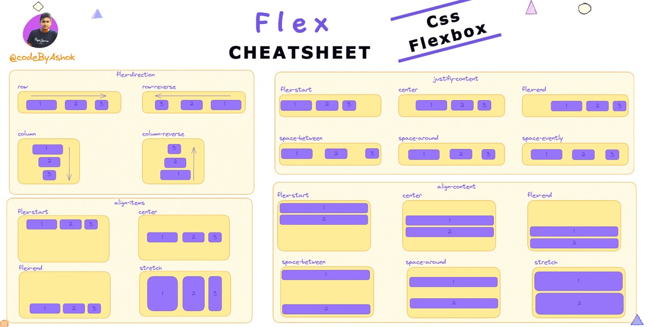
Source: @codeByAshok
https://css-tricks.com/snippets/css/a-guide-to-flexbox/
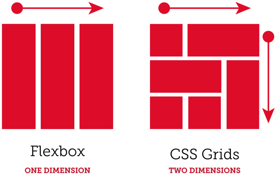
Grid
The CSS Grid Layout Module offers a grid-based layout system, with rows and columns, making
it easier to design web pages without having to use floats and positioning. Like Flex, it
gives you great control over spacing, alignmen, and wrapping. What's the difference
between Flex and Grid then? Where Flex works wonderful in one direction, the X OR
Y axis, Grid gives control over both the X and Y axis for more complex layouts.
Source: Josh
Bowen
https://css-tricks.com/snippets/css/complete-guide-grid/
Want to master grid in a really fun way? Play Grid
Garden! A game for learning CSS Grid.
Assignments
Codeacademy: Learn CSS: Responsive Design
- Complete the Learn CSS: Responsive Design
- After completing the course, navigate to your user profile.
- Take a screenshot of your profile screen that includes both your username
and course completion.
- If the course provides a certificate to completing that includes your name,
you may use that instead.
- In Slack, submit your screenshot or certificate in the
turn-in thread.
Positioning exercise (mini-project #4)
- Download the 'mini-project-4' folder.
- Unzip the folder.
- View the page and read the exercise.
- Follow the exercise instructions.
- Once complete, push your changes to GitHub.
- Add your name in the Slack turn-in.
Layout exercise (mini-project #5)
- Download the 'mini-project-5' folder.
- Unzip the folder.
- Follow along with the mini-project in class.
- Once complete, push your changes to GitHub.
- Add your name in the Slack turn-in.
Explainer CSS - Phase 2
Using your prototype, finish writing the CSS to apply your mobile design to your
HTML,
including layout and positioning properties needed to achieve the look.
The section will not be graded on the quality of your design, but on the quality
of your CSS code and how well you have applied it to your HTML. Your
complete mobile website should be finished at this stage.Your
desktop version will still not be ready.
- Finish applying the CSS needed to achieve your intended design.
- Apply layout and positioning CSS to make the visual flow of your website
easy to follow.
- Apply margins and padding so your layout has comfortable white space,
alignment, and spacing.
- Consider visual hierarchy principles.
- Don't forget to validate your code and apply any changes based on graded
feedback from earlier stages.
- Push your changes to GitHub.
- Add your name in the Slack turn-in.