Content
Design Critique
Critique is a standard part of design practice. Getting feedback from other people
early—before you're deep into building—is one of the most effective
ways to catch problems you've stopped seeing in your own work. When you've been
staring at a design for hours, it's easy to miss things that are immediately
obvious to a fresh set of eyes.
This week you'll give feedback on the Figma prototypes of at least three other
classmates. Three will be assigned to you as required, but you are welcome to look at and
provide feedback to any other project as well. The goal isn't to tear work
apart—it's to give the kind of specific, useful feedback you'd want to receive
yourself.
What to Look For
As you review each prototype, consider the design principles and concepts covered
in class:
- Is there a clear visual hierarchy? Do you know where to look first?
- Are alignment, proximity, and repetition being used consistently?
- Does the color palette feel intentional? Does it pass accessibility contrast
requirements?
- Is the typography readable? Are font choices appropriate for the content?
- Does the layout work at both mobile and desktop widths?
- Is the overall design appropriate for how a user would actually use
a recipe?
How to Give Good Feedback
Vague feedback isn't useful. "Looks good" or "I'd change the colors" doesn't give
someone anything to act on. Good feedback is specific: it names what you're
responding to, explains why it works or doesn't, and when suggesting a change,
gives some direction on what to try instead.
For each prototype you review, your feedback must include:
- A minimum of 3 things they did well — be specific about what's
working and why. "The typographic hierarchy is clear—the recipe title
reads immediately as the most important element" is more useful than
"nice fonts."
- A minimum of 3 things to improve — frame these constructively.
Describe the issue, connect it to a design principle, and suggest a direction.
"The ingredient list and instructions sections feel too crowded—
adding more negative space would help the user navigate more
clearly" gives someone something to work with.
Feedback effort should be comprehensive and done with care.
Leaving Feedback in Figma
All feedback will be left directly in the student's Figma file using Figma's
comment tool. To leave a comment, open the file, press C to
activate the comment tool, then click on the part of the design you're
referencing. This pins your comment to a specific element, which makes it much
easier for the designer to understand what you're responding to.
Leave separate, pinned comments for each piece of feedback rather than one long
block of text. It keeps things organized and makes the feedback easier to act
on.
Recipe Project: Responsive Structure
Before any visual styling goes in, the recipe project needs a solid structural
foundation: clean, semantic HTML and a responsive CSS layout that works at both
mobile and desktop widths. That's what this phase is about.
Think of it like framing a house before drywalling. The structure needs to be
right first. Trying to apply visual styles on top of shaky HTML is harder to fix
later than getting it right at this stage.
File Setup
Your project folder should be organized like this before you write a line of CSS:
recipe/
     index.html
     css/
          reset.css
          styles.css
     img/
Two separate stylesheet files are required:
- reset.css — the Eric Meyer CSS reset.
- styles.css — your own stylesheet, where all of your own written
CSS goes.
Both files get linked in your <head>, reset first:
<link rel="stylesheet" href="css/reset.css">
<link rel="stylesheet" href="css/styles.css">
Order matters. The reset runs first so your styles can build on top of it without
fighting browser defaults.
The Eric Meyer CSS Reset
Remember, browsers have their own default styles for HTML elements—margins on
headings, padding on lists, font sizes, and more. These defaults vary between
browsers, which means the same HTML can look different in Chrome versus Firefox
versus Safari before you've written a single line of CSS.
The reset removes most of that, giving every element a clean, zeroed-out
starting point. You can find it at
meyerweb.com/eric/tools/css/reset ↗.
Copy the full reset into your reset.css file exactly as-is. Don't
edit it.
Writing the HTML
Write all of your recipe content in index.html this week using
semantic HTML elements. Every content section from your Figma prototype should
have a corresponding element in the HTML. Use elements like <header>,
<main>, <section>, <footer>,
<ul>, and <ol> where appropriate.
All content should be present, including images and final copywriting; use alt
attributes on
your <img> tags. The priority is getting all
the content into the document with the right structure.
Building the Layout
Once your HTML is in place, write the CSS layout in styles.css
mobile-first. Your site must make use of flex or grid for layout for this
assignment. Start with your base mobile layout, then use
min-width media queries to introduce the tablet and desktop layouts. Leave
out all visual styles beyond structure at this stage—you're setting up the layout,
not finishing the design.
A basic starting point for a layout container might look like:
.container {
     width: 100%;
     padding: 0 1rem;
     display: grid;
     grid-template-columns: 1fr;
     gap: 1rem;
}

@media (min-width: 768px) {
     .container {
          max-width: 1200px;
          margin: 0 auto;
          padding: 0 2rem;
          grid-template-columns: 1fr 1fr;
          gap: 2rem;
     }
}
Using Colored Borders to See Your Layout
Add a temporary colored border to each major layout element. This makes your
layout visible while you're building it—you can see exactly what's
happening with spacing, stacking, and alignment without needing any background
colors or content in place yet.
.container {
     width: 100%;
     padding: 0 1rem;
     display: grid;
     grid-template-columns: 1fr;
     gap: 1rem;
     border: 2px solid green;
}

.container-children {
     border: 2px solid purple;
}

@media (min-width: 768px) {
     .container {
          max-width: 1200px;
          margin: 0 auto;
          padding: 0 2rem;
          grid-template-columns: 1fr 1fr;
          gap: 2rem;
     }
}
Use your browser's DevTools alongside this to check how your layout looks at
different screen widths.
FTP
FTP stands for File Transfer Protocol. It's a way to move files from your local
computer to a remote web server. Once your files are on the server, they're
accessible at a public URL—that's what makes a website a website rather
than just a folder on your machine or in GitHub's repositories.
You'll use an FTP client to do this. In this class, we will use Cyberduck.
An FTP client is a desktop application that connects to your server using
credentials (a host address, username, and password) and gives you a view of
the server files. You drag files from local to remote to upload them.
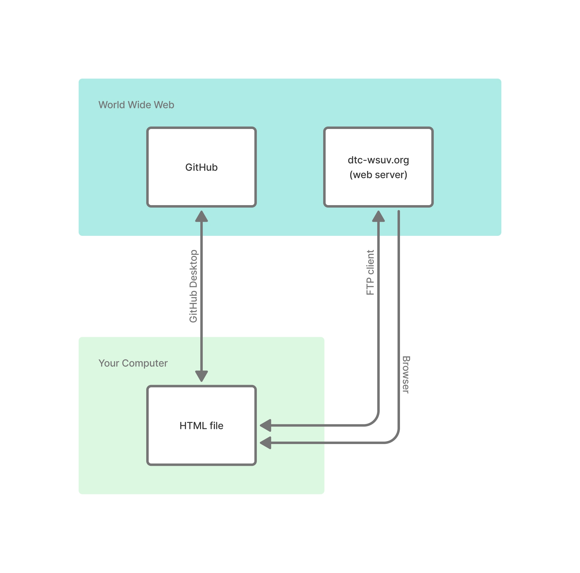
The diagram below shows how all the pieces fit together. Your files live on
your computer. GitHub Desktop syncs them to GitHub. The FTP client pushes them
to the web server. The browser can read files both from your local machine and
from the server.
Getting Connected
To connect to your student server space, you'll need three things:
- Host — the server address you're connecting to
- Username — your student server login
- Password — your student server password
Your server credentials are shared with you separately by Greg Philbrook.
Your Project URL
Your student server space has a public URL based on your username. Once you've
uploaded your project folder, your project will be accessible at:
https://dtc-wsuv.org/[username]/[project-folder]/
For example, if your username is jsmith01 and you uploaded a folder
called recipe, your project URL would be:
https://dtc-wsuv.org/jsmith01/recipe/
The browser will look for an index.html file inside that folder
automatically, so you don't need to include the filename in the URL.
File Structure on the Server
Your student server space is a public folder where files need to live to be accessible via a
browser. Files outside that folder are not publicly visible. Files inside that folder are
publicly visible.
Your local project folder structure should mirror what you upload. If your project
has a css/ folder, an img/ folder, and an
index.html, upload all of it—not just the HTML file. Broken
paths are the most common issue after an upload: the HTML made it to the server
but the stylesheet or images didn't, or they landed in the wrong folder.
After You Upload
Open a browser and go to your project's URL. Check everything: does the page load?
Does the stylesheet apply? Do images appear? If something's missing, go back to
your FTP client and check whether those files are actually on the server and in
the right location. File and folder names are case-sensitive on the server even
if they aren't on your local machine, so Styles.css and
styles.css are not the same thing.
Any time you make changes to your project files on your computer, you need to re-upload the
updated
files. The server does not stay in sync with your local files automatically.
Browser Caching
Browsers cache files—meaning they store copies of your CSS, images, and
other assets locally so the page loads faster on repeat visits. This is useful
in everyday browsing, but it can cause confusion when you're actively making
changes: you upload a new version of your stylesheet, refresh the page, and
nothing looks different because the browser is still serving the old cached
version.
If your changes aren't showing up after an upload, try one of these:
- Hard refresh —
Ctrl + Shift + R on
Windows or Cmd + Shift + R on Mac. This forces the browser
to reload the page and ignore the cache.
- Open an incognito or private window — Incognito
windows don't use the browser's cache, so you'll always see the latest
version of the files on the server.
When in doubt, check your work in an incognito window before submitting. It's
the most reliable way to see exactly what's live on the server.
Assignments
Design Critique
- Review the Figma prototypes of the assigned classmates.
- For each prototype, leave feedback as comments directly in their
Figma file using the comment tool (C).
- Pin each comment to the specific part of the design you're
referencing.
- Your feedback for each student must include at minimum:
- A minimum of 3 things they did well—be specific about what's
working and why.
- A minimum of 3 things to improve—describe the issue, explain
why it's a problem, and suggest a direction.
- There is no Slack turn-in for this assignment.
Recipe Project: Responsive HTML
Write the HTML and CSS needed for your project's basic responsive
structure. Your grade will be based on your understanding of semantic
HTML, folder structure, responsive units, media queries, and CSS flex
or grid for layout.
- Create a project folder called
recipe with the
following file structure:
index.htmlcss/reset.csscss/styles.cssimg/
- Add the Eric Meyer CSS reset to
reset.css exactly
as-is. Do not edit it.
- Link both stylesheets in your
<head> with
reset.css first, then styles.css.
- Using semantic HTML elements (
<header>,
<main>, <section>,
<footer>, <ul>,
<ol>, etc.), write all the HTML needed for
your recipe design. Every section from your Figma prototype
should have a corresponding element in the HTML.
- Write your CSS layout in
styles.css mobile-first,
using min-width media queries to introduce the
desktop layout. Your site must make use of flex or grid for layout for this
assignment. Visual styles will be minimal at this stage—focus on
structure.
- Add a different colored border to each major layout element so
you can clearly see the structure in action.
- Check your layout at multiple screen widths using browser
DevTools before submitting.
- Push your files to GitHub.
- Upload your project to your class server space using an FTP
client (Cyberduck).
- Share your live project URL in the Slack turn-in thread.