Dress for Success
Background
Dress For Success is a global non-profit with a mission to empower women to achieve economic independence by providing a network of support, professional attire, and the development tools needed to help women thrive in work and in life.
The Challenge
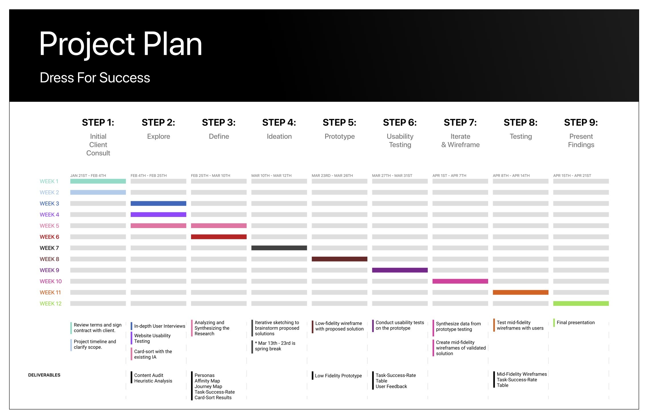
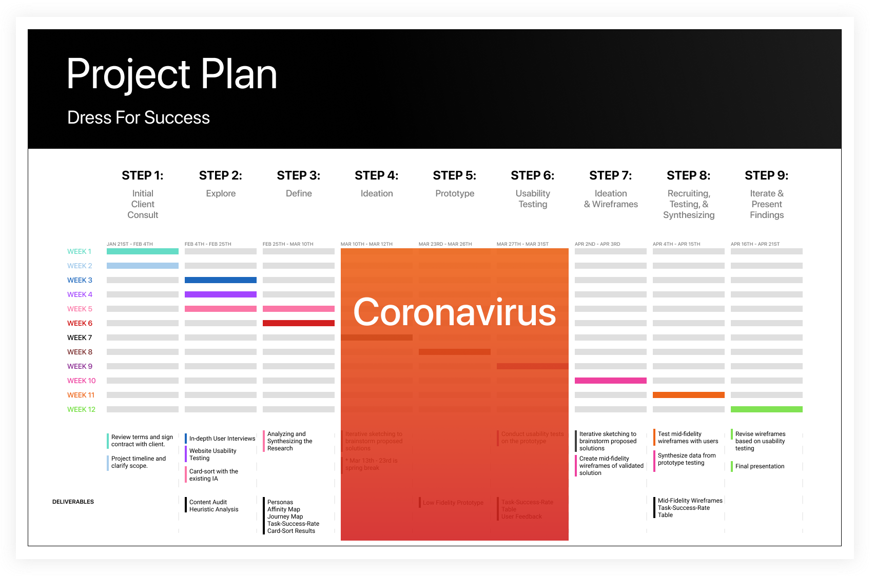
The current website had usability, organization, and functionality issues, causing friction for clients, volunteers, donors, and staff. The challenge and goal for this project was to redesign the website from the ground up in 12 weeks.
Process
Project Kickoff
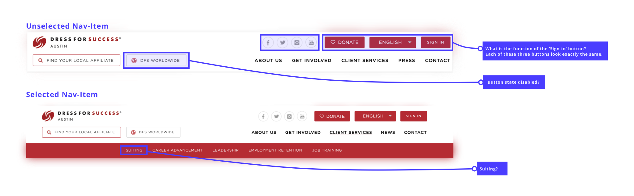
On day 1, my team and I met with our stakeholders to understand the business priorities compared to the user priorities. I began with an analysis of the site and explored what interactions existed and where there was room for further exploration. The first thing to catch my eye was the navigation. There were several links with confounding nav-titles, and buttons placed right next to each other with the same visual design.
We continued to go through each page, taking notes along the way, and narrowed in on four areas that needed the most improvement:
Stakeholder Asks:
1.
Navigation needs an overhaul.
2.
The current design does not facilitate easy browsing due to the sheer amount of content.
3.
Available client services were not clear or consistent across chapter websites.
4.
No quick paths to become a client, become a volunteer, or make a donation.
Building A Plan
Next, we began detailing our project plan and scope. As new contract designers, I realized our team hadn’t yet discussed that we were working solely off of assumptions. To form a deeper understanding of our users and their varied needs and frustrations, I proposed we begin with facilitating exploratory interviews.
After much discussion, and a promise to be swift with my interviews, my stakeholders and the team agreed with me. As a result of my user-advocacy in our first meetings, I took on lead researcher for the duration of the project.
Research
01. User Interviews
In my interviews, I set out to learn more about our four user groups and identify their pain points. I created a research protocol, which defined the product goal, described our target audience, and outlined the research goals. In total, I facilitated 8 interviews with a mix of potential clients, current volunteers, and staff members.
🕵️♀️ Research Goals:
- How have users discovered Dress for Success?
- What does the end-to-end experience look like for each user group?
- Motivations and challenges related to DFS.
- Relationship with use of technological devices.
🗒 Audience:
- Total of 8 interviewees
- New, current, and potential users.
- Donors, Staff, Volunteers, and potential clients.
- Each based out of Austin, Texas.
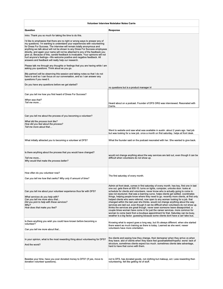
Key Findings:
We found that all of our participants had first discovered Dress for Success by word of mouth and that the majority were not particularly technologically-savvy.
Clients were quick to abandon our site because of the content overload. Most users resorted to calling rather than digging through the website to find out more information.
02. Usability Testing
Next, to set a foundation for our redesign, we began conducting usability tests on the current design to understand what was working and what was not. Additionally, we hoped to discover what the user is experiencing versus what they expected.
Participants walked me through their expectations, thought processes, frustrations, and delights. The qualitative feedback matched with the quantitative data allowed for further examination of the participant’s needs and how to best meet them through design.
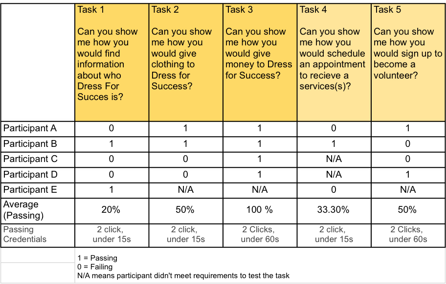
Testing revealed a major source of frustration was, as predicted, in the navigation. Our users frequently cited pain-points of not knowing where to click when trying to complete tasks. Additionally, participants often clicked in the wrong areas to navigate through the prescribed tasks and had difficulty understanding the labels and organizational structure of the page.
03. Card Sort
To further test the information architecture (IA), I conducted 6 open card sorts using OptimalWorkshop. Including the card-sort helped me answer three important questions:
Are the names of the current navigational links on the live site understandable?
Do the navigation labels accurately convey content?
Is the content organized in a user-centered manner? In other words, how easily can our users navigate the website — does the IA match our users’ mental models?
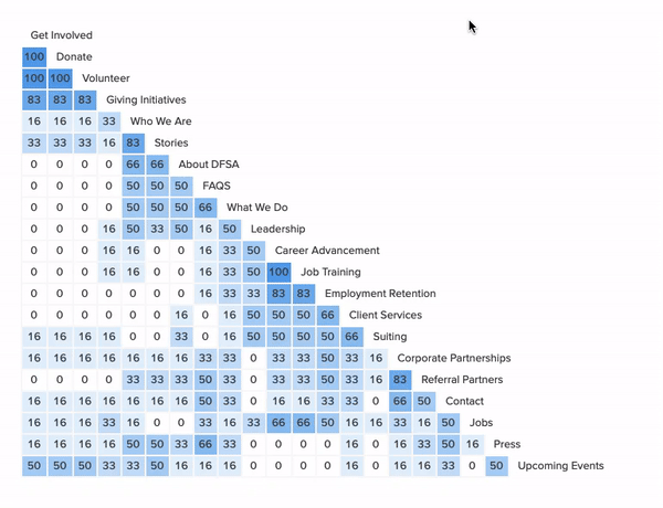
The card sort data showed users organizing the IA much differently than it was on the live site. These findings in conjunction with the previous research (usability tests and generative interviews) supported our assumption that the website’s current IA was not matching our users’ mental models, and was actually the primary cause of our users’ frustrations.
Empathize
Analysis & Synthesis
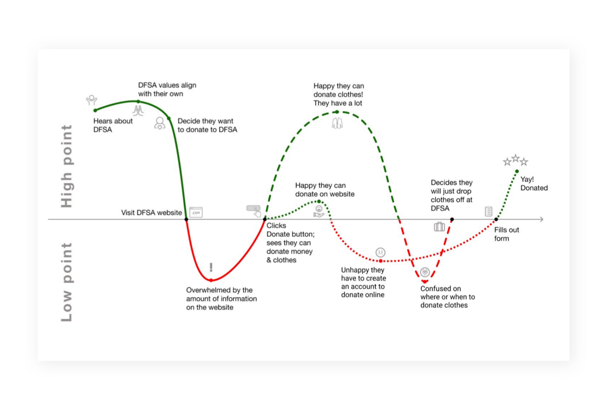
After research was wrapped, I reviewed and analyzed the qualitative feedback and quantitative data, using spreadsheets, affinity maps, and empathy maps to form an aggregate of distinct themes that arose from the compiled research.
Affinity Mapping on Miro
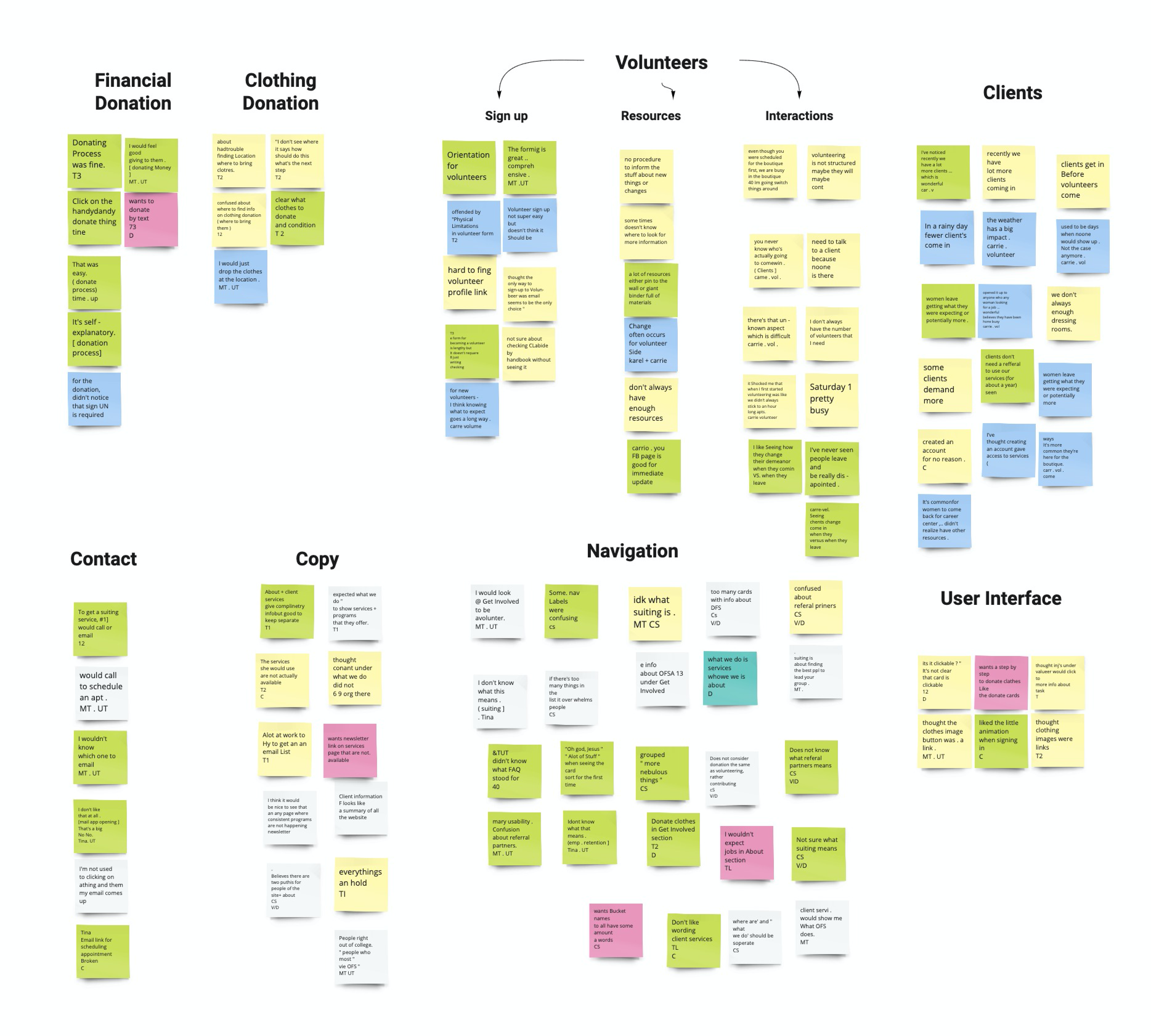
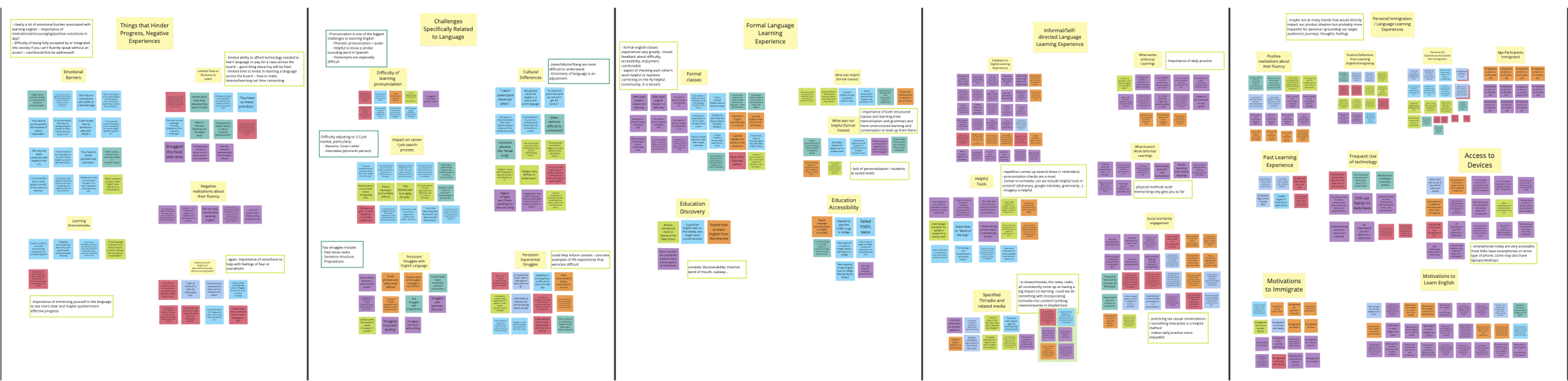
To synthesize, my team and I constructed various artifacts including 4 user personas and 4 user journey maps, which we later presented to the stakeholders. The research artifacts helped the stakeholders (who, notably, are already altruistic, wonderful people) gain additional empathy for our users.
Ideation
Collaborative Workshop
We were ready to begin ideating! My team and I proposed a collaborative ideation workshop with our stakeholders. We wanted to keep them integrated and informed in as much of the design life cycle as possible to avoid any miscommunication and stay within our timeline without any hiccups.
COVID-19 made an appearance, causing Dress for Success to temporarily close their doors. With the entire world being put on pause, our ideation dreams were the last thing on our stakeholder’s minds.
Our team needed to adapt, adjust our workflow and the distribution of tasks, refashion the project plan, and ideate new ways to ideate remotely.
Solution: Remote Ideation
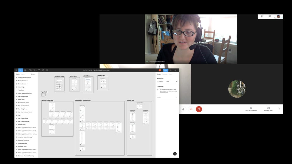
Instead of abandoning our ideation and design sprints completely, we pivoted to remote workshops by using a combination of Figma and frequent remote meetings.
These exercises formed a great foundation to move into feature ideation and prioritization. We were able to conduct a number of ideation exercises remotely (crazy 8’s, iterative sketching) and bounce each designer’s ideas openly and efficiently. This type of feedback session would become the basis for all of our design sessions moving forward.
Design
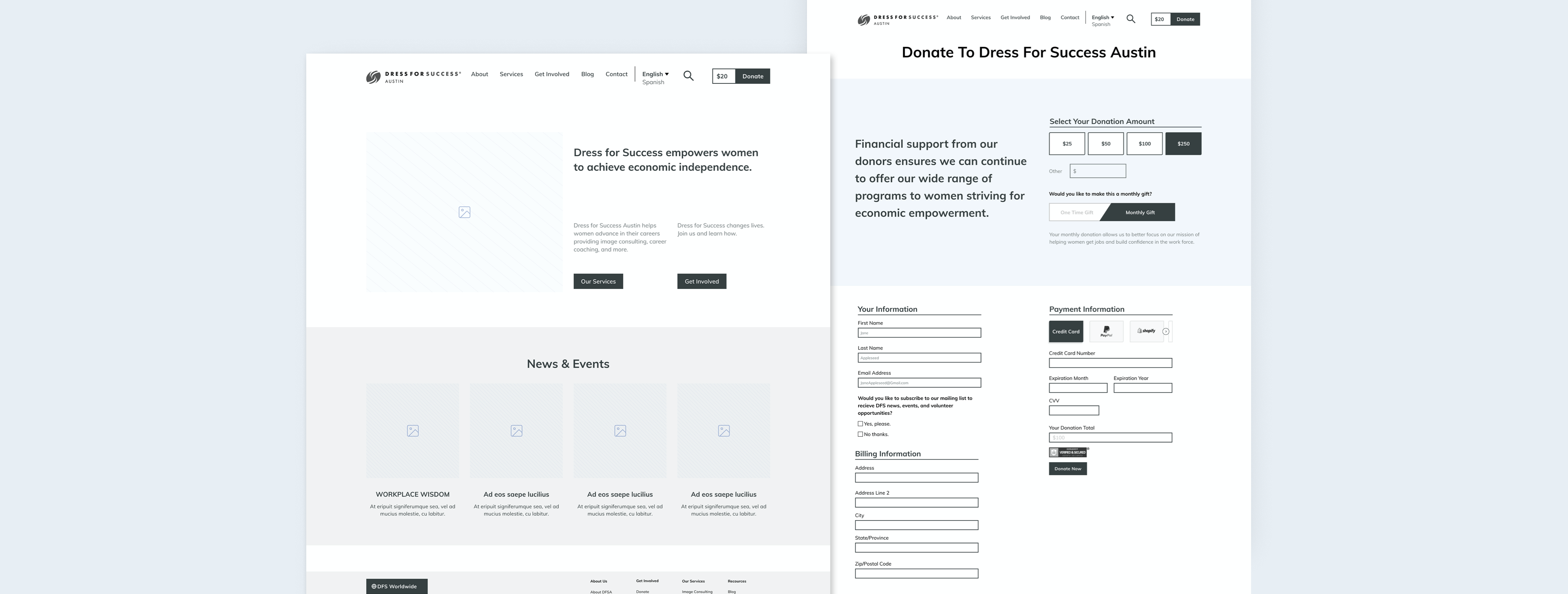
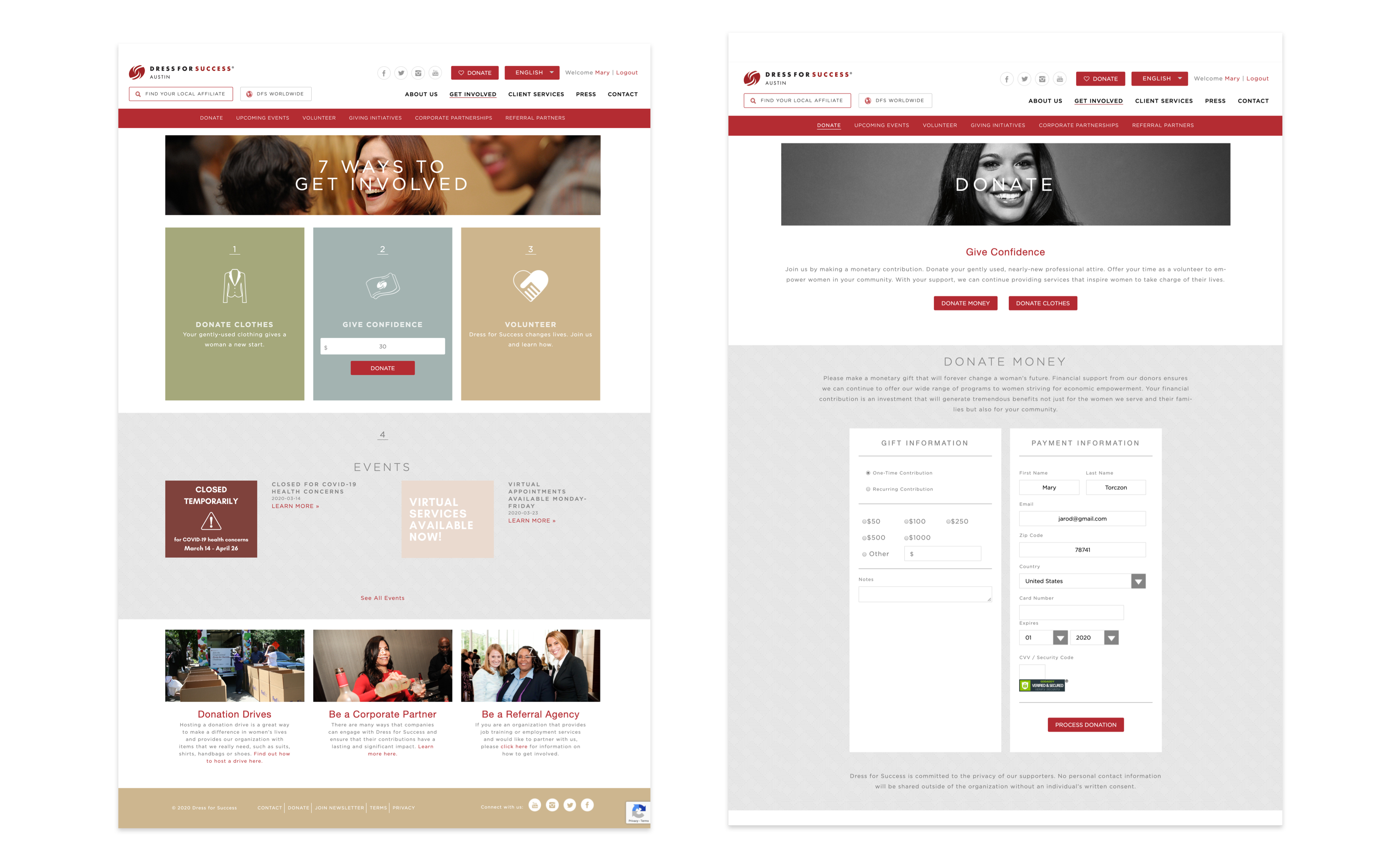
The Prototype + Testing
Through close collaboration with my team, I was able to accurately communicate subtle but necessary interactions I wanted to design. I was also able to fine-tune the complexity of the navigation and eliminate extraneous features for the website.
To validate our research and design, we recruited candidates from our target pool for user testing. Once again due to the pandemic, we conducted 6 remote 1:1 usability testing by sharing our screen and maintaining mouse control over our Figma prototype. We prompted the users with task scenarios and a “think out loud” approach.
Impact
Through conducting several usability tests on the final mockups, I compared the findings to the original designs and determined there was a:
70% increase in task-success rates
75% increase in user satisfaction (based on the Likert Scale)
20% decrease in drop-off rates (for volunteer & client sign-up)
Learnings...
Interviewing and testing with a variety of Dress for Success users revealed they’re all clearly passionate about the non-profit, however, I also found the majority of our clients were not necessarily technologically savvy. This meant I had to design the user flows as intuitively and efficiently as possible based on the user feedback. Without having conducted the generative research in the beginning, these insights would have stayed invisible. The interviews and card sort testing gave the team raw data displaying our user needs and frustrations, allowing my team and stakeholders to build empathy with the multiple user groups.
Overall, I was able to take complex design challenges, with countless constraints, and flex my communication skills to break each down into actionable solutions. With the combined efforts of our UX team and the stakeholders working so closely with each other, this project was a learning experience in acknowledging constraints yet still finding a way to be flexible and design a product with an improved user experience (even in a pandemic).