Chocolate Branding Project
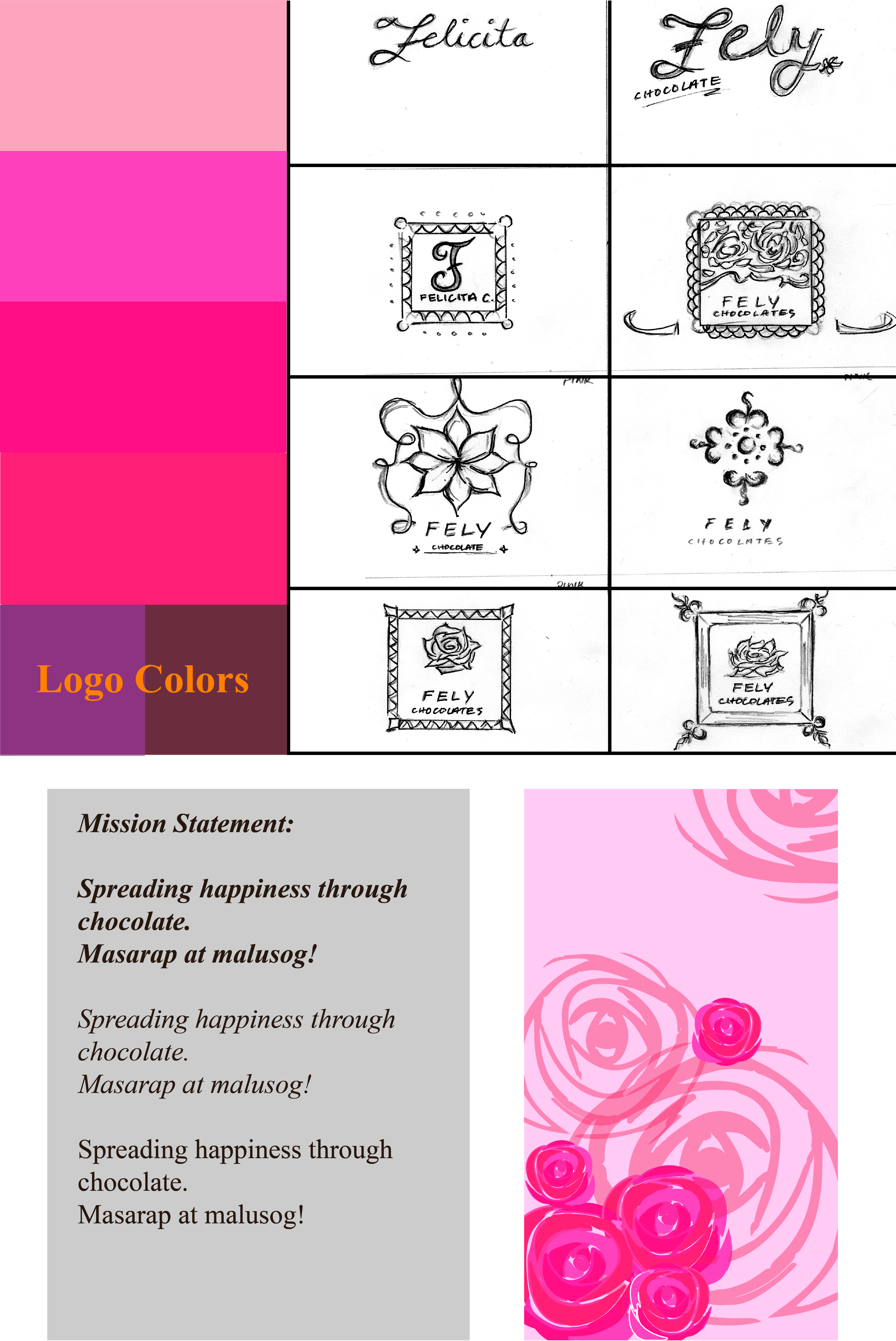
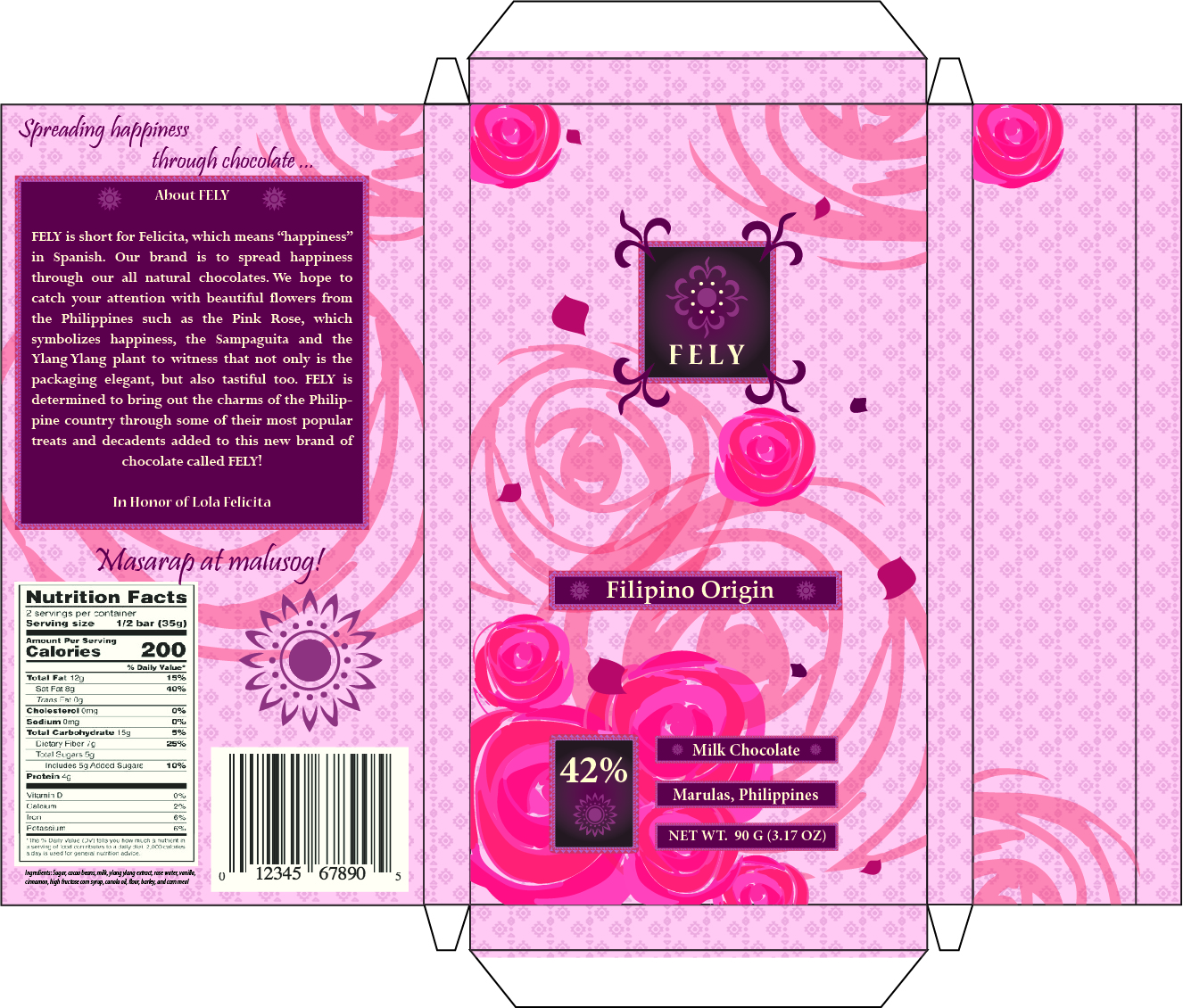
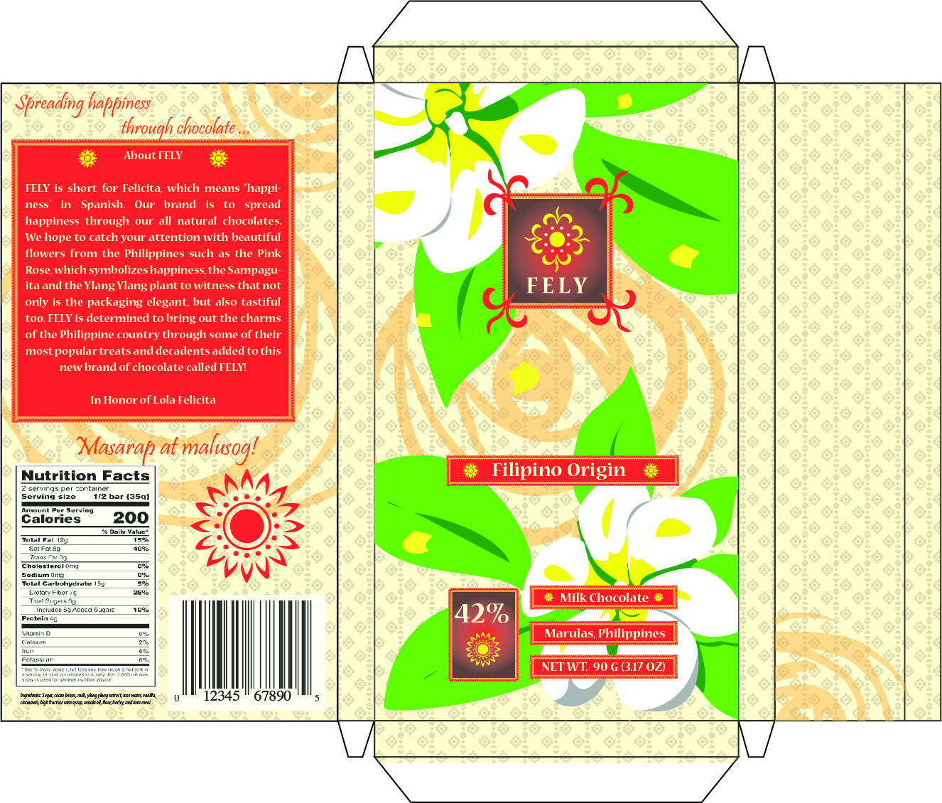
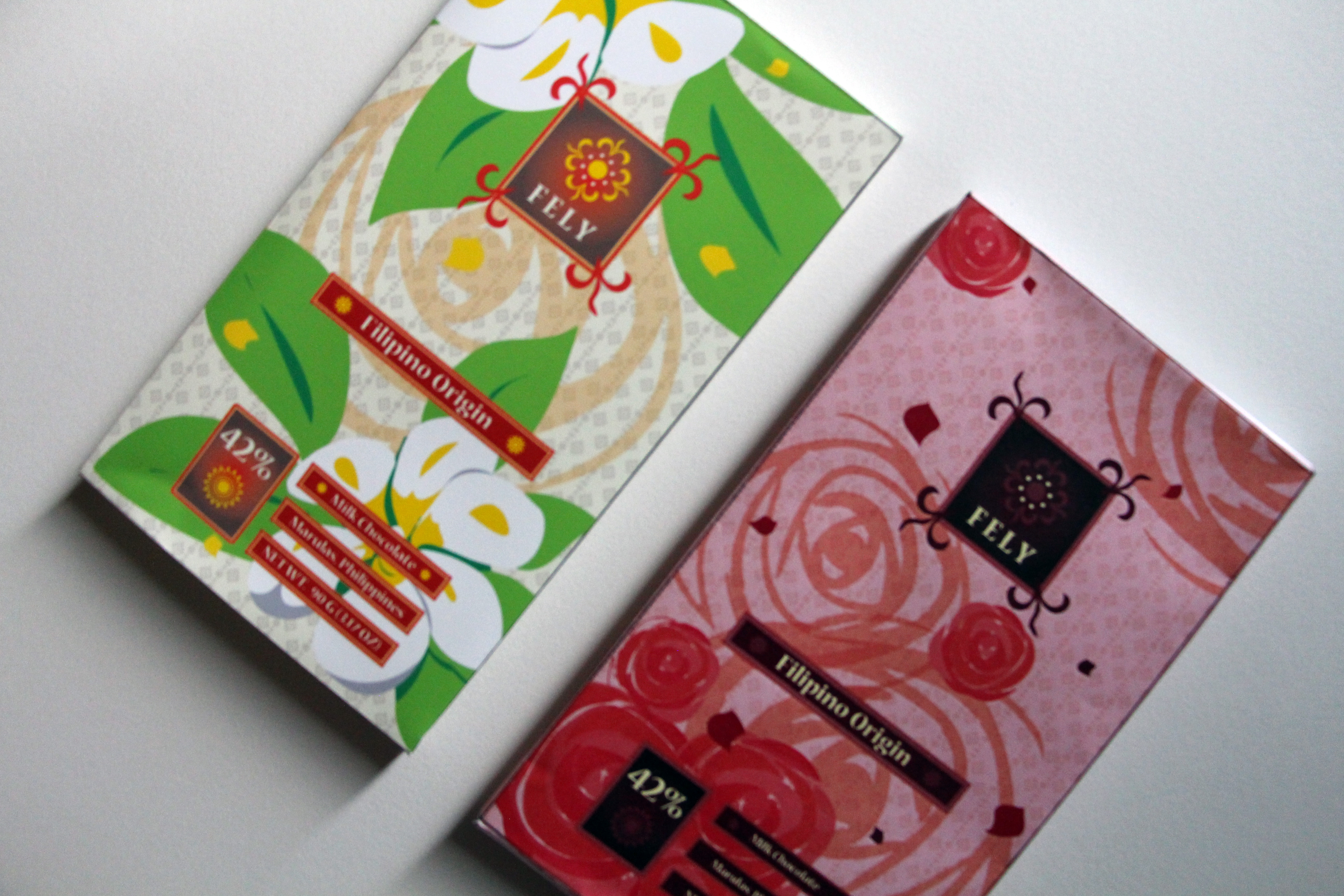
These images show the steps of my package design that I created for a graphic design course in Clark College. Preliminary sketches and color schemes follow immediate production into Adobe Illustrator.
This project focused on creating a chocolate package design based on a region of my choice. I chose The Philippines. I created a package design that revolved around the flowers of The Philippines, like the sampaguita, while dedicating it to my grandmother who has passed. Her name was Felicita, which in Spanish translates to happiness. The pink rose and bright yellow of the sampaguita both represent happiness.

Guestbook Design
My sister had her wedding on May 18th, 2019 and I asked if I could create designs for some of her sign posts. A simple design with floral retouches to accentuate the spring season.

Narrative Project
This project focused on creating a narrative soley based on a cover design for an imaginary comic. This narrative I created was about a simple lady in a city who secretly lives a lavish lifestyle no one knows about.

Logo Design
*NOT OFFICIAL* This project focused on creating a logo only using shapes. I went for a floral look and tried to make it unique, yet not be so complicated because simplistic designs look best when resized.

Abstract Cover Design
This project focused on creating a unique outlook for a destination specifically in the Pacific North West. I chose to make a design on the Tulip Fesitval that occurs in Seattle and around the Woodburn area during the spring. I was trying to capture the vibrant atmosphere while still showing beauty of the tulips.
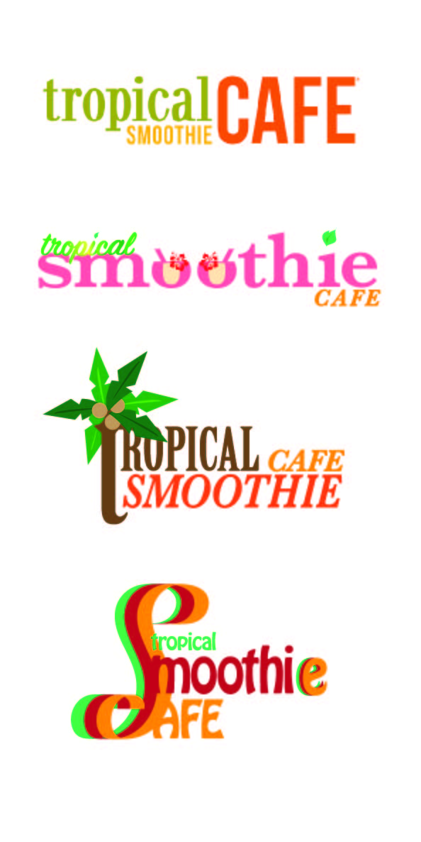
Branding Re-Design
This project focused on re-creating a brands logo. I chose to recreate the brand "Tropical Smoothie Cafe". The original logo is on the top while the rest I created. Personally, the original still looks the best, but it was an enjoyable project none the less.