“My Boyfriend Came Back From The War” is a very interesting hypertext story. It starts off as one big screen, and as you click on images or the hypertext links, the boxes split up and become smaller and smaller. At the “end” of the story, all the boxes are just black boxes with white outlining with no text or images inside. The story is about a man who comes back from some type of war and him and his girlfriend are having various conversations depending which links you choose. In one area the boy proposes to her, and they decide to get married the next month. In another, it is revealed that while he was away the girlfriend cheated on him with the neighbor, and then begs her boyfriend not to kill him. It’s interesting because there isn’t much storytelling going on, a lot of it is up to reader interpretation. The few lines of dialogue there are in the story rarely have more than a few words. I also like the use of the images as links as well, such as the different clocks and the images of the couple. It’s possible I just went through the story wrong, or wasn’t able to figure out how to explore it to its full extent, but for the most part there didn’t really seem to be that much of an option for the reader. It seemed once you starting working your way through a box, even if there were different options they would all lead to the same place. I guess it could be seen as multilinear based on which box you choose, as each one can be perceived as a different storyline. However the way I looked at it they were just multiple different conversations that went on after he came back.
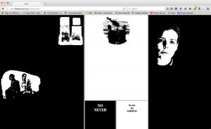
Like most hypertext, this confused me. However, I did really enjoy the aesthetic used of the boxes slowly getting smaller and smaller as you progressed through the story and were able to make different choices. I think I got the main idea of what the story was, as well as some of the more important outcomes for the storylines. Like I said above, I also enjoyed the relationship between the images and the pieces of text in this. It really feels like it blends together that much better and I love in the beginning that you click on the image of his face, and then once it splits up you have the option to click on his face again. I like the grainy black and white style the pictures have going on, it makes the story have more of a sinister feeling to it, almost like you’re not getting the whole story of what’s happening between the two (which I don’t believe we are, I think there’s much more to the story). It’s different from other pieces we’ve seen in the past because usually you pick one story and pursue it, and if you want to pick a different route you start over. This one you can go through every single route right after each other without having to restart or go again, since they’re all on the same page.
“I like the grainy black and white style the pictures have going on, it makes the story have more of a sinister feeling to it, almost like you’re not getting the whole story of what’s happening between the two (which I don’t believe we are, I think there’s much more to the story).”
Yes. The stark images and the black give the visual context for filling in the blanks of the story.