
Websites in the early wildcatting days of dial up modems filled our monitors with zany repetitive tile pattens and delighted us with dancing hamsters and talking cows. We could program a parallel narrative in the status bar and emulate pages turning with Java Applets. A trail of ants could follow our cursor across the screen. We claimed we hated the <blink> even as we coded it in our pages.
It didn’t take long––once corporations saw the value to be had from the Web––before the rowdiness of our explorations into this new frontier was gentrified. The F-shaped layout. The 6-second rule. Analytics and conversion rates. Missing images, misspelled words, miscalculated resolutions all fixed in the formal code review. Rawness polished off the front end. Does anyone remember Geocities of the 1990s? [1] You are indeed lucky, my friend. It was this nostalgia for the off-beat and exploratory that drove the re-design of John Barber’s Re-Imagined Radio website.
Re-imagined Radio is a research project about sound-based storytelling, writ large. Originally envisioned in 2013 with a focus on archiving and hosting performances of old-time radio, it morphed to add experimental sonic mediums that include transmission art, sound walks, soundscapes, and sound poetry, among others, and began distributing its contents as podcasts. It broadcast locally in Vancouver, WA and Portland, OR on low transmission stations (KXRW and XRAY-FM) and made its contents readily available for listening via the website itself. Over the years, it aired broadcasts of Framework Radio and expanded its reach vertically down the Western continental coastline from Nome, Alaska (KNOM) to Sonora, CA (KAAD-LP).
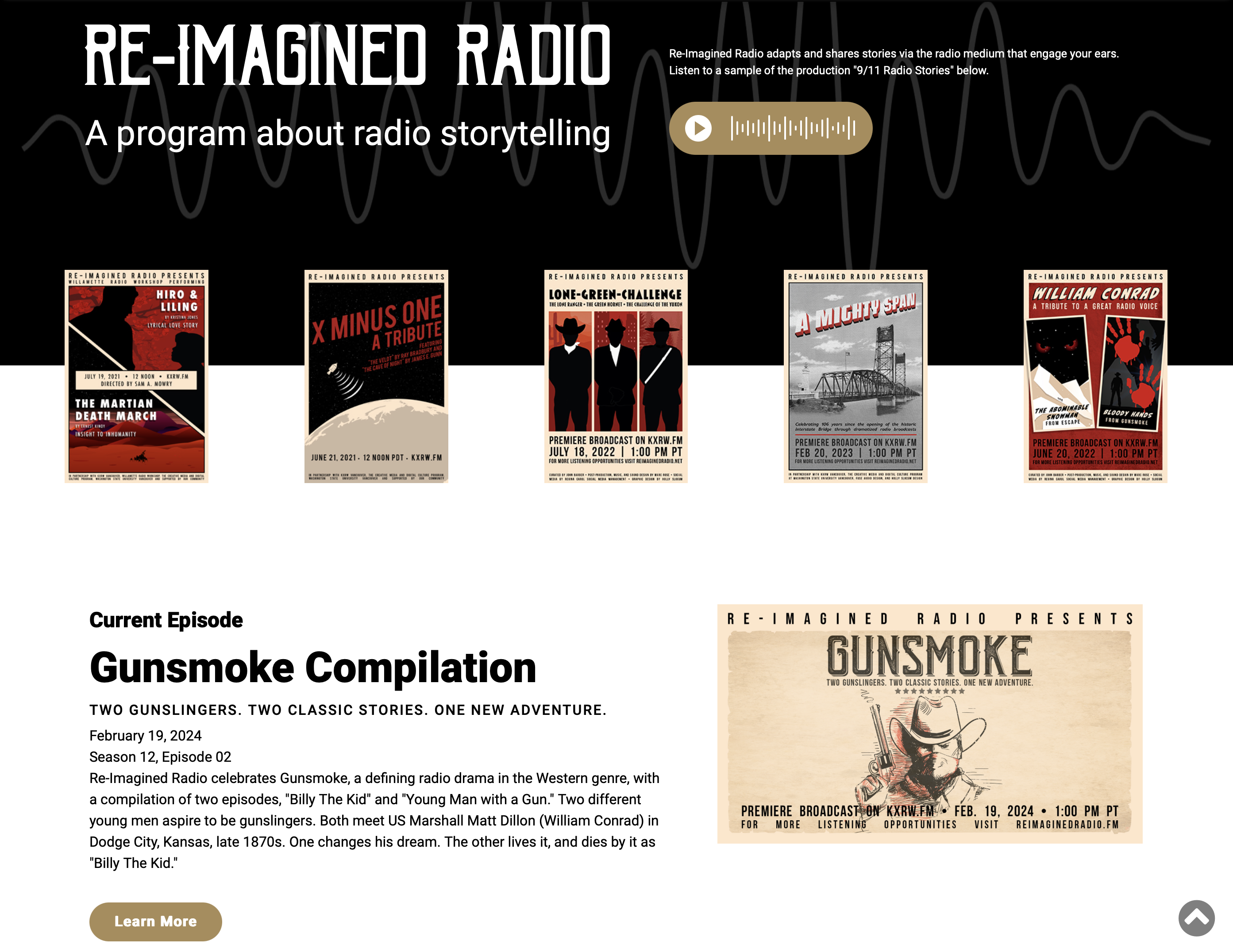
Because it started as a venue for promoting early radio broadcasts for a contemporary audience, its website reflected the aesthetic of the 1930s and followed the best practices of web design for commercial sites of the 2020s. Its move to YouTube, encouraged by Re-imagined Radio’s Rylan Eisenhauer, began to shift it toward a wider audience––the project’s tagline, “nothing to see, everything to hear,” thumbing its nose at the visual culture represented by the platform.
But the new direction Re-imagined Radio had taken required for its website to change. It needed something different, something edgy, something more playful.
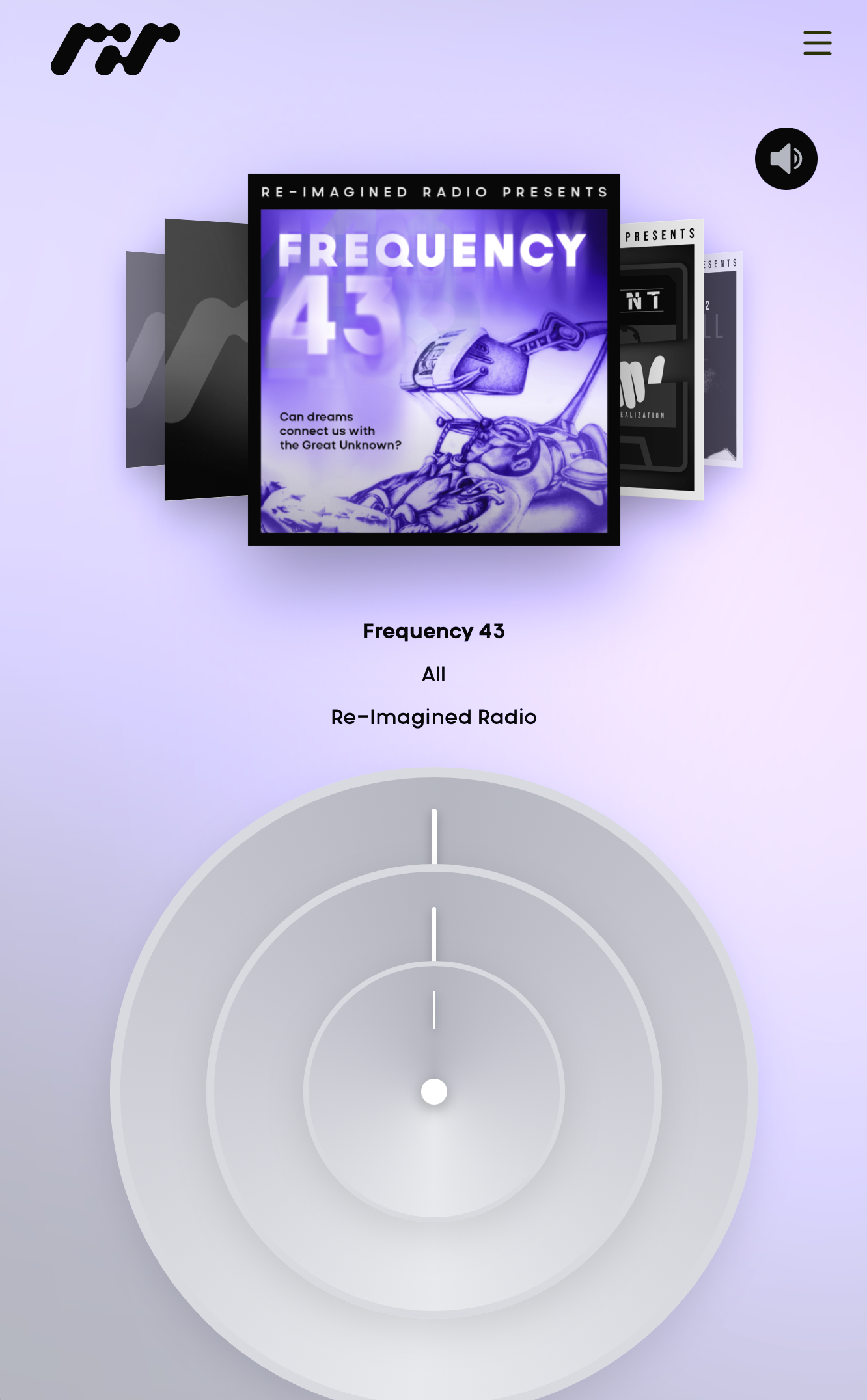
This is where Holly Slocum, the Senior Designer of the Electronic Literature Lab, entered into the scene. Inspired by nascent Web design and the wheel interfaces of the early generations iPod, Slocum set out to create a site that reorients nostalgia for these approaches toward a decidedly avant garde look. She shifted the color palette from the heavy emphasis on red, black, and white to bright purples, oranges, and yellows of cathode tubes. The interface cajoles users to spin the three wheels to discover and select episodes, genres, and channels. The rich metadata that formerly created a text-heavy experience for users is now punctuated with calls to action: accessing the episode script, tuning to a specific section. Even when encountering the content, users find the pages are further organized visually so as not to be overwhelming to the eye. Space and font sizes are used deftly. The site was programmed by the lab’s Greg Philbrook, whose prowess with Javascript made the functionality possible.
It is the most amazing website. See for yourself: https://www.reimaginedradio.fm/
Notes
[1] “One Terabyte of Kilobyte Age: Digging through the Geocities Torrent,” https://blog.geocities.institute/archives/7196.