To Do This Week
- Work on Blackbird Project CSS designs
DUE: February 18 (next Tuesday class – there will be time to get my help in class) - Work on Info-Card Visual Hierarchy
DUE: February 14 (this Weekend)
Notes
Mandatory Midterm Meeting (5%) – DUE by Tuesday Feb 25th
Please set up a mid-term Zoom or in-person meeting with me by messaging me on Slack. This meeting is to check in about how you are doing so far with HTML and CSS.
Below are my times to meet. You can either set up a 30 minute slot or just 5-10 minutes if you are feeling comfortable with the material so far. For longer sessions, we can meet on Zoom. For shorter, we can meet after class.
My Availability:
After class, for short 5-10min meetings.
For longer meetings (15-30min):
Zoom MTWTHF – 12:00pm- 2:00pm
Office Hours in #26 – T 4-5pm, W 3-4pm
Validate!
https://validator.w3.org/
web developer: chrome ext
Info-Card Class List
Blackbird Class List
CSS Review
Background Images
- CSS3 Background Images
- Background-size
background-size: 100%;background-size: cover;background-size: contain;
CSS Positioning and Layout
CSS Layout
- CSS Positioning
position: fixed;(relative to browser window)position: relative;(relative to itself)position: absolute;(relative to parent)
- Mr. Potatohead: Extra credit (3 points) for completing with
position: absolute;, uploading to the server, and sending the link.
CSS Grid and Flexbox
Practice: Flex-Grid Demo
Blackbird CSS Design (10%)
Due: Feb 18
Apply CSS for the final site design. Include:
- A cohesive color scheme using Adobe Kuler
- A background image
- Thoughtful typography
- A basic fixed-pixel layout
- Formatted CSS (proper indentation)
Note: Effort counts! Extra credit will be awarded for designs reflecting the poem’s meaning.
Checklist Before Submission
- Validate your project (HTML and CSS Validator)
- Use a color scheme with good contrast
- Add
alttext to images - Style links
- Format HTML and CSS code for readability
Ensure the following are included from last week’s Blackbird HTML assignment:
- One external link (e.g., Wikipedia page)
- One internal/anchor link (e.g., from author name to #bio)
- One image insert (images inside an “img” folder)
- Formatted HTML
- One external stylesheet (styles.css)
Visual Hierarchy Demo
Student Info-Card Designs:
- https://dtc-wsuv.org/sguo23/info-card/
- https://dtc-wsuv.org/gsinghose24/info-card/
- https://dtc-wsuv.org/egebhart24/info-card/
- https://dtc-wsuv.org/qmelton24/info-card/
- https://dtc-wsuv.org/gsinghose24/blackbird/
- https://dtc-wsuv.org/ivalderrama24/blackbird/
Visual Hierarchy Primer:
Difference: where the eye is drawn
Repetition: where the eye sees pattern and context
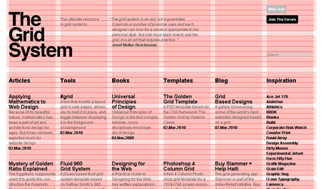
Grid System:
- proportion, alignment, balance
- to grid or not to grid?
- use grid paper for your sketches!
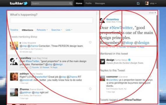
Golden Ratio Calculator (multiple or divide a width by 1.62%) : total length a + b is to the length of the longer segment a as the length of a is to the length of the shorter segment b
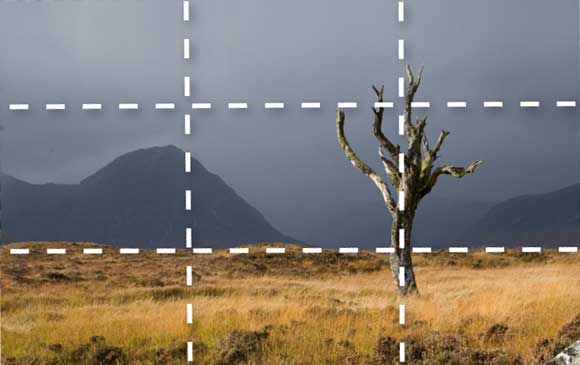
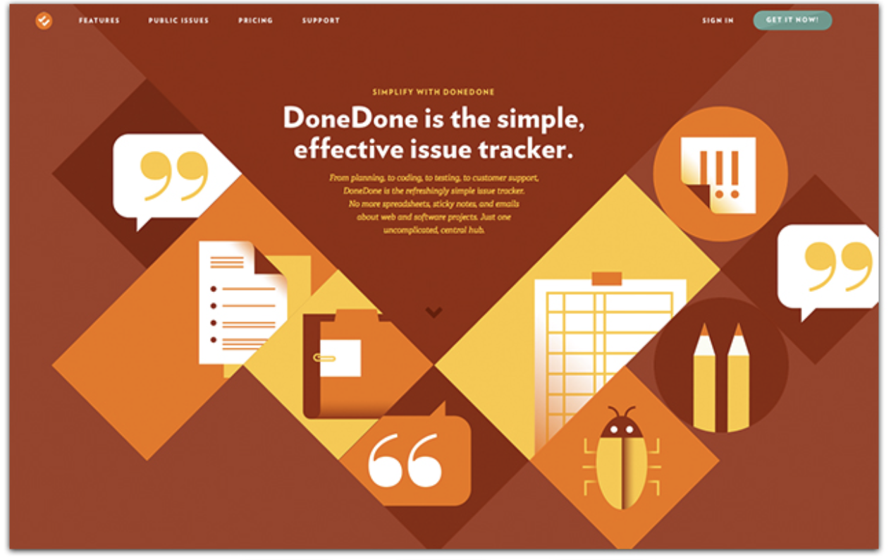
Layout examples:
Texture and Imagery:
Applied Web Color
web color values: RGB, 0- 255
rgba. “opacity” vs rgba
ImageColorPicker – get color scheme from an image
Typography
Rules of Thumb:
- chunk text (analyze the text)
- organize text for visual hierarchy, create difference and repetition
- organize for rhythm and tension (explore what baseline rhythm is)
- choose 1-2 fonts (make differences with weight, size, style, color)
- create difference in text areas (contrast, proportion, space)
- keep line length to 45-90 characters per line or 10-15 words
- use padding on text boxes with borders
- for text body, use CSS rules: “line-height: 1.5;” and “text-align: left”
- create strong lines of continuance (verticals, rule lines, borders, gutters and alignment)
- avoid underline and bold for emphasis ( italic is best)
- repeat styles for similar semantic elements to create repetition
Typography Basics:
- use “em” values for font-sizes
- CSS properties: color, font-size, text-align, letter-spacing, line-height, font-weight, text-shadow, text-transform : typography css reference
- add padding to text boxes – move away from borders
- Lorem ipsum
- Entity Code – A Clear and Quick Reference to HTML Entities Codes
Working with Fonts
Typography assignment, by former student Natalie Hendren
WORKSHOP
