Game User Experience (GUX)
An Augmented Reality (AR) game 🗗 with a historic focus that highlights the amazing growth and development of Vancouver, WA and digital engagement website. Assisted Web Dev team by providing critical analysis of Information Architecture and offering suggestions of best practices on numerous occasions.
In the Creative Media and Digital Culture program's Senior Seminar class, we collaborated on a competitive analysis that allowed us to see what kinds of games were already on the market and tried to decide what type would help support The Historic Trust's 🗗 mission to educate local younger generations about the events and major influencers of the development of Vancouver, WA. We eventually decided that a Citybuilder type of game would best allow people to express their creativity and unlock greater and greater challenges while learning about their local history and culture.
Staying Lightweight with WordPress
After we decided as a class on what type of game we should make, we broke into teams to start determining what we would need to create in support of the project. In the Web Dev team, we started right away with sketching out what The Historic Trust's new website for the project should look like as well as a site for the Senior Seminar teams, which we would call the gig site. Since the client's existing website is on a WordPress installation created by another consulting company, we knew we would need to build their site on their server using the same theme, which was Jupiter6.
I served as a voice for Usability and Accessibility by providing critical feedback and direction in terms of best practices and idea creation, such as that we should only use the least amount of plugins and JavaScript as needed to intergrate the required features. We all have learned the importance of page load speed and ease of use, especially in relation to mobile UX, which can be hampered when a dev team decide to add all the bells and whistles possible.
User Experience Planning
Although I was embedded in the Web Dev team, I knew from the start that I wanted to go into User Experience and specifically focus on Usability. I was allowed to contribute to the class and my respective team as anyone normally would but also to seek out tasks and problems that I could help with relating to my career goal. I created a UX Recommendation 🗗 to help bring awareness of how UX fits in with the project overall and to make some suggestions about UX methods we could use.
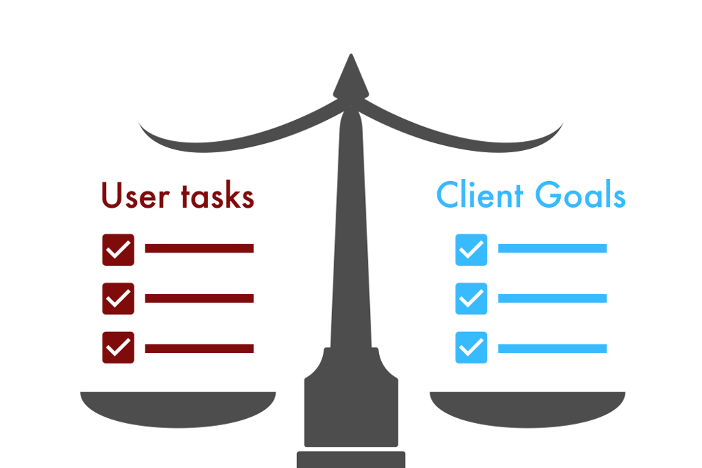
We didn't have a lot of time to work on this project (one semester, which is about 16 weeks), so I had to be careful what UX methods I recommended and invested precious time in preparing for and performing. I created a survey to gather first impressions of the game from my classmates who all were supposed to be playing each weekly build. I compiled a list of UX Heuristics 🗗 and VR Principles 🗗 to help anyone who needed some guidelines to asses their work. After researching how to conduct a Usability Study 🗗, I created a document to help prioritize the necessary user tasks and client goals 🗗 for the game and websites. and planned and executed Usability testing with and without users.
UX Results
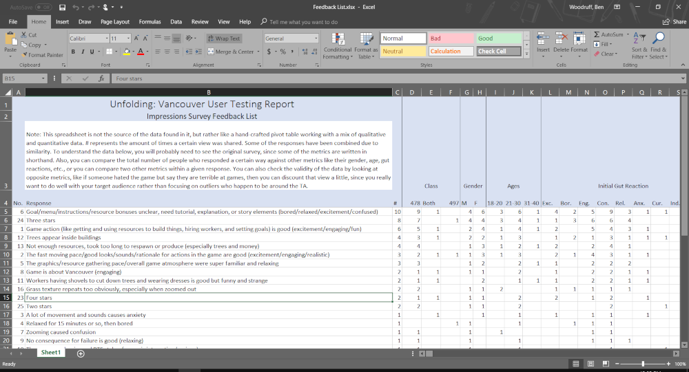
I created two spreadsheets that better organized and presented the data acquired through user testing and the impressions survey. The first presents the issues found in user testing 🗗 by grouping similar problems into categories and a severity score of either critical, serious, or minor, along with a few demographics and suggested solutions. The second spreadsheet (pictured above), presents various sentiments gained from the impressions survey 🗗 that shows the relationship between the opinions, demographics, and user preferences.
UX Deliverables
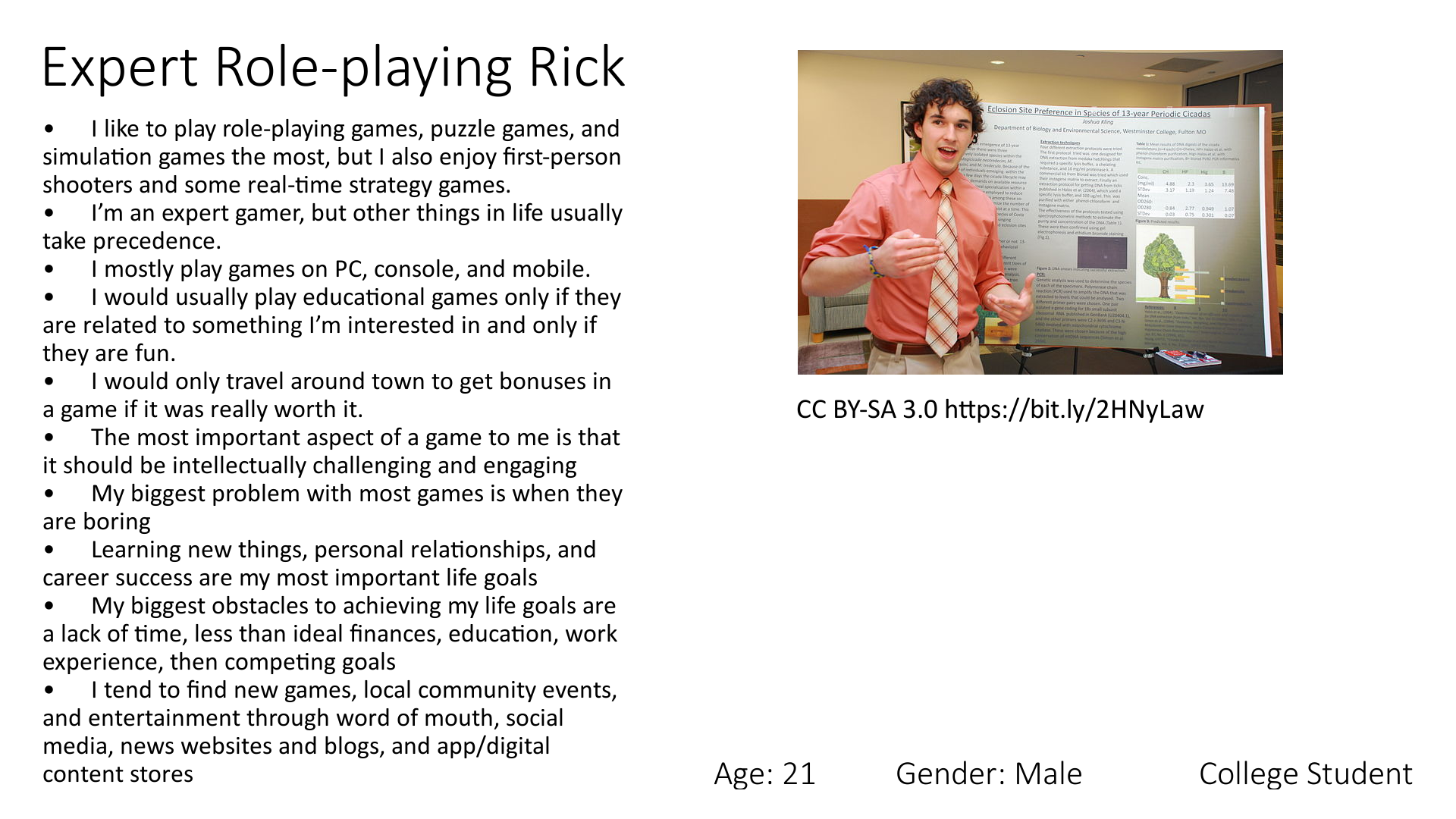
To help the CMDC develop a better way of gaining valuable information about their target audience (in this case, college students), and then present that information in a way that helps effectively direct development along the appropriate lines of user-centered design, I created a Persona document based on the aggregate of the most common sentiments, demographics, and user preferences gained from the impressions survey.
I intentionally set up the survey to gather this information, which should typically be known before conducting user testing and beginning development, so that I would have sufficient data to craft an accurate repsentation of the typical college student. The purpose of this exercise was to demonstrate the futility of trying to design a product for a user you don't really know, and then to provide the needed info so future development can begin in the right direction.
Conclusion
The result of our work was an enjoyable game that also educates and helps users get more connected to their community, two websites related to the project that are easy to use and accessible, and a plethora of original scholarly documentation that provided the foundation for developing a UX strategy as well as narrowing down which methods to adopt for evaluation and testing.


