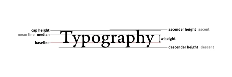
I would like to make the website as usable as possible this would include the implementation of the F-shaped reading pattern and the use of visual hierarchy to help the site look great, but it is not enough for the site to look great as the site needs to be usable to minimize frustration to the user. I can accomplish this using CSS which is a style that is applied within HTML. I can use typography for readability as the right font will help, as the typographic quality is determined by the way the text looks. Make sure the text looks good, then worry about the rest of the text later. We need to make sure the point size is 15-25 point on the web. The line spacing would also need to be readable at 120%-145% to be readable, which should be double spaced. Line length should be 45-90 characters per line as we don’t want huge lines of text. Font choice should reflect the best readable experience. The reading says to not use free fonts, however, In the CMDC program we are taught the opposite as the only fonts I have used are free fonts. From Google Fonts and possibly system fonts that can be downloaded from the internet. However, the reading told us to ignore system fonts and I agree with that statement only because fonts like Helvetica are hard to find on Windows PC and Google Fonts. Someone in my group suggested this font but since this is a system font on Apple Devices, it makes it hard to collaborate on designs for the web.