Low-fidelity Website Redesign
A website redesign project that focuses more on function over form, user patterns of thinking rather than eye candy. Using basic online drawing tools with reusable, custom UI elements, I created rough mockups based on improved Information Architecture that speeds up rapid iteration in design and devlopment.
The Ling's Cars website is a classic example of an unusable website according to industry best practices. However, in spite of Ling's peculiar site design, she manages to have a successful business with many seemingly satisfied customers. People even seem to enjoy the site, probably because of the strange and unique character of its contents. It was crucial in this case study to envision how to truly improve the site without removing all of its eccentric cultural elements.
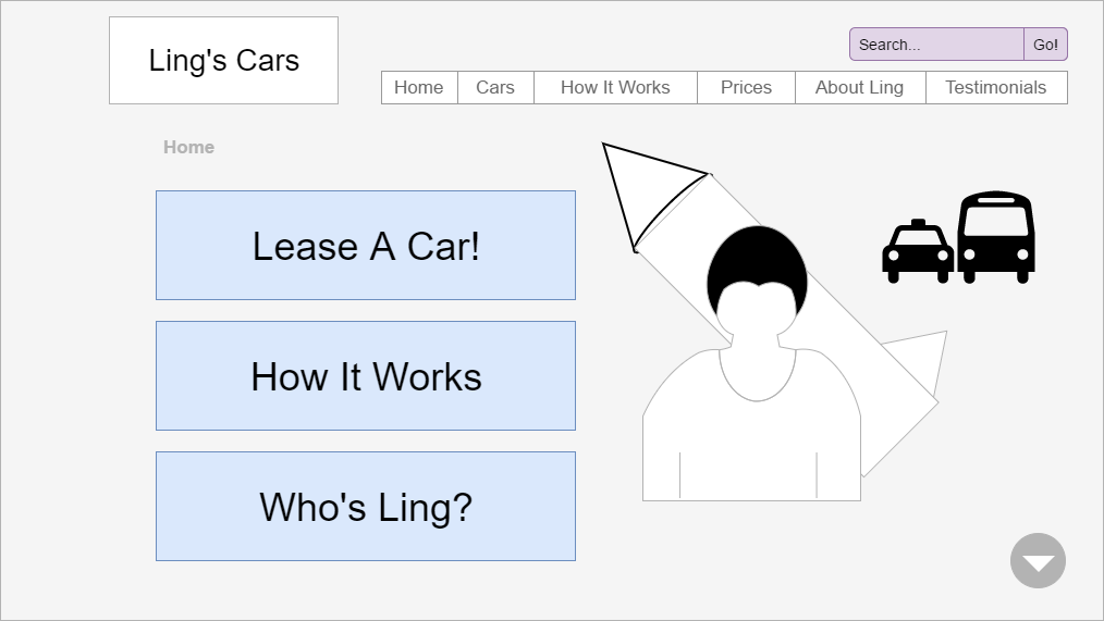
Unlike my high-fidelity website redesign project for the Oregon Wildlife Safari, this work is meant to get the ball rolling in the right direction from the very start, which helps save time and money before ever starting to code in a total overhaul like this. For the above illustration, which represents Ling's new home page, I wanted to prioritize only three main actions that would be crucial to both the user and to Ling, which would help make it much easier for everyone to accomplish their goals. This would still allow plenty of room for her distinctive creative content and design elements while helping focus the user experience.
Wireframes Save Time and Money
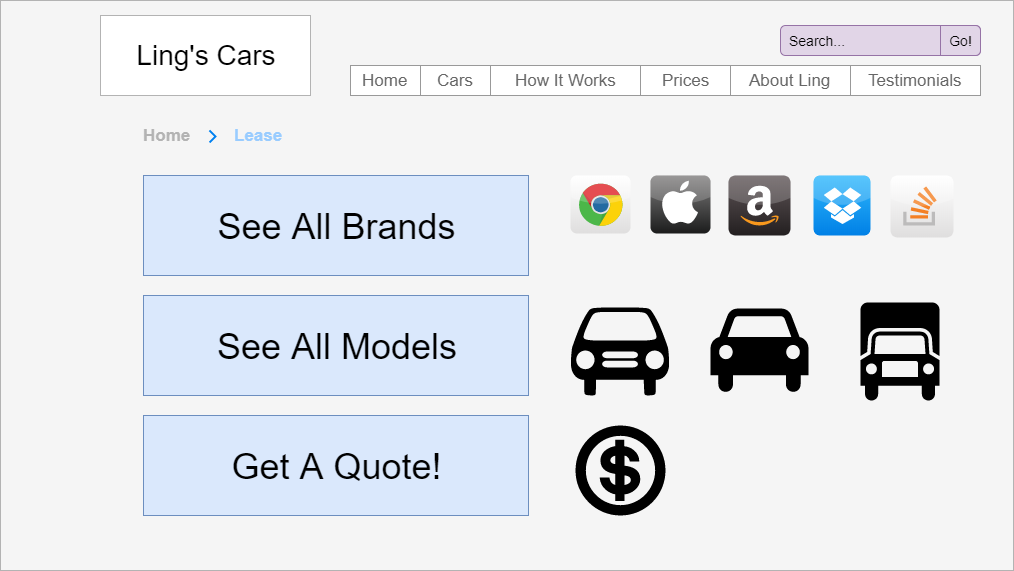
The buttons are large and inviting and include a clear priority order, with the top button being the most likely selection and the bottom being the least likely of the three. This priority of information architecture is based on my presumptions about Ling's target audience (that most users would want to lease a car but then start browsing rather than jump quickly to a quote), but further user testing and research would provide greater accuracy and insight into these kinds of decisions. Images could be included next to each button for illustration purposes, but would also drive clicks for the more focused users who tend to look for shortcuts and prefer efficiency.
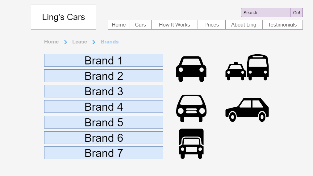
Since this list of brand names would be more inclusive, the buttons are shorter but still clickable. Notice the presence of a page indicator in the form of bread crumbs. This feature assures that users won't be lost in the process of navigating Ling's site, which is more likely when no clues are provided, especially since her site right now is over-decorated and has numerous examples of repetition in terms of navigational elements.
The above is an example of a very basic mobile user experience flow chart or mockup. The reality in design is that quick, usable designs start best with low-fidelity work that gets the most important facts first, like how to efficiently present a prioritized path from beginning to end. This approach reduces road blocks to development that come about by over-focusing on a specific visual design strategy. Leaving the visual aspects for later helps the development team get started sooner with the best and clearest idea of what the user needs, which dramatically reduces costs by focusing on quicker design iteration. Although these designs are very basic, they allow for immediate user testing and feedback for arriving at the best UX much sooner than traditionally possible.


