Design
Introduction to Design
Design is an arrangement of certain elements in a way to best convey your message/purpose. You see design everywhere; from flyers, to branding, to art, and more. In design, there are different elements to design: form, shape, line, color, texture, typography, and space. In this case, we will be focusing on color and typography, some of the more visually focused elements in design.
Colors
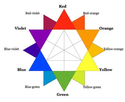
Colors can evoke certain emotions and/or thoughts, if used correctly. What is interesting is that the message behind colors differs based on culture, prior bias, or even personal preference. Chapman, 2021.
When you understand your audience, and choose specific colors that help strengthen your message, your message can go a long way.
So how can I utilize colors to work in my favor and create a strong, clear message?
Warm Colors
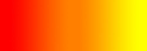
Warm colors encompass red, orange, yellow, and everything in between.
Red

In many cultures, red represents passion and energy. In some cultures, it even represents anger, violence, and blood.
However, in China, red represents good fortune and is even used as the color of wedding dresses rather than white.
In design, red is often used to bring a pop of color, energy, and, depending on the message, is used to back up the message. It can be used as a pop of color to draw in the audience’s eyes towards the color and give them a sense of energy.
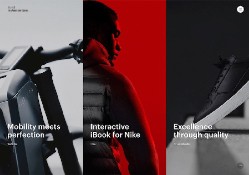
“Build in Amsterdam’s website uses a vibrant red accent color that draws attention to the middle of the page immediately. (2010)” (Color Theory for Designers, Part 1: The Meaning of Color)
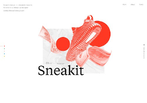
The bright red of the illustration on the homepage of Nacache Design’s site gives the page a ton of energy and vibrancy. (Color Theory for Designers, Part 1: The Meaning of Color)
Orange

Orange is a very vibrant and refreshing color. It can be often associated with autumn and therefore can be seen as change. What is interesting about this color is that it is in between red and yellow, being the balance between the two.
In western culture, this color is not only associated with balance/change, but also as a sense of urge. We see this color in street signs, life jackets, cones, and more.
In Eastern culture, this color has a more spiritual meaning, being connected to the color of robes that Buddhist monks wear.
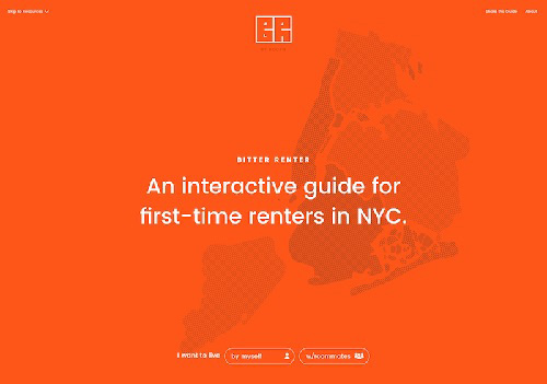
“Bitter Renter’s bright and bold home page takes full advantage of the energy that orange can provide to a design.” (Color Theory for Designers, Part 1: The Meaning of Color)
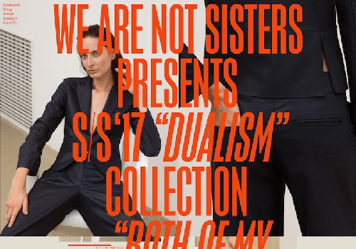
“We Are Not Sisters’ dark orange, oversized typography makes an immediate impact. (2010)” (Color Theory for Designers, Part 1: The Meaning of Color)
Yellow

Yellow is often connected with positivity and sunshine. In China, yellow is connected to royalty as well as eroticism. In Mexico, it represents both life (maize) and death.
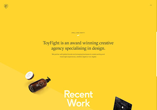
“Toyfight uses a bright goldenrod background, but otherwise keeps their design simple and straightforward” (Color Theory for Designers, Part 1: The Meaning of Color)
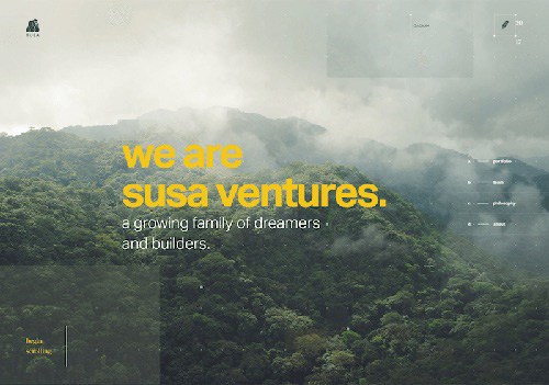
“Susa Ventures uses a goldenrod hue as an accent color in their typography to great effect,” (Color Theory for Designers, Part 1: The Meaning of Color)
Cool Colors

Cool colors include purple, blue, and green and often represent relaxation, reserved, and calming.
Blue

Blue gives off an authoritative stand, depending on the shade it can also be used in a playful manner.

“Deep Mind’s website uses various shades of blue for its background, giving it a trustworthy, authoritative feel. (2010),” (Color Theory for Designers, Part 1: The Meaning of Color)
Green

Green represents wealth, life, and nature. It can also represent envy, jealousy, and disgust.
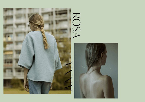
“Anna Rosa Krau’s website has a soft sage green background, which works almost as a neutral for this portfolio,” (Color Theory for Designers, Part 1: The Meaning of Color)
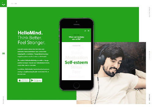
"HelloMind’s bright green background is youthful and gives a sense of growth (in line with their product for improving your brain function),” (Color Theory for Designers, Part 1: The Meaning
Purple

Purple is often tied with royalty and wealth, given how expensive it was to get purple hues in ancient times.
“The first project in Filippo Bello’s portfolio uses a purple color scheme that adds to the sense of creativity. (2010),” (Color Theory for Designers, Part 1: The Meaning of Color)
Hues
Hues often change its meaning as well. Dark purples can represent not only wealth/royalty, but death. Lighter purples are often connected to spring and romance.
Neutral
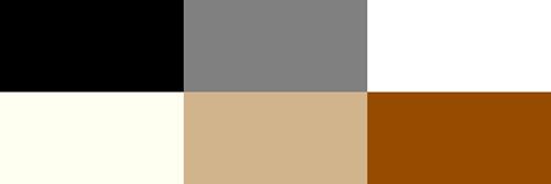
Neutral colors often serve as a background color. Neutrals can be paired with bright accents to emphasize certain aspects. However, solely using neutrals can serve as a sophisticated, minimalist design that creates clear, yet bold designs.
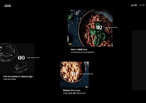
“Anonymous Hamburger Society’s black background is a perfect canvas for the amazing food photos on the site,” (Color Theory for Designers, Part 1: The Meaning of Color)
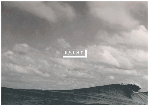
“Spent used white typography to lend a modern yet soft look to the site. (2010),” (Color Theory for Designers, Part 1: The Meaning of Color)
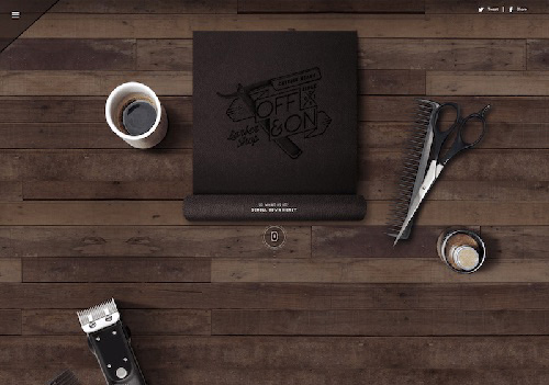
“Off & On Barber Shop uses various brown elements for the bulk of their site, giving it an old–fashioned feeling. (2010),” (Color Theory for Designers, Part 1: The Meaning of Color)
Typography
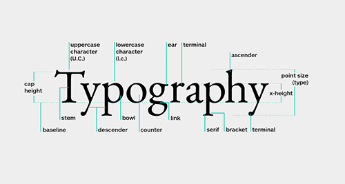
“What is Typography? The Beginner’s Guide to Everything Typography,” (Prokhorov, 2019).
Typography is the visual component of type. While you may still read without typography, typography can alternate messages and communicate. How? To start off, there are different classifications of typefaces.
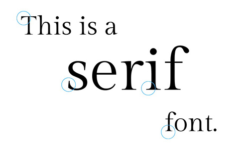
Serif
“What’s the difference between serif and sans serif typefaces?”
Serif typefaces can be identified by the little marks at the end of letters (serif). Its style is often tied to history, tradition, and authority. It is seen in newspapers, for example.
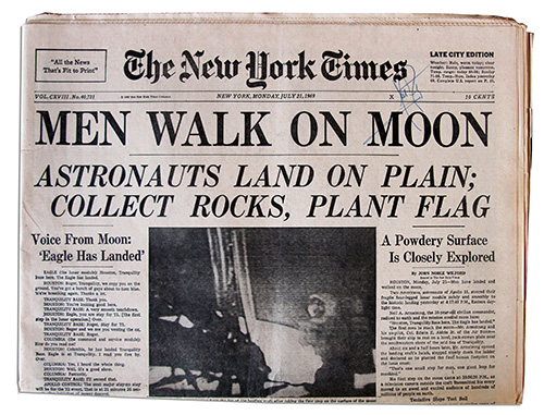
Headline from the New York Times, July 21, 1969. Photo from Pics About Space
Sans serif
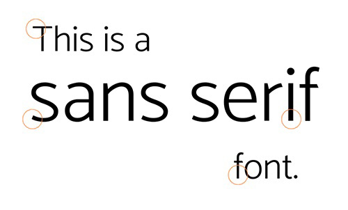
“What’s the difference between serif and sans serif typefaces?”
Sans serif is much like serif, except it lacks the extra little marks, or serif, at the ends of the letters. Opposite to its counterpart, serif, sans serif is often tied to modernity and minimalism for its clean legibility.

“Sans Serif vs Serif Font: Which Should You Use & When?”
Decorative
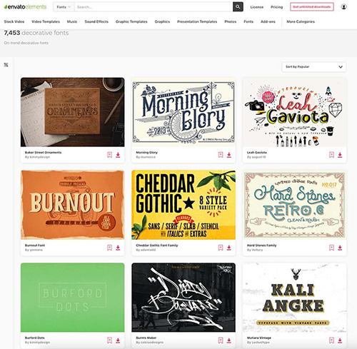
“25+ Best Fancy Fonts With Decorative Alphabet Letters (2023),” (Nieves, 2021)
Decorative is much different than serif and sans serif. Unlike the legibility of the previous typefaces, decorative is purely aesthetic and ranges from a vast number of styles. Its usage is commonly seen in branding and gives a unique personality to your message whilst clearly conveying how you want your audience to view your text.
Sources:
https://www.smashingmagazine.com/2010/01/color-theory-for-designers-part-1-the-meaning-of-color/
https://www.shutterstock.com/blog/color-symbolism-and-meanings-around-the-world
https://practicaltypography.com/
https://www.toptal.com/designers/typography/typeface-classification
https://www.masterclass.com/articles/serif-vs-sans-serif-compared
https://careerfoundry.com/en/blog/ui-design/beginners-guide-to-typography/
https://www.postprepress.com.au/whats-the-difference-between-serif-and-sans-serif-typefaces/