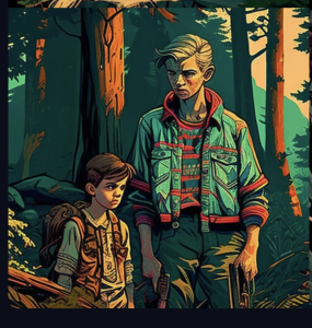
Final Project

In this Visual Narrative I wanted to show a story of taking heroic action being the wrong choice, how sometimes the best thing to do is to calm down and wait. I like making visual media and am trying to work on my style as an artist, this project went a long ways towards that development and parts of it are some of my best work while other parts are some of my weakest. I would also consider this a piece of Hypermedia since the piece requires user interaction to progress and change some frames. I put a lot of thought into how the scenes transition from one to another and about what the best symbol for the interactions and visual style of the talk-bubbles would be. Doing this project taught me new drawing styles and new tools within Photoshop, so I would call it a success from that viewpoint.


https://dtc-wsuv.org/dtc354-luers/jhall-final354/

Story and Games

My most favorite narrative game would be Majora’s Mask, this entry in the Legend of Zelda series is the most off-mold of the titles. Link has arrived in the land of Termina and it is going to be destroyed in 3 in game days, which to the player takes 54 minutes. Obviously you cannot save the world in under an hour so you are given the power to reset time, and with it the entirety of the world. Your money, your arrows, your actions, your progress, is all reset except for a few key items, but most importantly your knowledge is NOT reset. After a number of time loops you start to learn the inhabitants’ routines, schedules, hopes and dreams, and that is the most important aspect of the game to me. The game isn’t really about saving the world and being the hero, it’s about getting to know the people and learn that everyone has problems and everyone reacts to the end of the world differently. Every time you reset the loop everyone will forget you, even the dungeons will reset, so you need to figure out what you need to do to gain the power to save these people. However, not everyone CAN be saved. There are multiple people you interact with who are going to die or have already died. This game is considered to be the most adult Zelda game there has been, there are multiple instances of characters with depression, kidnappings, alien abduction, and abandonment. The aspect of the time-loop introduces something no other game I’ve played does, a sense of futility. Everyone you help, or hurt, will forget you. I would argue that the strategic gameplay drives the narrative in this case, you have to prioritize what you will do, where you will go, who you will help, each loop to create progress in the game. Each major location in the game is dealing with some sort of tragedy in their own way, in the jungle monkeys have kidnapped a princess, the rock-people are waiting for their elder to save them (who you have found frozen solid) from an eternal winter, the fish-people have had their young stolen, and the canyon area is experiencing the dead rising. The most important though is the hub town, here everyone is dealing with the impending apocalypse in their own way, denial, anger, bargaining, depression, and on the last day acceptance. The game is really about how people deal with grief, and how everyone experiences it differently. This game may be my favorite game of all time.

Symbol, Index & Icon

Book From the Ground:
From Point to Point

This story is very unique and could likely be read by any modern human. By bypassing the use of symbols in their story they create a work that doesn’t require the convention of written or spoken language. The text is primarily Icons with indexes showing actions taken. It’s very surprising how easy it is to read when it initially looks overwhelming with the amount of information shown, however when you think about it using words you could cram a lot more information into a smaller space. This leads me to believe that icons have the most information stored in the image while symbols have the most information stored in the human mind. An icon tells you more about its subject, indexes and symbols are used to spark the information stored in your brain about the subject.

I think if I want more control over what the user knows while experiencing my works or to be available to a wider audience I should use more icons, they need less outside knowledge to interpret and in the case of letters and words the user would need to know the language. Icons are more universal and anything with eyes can correlate an icon with its physical counterpart. I can use various icons to convey meaning like maybe blue bubbles to stand in for an oxygen readout, or a sign with a bed on it to denote an inn.


Hypertext and Hypermedia

Yes, the computer has changed storytelling. However focusing on hypermedia, the popularity is lackluster. I believe a major problem that was only recently solved was that the most popular hypertext program was only compatible with Apple. With the creation of Twine hypermedia can now have a larger creator base, leading to more content that can potentially reach more users.

The best kind of stories that work with hypermedia are ones where the author wants the user to find the story, traditional stories can work but they are kind of clunky in their presentation.

“My Boyfriend Came Back from the War”
The navigation and eventual division of the screenspace was very interesting and was most interesting part of this work. There was definitely plot but any character development was lost in the medium. I couldn’t tell the chronological order of events except that the center division of the screen became the war events.

“How to Rob a Bank”
This was more directly a traditional story and was very linear. The use of showing the searches was a good way of showing us what the character was thinking about. I also enjoyed being able to use the arrow keys to transition forward and backward through the narrative.

“With Those We Love Alive”
This story is the type of story that I believe works best in a hypertext format. You can make choices to explore the environment and learn about the world somewhat organically. I especially liked the ability to influence the details of the story but that interaction wasn’t well explained.

Cinema Language

“An Occurrence at Owl Creek Bridge” is over 120 years old and still tells a good science fiction story. Each version tells its story effectively, but the video tells it more efficiently. The written story gives more background about Peyton Farquhar and his motivations along with an account of his intended crime, but these are not actually relevant to the story being told. We simply need to know that he was convicted of a crime and has a desire to return to his family, nothing else revealed about his character becomes relevant in the events of his escape. Nothing about his plantationing or his political views or sympathies to the South, in fact he could have been a factory worker from the North and the story wouldn’t change in the slightest. The only background information that is important to the story we are given in the establishing shots of the video, there’s a crime and Peyton is being executed. Aside from the history of Peyton the two stories mirror each other very closely. And for a video based on a written story it does a great job of being faithful to the original. The video shows each scene happening as the story has told it, the driftwood slowly flowing downstream, the ticking of the watch growing louder and digging into his mind, and making sure to note his injured hand when he made it to shore. The video even does well conveying each indication that what we’re seeing is not what is real, adding in each breadcrumb, confusing runaway scenes, suddenly manifested injuries, fantastical landscape, and the run to his wife that seemed to always be farther away than it should have been.

Visual Narrative II

I tell the FICTIONAL story of my dog finding the front door open and going on a walk to the park. I use Scene to Scene transitions to tell the story of his choices taking him to the park and home. It shows him in new locations and the reader assumes that he traveled from one location to the next. I don’t need to show him traveling because the reader’s closure bridges that narrative gap for me.

Visual Narrative I

McCloud makes a few points that I take into my own work. First is that what is on the “page” is not the thing, it is at best 2 existences away from the thing. It is a symbol that is either digitally or physically being given to the user. This means that there is a lot of leeway in what that represented symbol can mean to the user. showing someone a picture of an Orange can elicit different understandings than just showing them a physical Orange. You wont get all of the sensory input, especially depending on the limitations of your medium. However you can have more control in their perception of the subject. You can control the environment, the tone, and potential extra knowledge about the subject.

Another point he talks about is how a user sequentially experiences your work. Different cultures read in opposite directions, and when you give your work to an audience you have to know how they are going to perceive it. I usually try to give my work multiple angles to perceive it from, if a visual work, create different meaning depending on the visual hierarchy the user uses. I find it fun to create interactive experiences and imagine that some users will find fun puzzling out different meanings or stories from them.

The final point I take away is the importance of what transitions you choose to use in your work. Each one brings different experiences, some can slow the reading down to create tension or give more information by overviewing an environment. It was also interesting seeing the difference the direct constraints of a medium and the cultural expectations created in the use of transitions. Where episodic comics that sell chapters at a time used more time saving transitions as opposed to manga which are usually sold a book at time taking more time and giving more aspects of a scene.

*Bonus*
The touch on object permanence(closure) was really fun to read about in a literary sense. Even in someplace like videogame design this can apply since unperceived assets are usually not loaded but you still need to have a user think the whole world is there.