Multimodal Website – Learning Differences

Here is the link to my group’s project!

Multimodal Website Project – Learning Differences

My contributions for this project was most of the initial website design, structure, and function. Rich helped finalize the overall look and styling of the site. My job was to implement all the content into html, add the visuals that other members had collected, and add styling. There was constant tweaking and changing of the content on the pages that I was in charge of taking care of. I provided much of the content for the page I was in charge of (Dyslexia), though my groupmates also helped when I needed it. For the end of the project, I was also the person in charge of uploading the site to the DTC servers.

Marshall’s Media Madness

Our group’s project is a collection of descriptions and examples of Marshall McLuhan’s Medium Theory. The intent of this project is to provide illustrative examples of what each medium is, and a written description of how its affordances and constraints influence the content of the medium.

My role was web designer and copy-editor. I was responsible for writing the copy text of our sections and coding the template to fit our design.

Link to the project:

https://dtc-wsuv.org/sslater21/DTC%20338/digipub-multimodal/index.html

Fear of Coding Contribution

For this project, my team created a website about the fear of coding. Many times in the DTC program, students can feel intimidated by their first experience with coding. Within our website, we included a story about our hero making it through his first experience with HTML and CSS, while providing advice along the way to help readers who are similarly struggling.

I was the team leader and the lead writer. While we all brainstormed for the story together, I was the one who wrote it. I also have been coordinating the team and leading team discussions. For example, after each class I would post an update in Slack so that people were reminded of what their jobs were for the upcoming week and what we discussed during that meeting. I also found the color palette that we decided to use on the site. Finally, we were each responsible for providing some advice on one of the pages, and I did so for the last page.

This project was so fun to do, and I had a fantastic team to work with!

Fear of Coding Multimedia Contribution

Selfie Prompt Generation done in Stable Diffusion 

When reflecting on this short multimedia project, I had several takeaways I want to highlight. Learning to code is a personal journey much like taking a leap of faith into the unknown. When you decide to code, you have to get dirty with it. It has to be done in a way only you could understand. That might be terrifying or exciting to the student who lives to tell the tale but the rewards are great. It’s a versatile art that anyone could teach themselves to work with. With that said, we never stop learning. Languages are constantly updated and that is the fun of taking on this journey. You are always going to improve if you put in the work.

For my specific contributions to the published multimedia project, I brainstormed with my team and came up with different story lines. We originally had come up with a form of ASCII art to compliment the story but found that it only made coding look that much more intense and not attractive. For the DTC program, we do invest much time and energy into learning the very basics of front-end development.

My main contribution involved the artistic elements on the pages with the illustrations. I specifically want to mention AI image generation and how that came about. Within the stable diffusion plugin of Photoshop, I discovered what “seed” meant and how to make a prompt. Seed means a generation of images that are related to the image you have chosen. The prompts had to be specific in such a way to tell the system what you are hoping to get out of your generator. Not all the time did I get what I was hoping. The downside with stable diffusion was the cost I had to pay. Twenty dollars for a number of image generations. Those included the amazing selfie generations I was able to send to my team. They can now be reused in any project they want. Downside, I spent the credits quicker than I had intended. On the bright side, I discovered Canva has a free beta AI text prompt generator. It does have a limit per day but the upside was that I had found a style of doodle that I wanted to use for the multimedia project. I have so many saved generations on my local computer that were beautiful and detailed. Hence the price of stable diffusion but for this specific project, Canva was able to work.

Fear of Coding Contributions

I am one of the two website designers for the Fear of Coding project. Courtney, the other website designer, and I worked on creating the shell of the website and integrating color, typography, and layout that us and our group decided on. One of my primary duties was creating the navigation bar that worked with the grid that Courtney created. Additionally, I helped with getting the website less likely to scroll down, adding in scroll boxes when needed for text. I helped add some images that Jessica G. created for our team pictures. Beyond website design, I wrote some advice for chapter 3 in our website. I discussed how to approach big concepts and problems, such as encouraging use of online resources like W3Schools and Mozilla’s MDN Web Docs.

Multimodal Project Contribution – Learning Differences

I was the managing editor, multimedia designer, and creator of communications for the Multimodal project. I worked to establish a mode of organization for each chapter within our publication project, meaning that I created a baseline template for the group to follow for their assigned chapters. I also worked to create deadlines for my group members and I to follow in order to finish the project in a timely manner. Additionally, as the multimedia designer I, along with the input of my team members, looked for color palettes and typography that would best suit the publication look that we were going for. I also worked to design a logo/favicon and title image for the publication. As far as editing goes, I worked on writing the ADHD chapter within the publication along with working with my team members on writing out part of the introduction and part of the Dyslexia chapter making sure that everything looked good. Finally, as the creator of communications, I worked to design a promo poster with my group members for the publication as way to gain outside interest in the project.

Multimodal Project Design Elements

First off, the typography was a huge aspect. The levels of hierarchy regarding our title text on each page, to having the headings smaller, and then of course the body text, as well as the ordered and unordered lists. I think the template lends itself well to having a hierarchy of content, where the right side of the screen is where all the content goes. “The most important content is the largest or takes the most amount of space on a webpage” (Oxford Digital). We even implemented a background color behind the main div element so that the content has a white background and will stand out from the colored backing. We also prioritized using lots of visual elements in order to provide a more hyper attention environment. “An image can communicate your ideas much faster than text.” These breaks will help with digestion of lots of information as well as make it more fun.

Typography Design and The Multimodal Project

“But as professional writers, we do more than write. We edit, we format, we print, we generate PDFs, we make web pages. More than ever, we’re responsible for delivering the written word to our readers. So we’re not just writers—we’re publishers.” (Butterick) 

For this week’s blog prompt, I was amazed at the information in Butterick’s Practical Topography. Typography is very much a key component in everyday digital and print text. For this reason, I want to cover the key topics. “Good typography is part of good writing.” (Butterick) You cannot have one without the other. From type composition to text formatting and font choices, typography is a skill set that takes practice. For the multimodal project, typography is based entirely on both image and text. ASCII art is a typographical placement in strategic areas that cover different shadows within the picture.   

Since “most readers are looking for reasons to stop reading,” (Butterick) the writer and publisher must make certain that typography holds the attention and makes reading easier. This involves less concentration on trying to understand mechanics and more focus on deep literacy. Eyes are more drawn to attractive designs which covers Butterick’s second law of typography, the law of judgement based on substance of material. For the multimodal project, beauty of design typography carries the character throughout the story and how he overcomes he/her fear of coding. The background ASCII is how our characters move through the environment. I am still exploring the use of animated ASCII and how the law of typography and design draws on the movements of the character.  

Ideas for The Multimodal Project – Thea Hieronymus

I’m in the “How To” project and our main elements are probably going to be text and images.

With focusing on CSS and design I would really like to see us use visual hierarchy using color. Color draws people in so it is very important to use the right color scheme for the project. It is very important for us to use color in the important information why are trying to produce. This includes highlighting things in potentially yellow or red if it matches.

When looking at Practical Typography I really wanted to look into text formatting and font recommendations that they provided. I think the way the text is laid out is very important for people when reading. Text size, format and layout, and font choice are very important. You don’t want to use a crazy font but also don’t stick with the basic one that everyone is using. For formation, I would like to be in a more F pattern where people read from left to right and top to bottom.

From here my group is going to discuss color and typography, and finalize our text before we really get to work on the design.

Design for Multimodal

My group’s multimodal project is heavily visual and audio based with text to explain these sections. The visuals themselves need to be designed in an engaging way, but making the text visually engaging is equally as important.

We can utilize typography, colors, and visuals for our multimodal project. Typography hierarchy “enhances the readability and usability of your content” (Oxford Digital). It will be essential for us to use different font sizes so certain information is marked as more important. This will be achieved using headers and subheaders to label which section is being shown. Font weight can also be important. In some instances, it will be appropriate to bold or italicize some words. It’s important to use these sparingly, because “they are tools for emphasis… if everything is emphasized, then nothing is emphasized” (Butterick). Other than font size and weight, we also might include different font families for headings versus paragraph text. This will make the text more visually interesting and help viewers distinguish what is a header and what is the main body text.

This project will be heavily visual with text to invoke deeper concentration, but the images and animations will tell most of the story. These visuals will most likely take up the whole page at one time and then when you scroll, text and more information will appear. The images and animations we use will tell the story first, and the text will be more in-depth and give a clearer explanation. Although we already have images to separate sections and text, we can use colors to emphasize certain words or indicate importance.

Typography and Imagery – Design for Reading Blog Post

I’m in the Fear of Coding project and our major elements are text and images. We’re using ACSII images to enhance the story of our character learning to code. Part of the design is having a horizontal scrolling webpage.

One of Digital Oxford’s suggestions on visual hierarchy was to determine the size and position of each element on the webpage, as size and position help decide importance. As one of our major elements are images, it would be good to place them in a highly visible matter. Another principle they discuss is about F-pattern design, and one of their suggestions stood out to me:

“Start subheads, paragraphs, and bullet points with information-carrying words that users will notice when scanning down the left side of your content.” – Oxford Digital

It makes a lot of sense, especially when using their example images of the F-pattern. Breaking text up with variety, including images, will help readers keep interest and understand the text more. I think it will be important for my group to do so; we might not need to use bullet points, but keeping enough variety in subheadings, paragraph spacing, and imagery will certainly help.

The last thing we should focus on is of course the typography of our work. In Typography in Ten Minutes, the last suggestion is to use professional fonts or otherwise be particular about which fonts to use. I completely agree with this suggestion, though I’d argue that you don’t necessarily need professional fonts to make text look nice. Either way, taking the time to carefully choose a few fonts for our project will really help it go a long way. We might choose a sans-serif font, or perhaps something similar to Courier New.

Devon Baxter – Multimodal Project Design Implementation


I would like to make the website as usable as possible this would include the implementation of the F-shaped reading pattern and the use of visual hierarchy to help the site look great, but it is not enough for the site to look great as the site needs to be usable to minimize frustration to the user. I can accomplish this using CSS which is a style that is applied within HTML. I can use typography for readability as the right font will help, as the typographic quality is determined by the way the text looks. Make sure the text looks good, then worry about the rest of the text later. We need to make sure the point size is 15-25 point on the web. The line spacing would also need to be readable at 120%-145% to be readable, which should be double spaced. Line length should be 45-90 characters per line as we don’t want huge lines of text. Font choice should reflect the best readable experience. The reading says to not use free fonts, however, In the CMDC program we are taught the opposite as the only fonts I have used are free fonts. From Google Fonts and possibly system fonts that can be downloaded from the internet. However, the reading told us to ignore system fonts and I agree with that statement only because fonts like Helvetica are hard to find on Windows PC and Google Fonts. Someone in my group suggested this font but since this is a system font on Apple Devices, it makes it hard to collaborate on designs for the web.

Thoughts on Design Ideas for The Multimodal Project

“Visual hierarchy in website design helps guide a website visitor in a logical progression from most important content on a page to least important content.”

After having read A Really Simple Guide to Visual Hierarchy in Web Design I was able to have a better understanding of the importance of incorporating visual hierarchy within web design. As the quote above states, the purpose behind visual hierarchy is to guide your website visitors through your web design in a logical manner so they may understand the content in its entirety. In keeping this idea in mind, I think that when it comes to what design ideas I would like to incorporate within the multimodal project I want to keep three of the hierarchy methods mentioned in mind: Size, typography, and color.

Within the guide, it states that “In size hierarchy, the most important content is the largest of takes the most amount of space on a webpage, followed by the second most important content and so on.” For the multimodal project, I want to ensure that I am using size hierarchy in a manner that will invoke to my audience what content is most important to their understanding. Without this incorporation of size hierarchy, I feel as though the website visitor will get lost within chunks of information if there is no distinction.

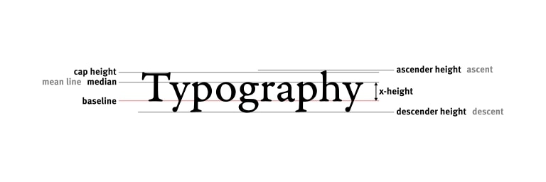
Now, for typography, the guide states that “Typographic hierarchy is all about formatting the typography of your content in such a way that your website visitors can clearly see what’s most important.” This is very similar to size hierarchy in that we are wanting to create a distinction within our content, but what’s most important about typographic hierarchy is enhancing the readability and usability of the content. Given that the subject of my multimodal project will be to educate other on different types of learning differences along with the resources available to combat them I want to ensure that my website visitors can read the content.

Finally, the guide discusses that the usage of color within your web design is important as it will allow for important content within your web design to stand out. Although this may not seem as important as the typographic and size hierarchy I believe that this could be useful within the multimodal project. For instance, I could possibly use color hierarchy when inputting my statistics within my web design to make them stand out. This will ensure that my audience not only sees this information but knows that this is a key part of their understanding.