When looking at both “Galatea” is the level of choice the user has in deciding what to talk about. To me it comes across as a perfect example of multi-linearity. If you want the story to have some semblance of linearity, there are defined paths that a user can take.
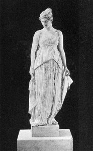
What path the user chooses is ultimately up to them. What I noticed quickly as Rettberg did is that the artwork is not necessarily a puzzle intensive experience, it isn’t an incredibly challenging piece. What Emily Short does that I love is really focus in on the writing of the story. Quality of writing is an incredibly important element and Emily Short really does a fantastic job on this front. Galatea has wit and a unique character as she is carved from stone. There is clear inspiration and reference to Greek mythology which I must confess, makes me like the work even more. Who the sculptor was and why he hated everyone, the idea of love, etc. all create a beautiful tapestry. With all of that said though there were some problems. One in particular was the text options. At times I would feel limited in my options despite it being a relatively open experience. However it wasn’t a big enough problem that it brought the entire experience down with it. Rettberg discusses how Short doesn’t create games to be won or lost, but rather stories designed to create an experience. In this way Short differentiated herself from the rest of the crowd during the time, using the framework of interactive fiction to explore different narrative paths. (Rettberg 100)
A less enjoyable story that I explored was Jason Nelson’s “Game Game Game and Game Again.” It wasn’t necessarily a bad IF, there was a clear point and statement. For example, while there is an “objective” which is the door, you don’t really feel like you win much of anything. Nelson is exploring as he described it, “artists changing worldview lens.” In this way it, like Short’s Galatea, utilizes the IF framework as a method to explore different ideas and forms. The problem derives primarily from the visuals. As a person who is obsessed with visuals, the design of this piece is just ugly. Now its pretty obvious that this was intentional on Jason’s part, as he explained that it was an anti-design statement; but it doesn’t make it any less easy to engage with.
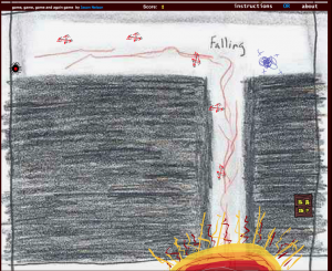
It didn’t help that the writing was not the best, and often times I was left more confused than satisfied. Perhaps I ought to take a few more looks at the work to see if I can decipher any more meaning out of the piece.
I will say though his line, “Come on and meet your maker,” is now stuck in my head.