
For this post, I chose to focus on “Cityfish” by J. R. Carpenter and “Loss of Grasp” by Serge Bouchardon.
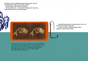
I read Cityfish first, and even before I got into the story, I enjoyed the unique page layout. I think it does a lot to show how time passes for the narrator, literally moving the story along as it does so figuratively as well. I also enjoyed the collage-like aesthetic, since it seemed to very accurately portray a young person’s thoughts and memories: fragments of photographs, mental maps, illustrations, snippets of foreign languages and even pieces of poetry and quotes…they all come together to form a cohesive picture of the narrator, Lynne.
Something else I liked in this story was the various pieces of ephemera (such as the Transit Authority buttons) that took you forwards and back. For me, I didn’t realize they were links until partway through the story, and when I clicked on one, it took me backwards in the story. I took this as showing how Lynne feels about her New York summers–repetitious and jarring–and so again, really helped to add to the character.
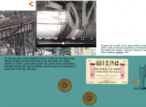
The videos included also did a lot to build the atmosphere. Rather than showcasing smooth, glamorous shots of the New York skyline, the videos are all rather banal, showing rows upon rows of marketplace goods, blurred grey views from transit windows, shadows of passerby moving over the concrete…again, it helped a lot to place me in the scene with the characters, and fit Lynne’s bored and annoyed mindset very well.
All in all, I felt that Cityfish wasn’t abstract per se, since while it was fragmented, each piece was concrete and vivid, but it was definitely immersive and told an interesting story about family dynamics and feeling like an outsider. It was somewhat interactive in that it invited the reader to explore the world being built, but it was overall pretty linear, as it did have a specific plot with pretty definite forward motion, going from Nova Scotia, through New York, to the Aunt and Uncle’s apartment with the fish being fried at the end.
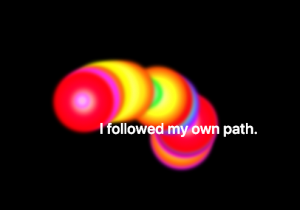
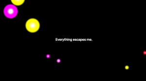
Loss of Grasp was more abstract, but still had a strong character, as well as an immersive kinetic setting. I liked how the interactive quality of it also told a story. A good example is in chapter 1: when the character is describing feeling in control of his surroundings, the mouse controls a series of glowing, musical orbs. When the narrator begins to have doubts, however, and finally realizes he has little to no control, the orbs explode into random patterns, no longer following your cursor at all.
A great example of interactivity and character/plot work involving kinetic typography is in chapter 4, when the narrator reads a portion of an essay written by his son. In it, the son describes not having a hero, and the narrator is instantly betrayed.
“How can he do this to me?”
-Narrator
After the essay is read by the son, you can click on a paragraph and the letters fly aside, revealing what the narrator is actually taking from it: phrases like “I don’t want anything from you” and “You are not a model.”
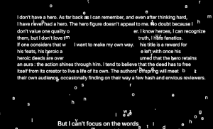
The other text transitions themselves are also very insightful and do a lot to help portray the mindset of the narrator. Instead of cleanly moving from one thought to the next, they flash through a mess of gibberish symbols and letters. This is pretty much constant throughout the story, and it good continuity as well as character work.

Overall, this piece includes a lot of vivid kinetic typography, interactivity, and intriguing narrative. While it is a little abstract (the narrator and characters aren’t given names, no true setting is given, etc) it does follow the story of this man’s life and mental instability.