Multimedia Fiction

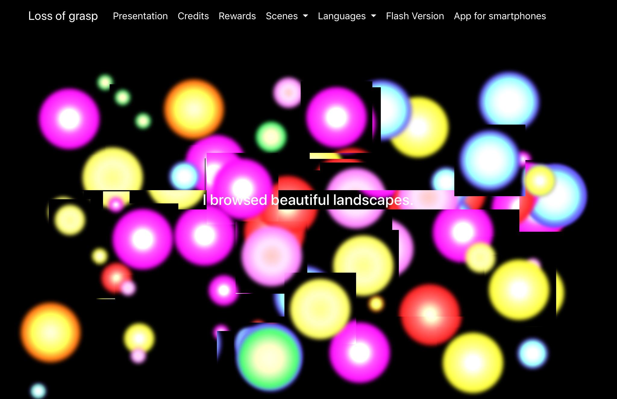
This week, I chose to take an in-depth look at the works “Loss of Grasp” and “How to Rob a Bank.” Loss of Grasp generates words through mouse clicking and every once in awhile it seemed as though the words showed up based on a timer. If I clicked sometimes a word would show up, but other times it would take awhile to actually show up, hence my suspicion that it also used a timer to precisely decide how long the user must interact with certain words and phrases. This timed text combined with the ability to click around on the screen creating expanding circles of color and different sounds creates a world that to me felt like a representation of what it’s like to think to yourself. Seeing those circles of color reminded me of the times as a kid where I would close my eyes and rub them hard and see all of the colors that would show up. I don’t know if this was the artists intention, but it’s definitely what the work made me think about, and I found it very immersive because it felt as though I was in my own thoughts. This work is a fiction based on the fact that it is not based on or referencing anything in particular. I believe if there is any character in this work, then it must be the user.
In How to Rob a Bank, the world is generated based on a fake iPhone screen, by clicking through it switches between various “scenes” within the phone, such as two characters texting each other about several things throughout the course of the story, news articles, images, social media, etc. Since this is the kind of world we see every day on our own devices, it was especially easy to become immersive, since I am so used to being able to become immersed in the sole technology in my hands on a daily basis. This work comes across as more of an obvious work of fiction than Loss of Grasp, mainly because it is much easier to tell what’s going on and gain a clear understanding of the plot and characters. There is a clear beginning, middle, and end.

Multimedia fiction

The first one of the readings I explored was “88 constellations”. Within the framework of box images, video, and audio combine to make this multi-linear story. The constellation lets you pick the sequence of the story. It deals with the digital world, history, and the present. I also liked how it used fictional stories from movies to “teach” through this story.

I liked the multilinear stories on “how to rob a bank” best. I felt it did a better job of connecting the characters to one unified thing. It reminded me of the movie “searching”, where the whole story was told through the use of different digital platforms. The story told is that of a couple who rob banks. But it is not just told through their viewpoint.

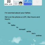
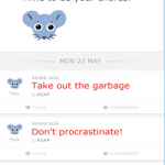
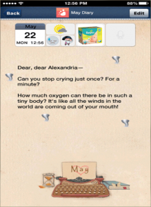
The part that captivated me the most was the part with the woman and the baby. It’s able to tell a story through the vehicle of a phone. She documents her experience with a new baby. It captures the joys of motherhood with the heartaches as well. The reader can see her scrambling through a baby help book for answers to stop the child’s crying. Also, the icons or apps that show the degradation of the family unit, as the husband and wife grow further apart. It seems they are both bored with each other or maybe what life has become, compared to their careers robbing banks. It seems at the end of this entry that the mother asks for forgiveness from the child, assumedly for leaving it so she and her husband could pursue their “career”.

Dylan Niehaus – Multimedia Fiction

The first work I decided to explore was FilmText by Mark Amerika. I found this work to be interesting and intriguing, I found myself stuck and unable to advance. I also feel that the work lacks any real narrative, although it does have quite a bit of intricate interactivity to it. The sound work in this piece of literature is also quite interesting, its very dissonant and I found myself a bit mesmerized by it. One thing that I have learned from exploring different pieces of electronic literature is that I greatly appreciate atmospheric music that sounds a bit “off” if you will. I also find this works use of symbols to be quite interesting, although I am not sure if the symbols are unique and created by the author just for this work or if they are simply letters of a different language. Despite the interesting elements of FilmText, I would have to say that I do not entirely enjoy it because it lacks meaning to me and I just feel lost while exploring it.


Next, I decided to explore How to Rob a Bank by Alan Bigelow. When compared to FilmText, I found How to Rob a Bank to be much more immersive and enjoyable. This is mainly because How to rob a bank is a much more straightforward story told in a rather unique way, rather than an abstract piece of art that is interactive. How to Rob a Bank tells a linear story through a person’s actions on a cellphone, which I found to be captivating and immersive. I found myself looking forward to the next actions performed on the cellphone to reveal new information in the story. I also enjoyed the background noises of cars passing by on the street and birds chirping – very relaxing, in stark contrast to the story being told. 

Multimedia Fiction – March 1, 2019

Multimedia fiction combines key aspects of hypertext fiction, kinetic and interactive poetry, and interactive fiction to combine digital writing into immersive pieces of art. Combining sound, animation, storytelling, interactivity, and more to captivate the reader, multimedia fiction paints a fictional space for its audience. Much like the previously mentioned forms of electronic literature, multimedia fiction is a museum for fanatics of the avant-garde, but it also contains simpler pieces for those who prefer straightforward art.

A simpler example of multimedia fiction is Alan Bigelow’s “How to Rob a Bank – Part 4”, which follows the daily diary of a new mother trying to raise her baby as she realizes she and her husband are growing apart. By using outside environment sounds and the interface of a phone to emulate a person using their phone outside to write up diary entries, the protagonist becomes much more human. By documenting the decline of the mother’s mental state as she becomes more stressed from motherhood and her relationship with her husband within this outline of a phone, the piece is presented as a fictional but immersive story.

A more abstract piece of multimedia fiction is Mark Amerika’s “FilmText”, which puts the reader in a simulated environment, akin to a video game. The reader can click on various cones being emitted from craters to open up different documents that explain the universe of the piece. “FilmText” stands out much more as a piece of fiction with its sci-fi elements arising from Amerika’s creation of ideas like a “Digital Thoughtographer”, but it still manages to be immersive like “How to Rob a Bank – Part 4”.

Multimedia fiction manifests itself in many different forms to allow for its writers to convey their message in any way they choose. Whether it is immersive, simple, abstract, or more, multimedia fiction appeals to fans of writing, technology, avant-garde, and the like.

Kinetic and Interactive Poetry

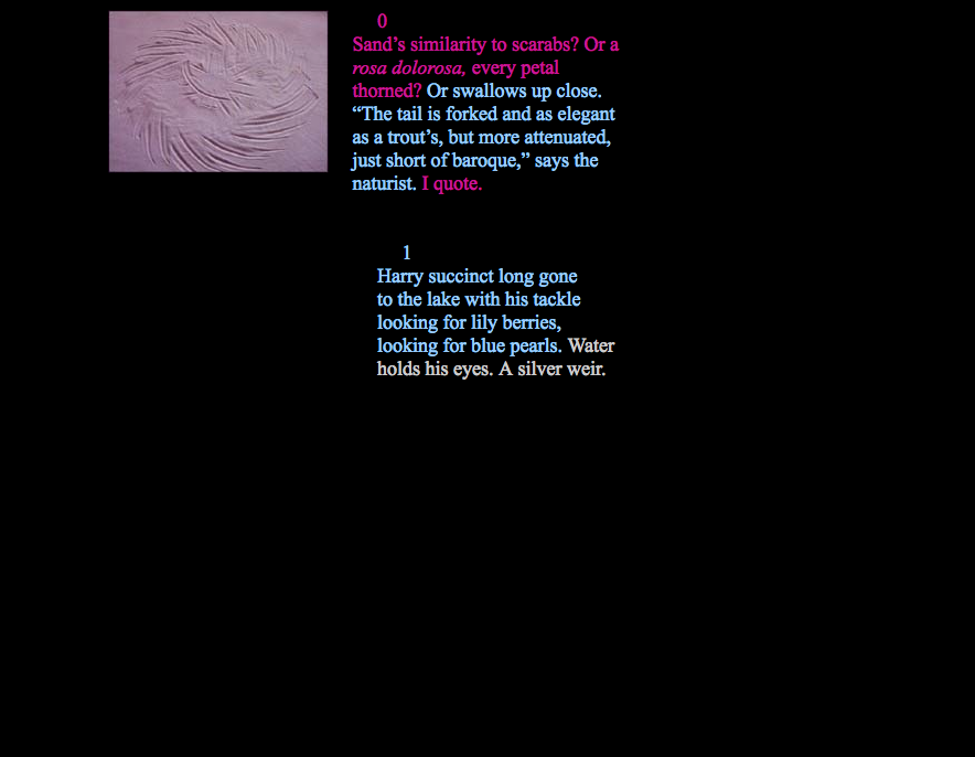
The first piece of poetry, that I read, that I found to have stood out was Stephanie Strickland’s “The Ballad of Soot and Sand.” I found the poem to be amusing in a way that it shows how different-colored texts can show more meaning to the poem than others. It also shows progression in a way that you feel peeks your interest with how you feel. It can also show us that multilinear can work on a much deeper level and more than just games but you can also read poetry with choices. the multi-color effect also gives people a sort of what is what, like the topics of being discussed in the panel and the corresponding picture that is shown and how they are sort of similar.

Another poem that I found to be very interesting is Brian Kim Stefan’s “The Dreamlife of Letters.” I liked the poem because it did something that I think is a good addition to Kinetic poetry and that is “Visual Poetry” for people who don’t necessarily like to just read with their eyes but see what the action of the words within the poem itself.

“Considering the relation between writing and technology, visual poet Derek Beaulieu writes that he proposes a poetic where the author-function is fulfilled both by the biological ‘author’ of the text and the technology by which it is created” (Beaulieu, 2012, p. 74)

This tells me that authors and poets alike wants to show a different way of telling stories to readers by having them to be shown.

Digital Poetry

“The actual experience of interacting with IF can however sometimes seem more like conversing via telegraph with a precocious chimpanzee who has worked out a compass and the possession of objects than conversing with an adult human.”

(Rettberg,90)

I feel like this quote from the book encompasses how I felt reading it. The ones I was most drawn to were the works that embodied concrete poetry. The visuals helped the meaning come across more clearly. Cruising was visually captivating, although I liked the simplicity of Shy boy.

However, Rain on the Sea, in contrast, is a simple black and white text-based video. Although the words flash so quickly on the screen the viewer must be very focused. I think I understood what the author was trying to say although, I will admit even after viewing it a few times I know I missed some of the words. I think the poem is talking about relationships and a bit of inner turmoil. In the first part, the character is talking to God whom it seems like she is thanking for getting her out of a bad marriage? At least that’s what I thought the story was about. I do think that others could take different interpretations of the poem.

I would be interested in looking more into A is for apple. Most of the links seemed broken, which I guess can happen to any digital piece.

Kinetic Poetry

Rettberg’s chapter on Kinetic and Interactive poetry covers many types of digital poetry. The sections I found myself most interested in were those on visual and sound poetry. I appreciate the kinetic aspects and found that digital poetry that combined sound and text as images held my interest best.

“Rain on the Sea” by Y0UNG-HAE CHANG HEAVY INDUSTRIES was incredible. It took me by surprise (as did most of the works we studied this week) because I didn’t know what to expect. I hadn’t explored their work before. After experiencing “Rain on the Sea” I found more of their work to see what else they’re doing, and found that they have a style. The use of Flash, and pacing their text to upbeat music so that words are presented almost too quickly to comprehend created a juxtaposition. I found myself enjoying the music but trying to follow the story, and feeling oddly conflicted trying to experience the story, visual art, and music all together. I grew a little frustrated with the edges of the text being cut off and flashing by so quickly, but liked the story and the music. At the end I was left feeling both wrung-out and exhilarated.

Tachistoscope was another piece I really enjoyed. The presentation of single words (mostly) atop images that at times enforced and other times contradicted the text was visually interesting, and I enjoyed the story that Poundstone was telling. The addition of sound drew me in more and kind of helped me keep pace with the story. I went through it a few times, trying to focus more on the words in white font and find out how they’re affecting my experience or interpretation. It was difficult but I think I got more of the story that way.

This class module is very interesting and I’m super enjoying exploring it!

Kinetic and Interactive Poetry


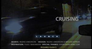
The first pieced I looked at was “Cruising” by Ingrid Ankerson and Megan Sapnar. It was a really cool and interesting way to tell the story. As you move the mouse side to side, it goes through a slideshow type strip a the bottom. When you pull the mouse up or down it will either zoom in or zoom out of the story. Although it was a really cool idea, I’m not sure I exactly liked it. It was pretty hard to control, at least for me, and the constant moving and zooming in and out actually made me feel a little nauseous. It is possible iI was just doing it wrong though. The second one I looked at was “The Dreamlife of Letters” by Brian Kim Stefans. If I’m being honest, I didn’t really understand this one either. I’ve never been a huge fan of poetry, especially poetry that is made to be confusing on purpose. I do understand the importance of poetry and interactive poetry, it’s just not really anything I think I will ever be interested in. I did try really hard on this assignment to find one of them that I did like. I went through each one but either I couldn’t figure out how I was supposed to do them, or they didn’t really make sense to me.

*EDIT* I’ve just now realized that I never got past the introduction part of “The Dreamlife of Letters”. I’m not sure how I didn’t get past it before, since I looked at it for a good 5-10 minutes. Now that I’ve explored this piece deeper, I actually really enjoyed it. I love how it flows through without anyone having to interact with it at all. Out of all of them, I think this one ended up being my favorite piece to explore through.

Like I said before, I understand that they are an important piece of history in literature, and interactive poetry is very important in electronic literature. But this is a type of electronic literature that really challenged me. I did like that there were some in video form such as “Rain on the Sea” that I found myself understanding a little more. It goes by really fast, complete with music to match the speed of the switching letters and numbers on the screen.

Kinetic Poetry


“The Ballad of Soot and Sand” by Stephanie Strickland has a hyperlink structure similar to hypertext fiction, while using elements of kinetic and interactive poetry. The poem is traversed nonlinearly through links in the body of the poem, within words that correspond to other passages. Soot and Sand is more navigable and asks less of the viewer than more dense or confusing pieces of hypertext e-literature by having links to other parts of the poem along the bottom of the screen. Links to passages that have been read are in bold. Each passage is formatted differently, with text aligned or oriented in different ways and color is applied to the text, affect how the text is read, at what rate it is read, and giving more significance to passages and words by coloring or orienting them differently than the rest of the text, conveying meaning that might not a have been drawn by the viewer otherwise.

Words and letters are not only carriers of meaning but material objects that themselves have variable properties. -Rettberg

David Jhave Johnson’s “SOFTIES” are a more dramatic example of manipulating the appearance of text to convey meaning. In his piece “Stand Under” he stretches and pulls the word understanding, broken down and rewritten several times to create an abstract kinetic form. The words “stand” and “under” are reiterated and stacked on top of each other under a long stretched letter. As the stretched letter is pushed and pulled the understanding beneath it compresses and contracts. The description of the work states “State under. Humility understands.” The work visually represents the literal meaning of the word understanding and how to achieve understanding through humility, and placing a situation one is trying to understand above oneself. Manipulating text minutely or grandly can be used to communicate major or minor subtext.

For Those Frustrated With Electronic Literature, Here is Your “Bone”

Farinsky Blog 6: Kinetic and Interactive Poetry

Image result for throw me a bone
Not all of us have felt as suave as Austin Powers navigating electronic art.

I will be the first to admit a sort of “hypertext fatigue” which has built over the previous weeks and has deeply challenged me.

Most have been massive works that are told in a deeply unsatisfying, non-linear fashion unless one spends hours pouring over the hundreds of linked pages to try and piece together some sense of story. And with a long list of works to look at each week the frustration is compounded as I fail to understand work after work enough to feel comfortable writing an intelligent blog post about them.

This week was refreshing because the majority of works were in video form. I was able to see the entirety of the piece in under 15 minutes which was more conducive to re-watching, and interpreting.

Here is my “like” list:

Knowing the narrative is a first, critical step, of understanding a literary piece before further analysis, and becoming able to appreciate it stylistically. Two works do this particularly well, “Shy Boy” and “Rain on the Sea”.

“Shy Boy” is a poem that has been produced through a program to bring a kinetic feeling to the work. This work is a strong argument for why Electronic Literature deserves to exist as a genre because it takes the form of traditional poetry, but uses programming to enhance the delivery. The strong literary influence makes this work more than digital art.

Similarly, “Rain on the Sea” has a lot of reasons to like it. The work uses text to tell a distinct story using language, sound, and speed to explore past the constraints of print. The soundtrack accompanying this work is an upbeat jazz mix which signals to the reader this work is going to move fast. It is almost incomprehensible it speeds by so quick. However, since this work is a video browser extensions such as Chrome’s Video Speed Controller can be used to slow the video playback speed so a second viewing can focus on reading each word building on the first viewing’s understanding. This makes the work accessible to more people who would otherwise give up on engaging.

Special mention goes to A is for Apple, by David Clark because it is hypertext, and it is easily navigable. The page title is clearly visible as well as a link to restart or find the map which makes this work so much more readable. 

The time I spent with these works was so much more enjoyable than previous weeks because most of my time was not devoted to figuring out the narrative. I was able to understand the text and then dive deeper into the stylistic features and layers of meaning compared to feeling lost and angry at link-based fiction.

Shy Boy, Sound Poems, Kinetic, and Interactive Poetry

            When I was reading about sound poems, I didn’t know what to think about them like someone really tried to pass off random sounds as a poem? But after listening to it as well as reading Jörg Piringers reasoning it is both intriguing and cool. It is also interesting to see how different sound poem is from shy boy. Shy boy has a soft melody in the background but has a larger focus on the visuals the text moves and falls at the pace you read it as well as to shows the sadness and loneliness of the boy. I personally really enjoyed Shy Boy and liked how its interaction with the reader I tried to read rain on the sea, but it was to jarring and I wasn’t able to follow it. The time spent in making(author) and reading/interacting(reader) with Shy Boy is also a part that I hadn’t thought about and enjoy.  

Sounds Poems and Shy Boy

In Sound Poems, all is handed over to the user. It contains 6 poems to interact with and none of them contain any sort of symbolism. While these poems focus on sounds themselves, I am reminded that sound is very important in traditional written poetry especially when it comes to rhythm and reading them out loud. This set of poems embraces that aspect. These poems are very visual too as the user may drag the letters all around the screen. There isn’t terribly much the user may create using these poems, so I think of these poems as a demo for what could potentially be done with interactive poetry that have more description and symbolism. The poem Shy Boy has the more symbolic poetry that readers have become to expect but can especially be read as a concrete poem or Vispo. The ways that some of the words and phrases are presented emphasize their meaning. The word “melt” falls down below. The word “vanish” slowly disappears. The phrase “not to be there” pops out very quickly. “Pencil smudge” is smudged under a layer of gray. The words that begin and restart the poem, “Enter” and “re-read” are red. This symbolizes the hardships the boy goes through.

“Interactive digital poetry further considers the relationship between reader and text as a recursive feedback loop.”